A Collector's Guide: The Patek Philippe 3940
The ideal daily wearer is different for everyone. Depending on your lifestyle, you might prefer a rugged, steel sports watch to climb mountains with, or perhaps you need to be able to glance at multiple timezones, as you hop from one continent to another. But for Philippe Stern, the man who used to be at the helm of Patek Philippe, he needed a watch that channelled the understated elegance that the Maison has been known for, since its founding. Enter the reference 3940. An automatic, perpetual calendar that hugged the wrist and slipped under the cuff with such poise that no one would notice it – unless they knew what they were looking for.

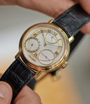
Philippe Stern with his gold dial Patek Philippe 3940 on the wrist
Philippe Stern’s job required him to look, not just years, but decades into the future, whilst keeping an eye on the historic past of the manufacture that his family had owned since the early 20th century. That is exactly what the 3940 symbolised. A perpetual calendar that wouldn’t need adjusting for over 100 years. First conceived in the most classical of materials, yellow gold, it would house the all new 240Q movement behind a solid caseback.
John Reardon, a recognised specialist in Patek Philippe and former International Head of Watches at Christie’s, might’ve said it best when he said, "for the price, there is arguably no other watch that encapsulates all that defines Patek Philippe.”
A watch for modernity
To introduce the reference 3940 in 1985 was a rather audacious move. The Swiss watch industry was still feeling the effects of not only the Quartz crisis, but also a global economic downturn which resulted in massive downsizing for many watch brands, with some pivoting towards this new technology and some having to fold altogether.
But rather than follow the wind, Stern decided instead to double-down on the brand’s heritage by creating a pair of complicated references: the 3940 and its sister, the perpetual calendar chronograph reference 3970. Rather significantly, the two references essentially kick-started the serial production of complicated Patek Philippe watches. A rather daring step, considering most of the industry was moving away from tradition, rather than embracing it. As Sean Song, a vintage watch dealer and collector puts it,
“It marked a return for high end watch brands. At the moment, I think the 3940 is more important to Patek Philippe themselves than to collectors, as they know just how significant this release was for the continuity of their brand.”
Prior to these, complicated watches by the manufacture were produced in relatively small numbers. To give you an idea of scale, the iconic 2499 is believed to have been made in 366 pieces over 35 years, with numbers cited closer to 4,000 for its successor, the 3970. Similarly, the 3940 was preceded by the 3448, the very first automatic perpetual calendar by Patek Philippe, recognisable for its angular design and razor-sharp lugs. In production between 1962 and 1981, it is understood less than 600 examples left the manufacture, in contrast to several thousand 3940 perpetual calendars out there.
However, whereas the 3970 was a continuation, the 3940 was something new. It decided to abandon the aesthetics cemented by previous references. The dial layout was revamped, with the day and month aperture being replaced with three sub-dials. The sharp lines were substituted for a smoother, more modern design. Powered by a much thinner movement, it enabled an elegant, slim case that fit tightly to the wrist.

A first series 3940 and a first series 3970
Looking back, it is interesting to consider what else was going on at Patek Philippe during this period. Many choose to focus on the Nautilus 3700, in production during this time, as the embodiment of contrarian thinking from Patek Philippe. It certainly was in many ways, but the manufacture was also following a change of direction in consumer tastes, established by the Royal Oak a few years prior. The pair of complicated references – the 3970 and 3940 – were arguably equally, if not more, against the grain. Throughout this article, we will look to frequently compare the path of the 3940 with its sister reference, the 3970. Born from the same thinking, they share an extremely similar story.
The first 25 pieces for Beyer (1985)
When Philippe Stern chose to release the 3940 at an unprecedented time in the industry, he did it to help a close friend of his, Theodore Beyer, celebrate the 225th anniversary of Chronometrie Beyer. The first 25 models were numbered, with the dials stamped with Beyer and their series number. Watches numbers 1 to 15 were fitted with a German calendar, whereas numbers 16 to 25 came with the English version. They were delivered to Chronometrie Beyer in May 1985. What a day that must have been.

Number 6 - sold at Christie's in 2008 for CHF150,000
Aesthetically, these watches might just be close to perfect. The combination of the yellow gold case and golden, almost salmon, dial is reminiscent of some truly great vintage watches from the manufacture – gold on gold 2499, anyone? The austere Beyer signature, below the Patek Philippe one, combined with the more playful cursive numbering, elevates it even further. Beyond visual appeal, there is a real significance to Patek Philippe numbering a dial. It is rarely ever done, usually reserved for the tourbillons by the manufacture.
Theodore Beyer himself was gifted the very first piece (movement no. 770’001), which now resides in the Beyer museum that sits below the shop in Zurich. As for the second model to come off the production line (movement no. 770'002), it was sold on 9 July 1985 to the important collector Dr. Eugen Gschwind. It now lives in the Patek Philippe Museum in Geneva.

An advertisement from Chronometrie Beyer (credit: Adam Magazine)
Old advertisements are often a rich source of visual knowledge for collectors. In fact, they can often act as surprising clues when carrying out meticulous research. The advertisement above, printed in a German newspaper, features “No. 3” of the pieces made exclusively for Beyer. It is amusing to imagine that with the first piece having gone directly to Beyer himself, and the second one ending up straight away with an important collector, the third one would have briefly been set aside in order to be photographed. We wonder where it is today…
First series and pre-series (1985 — 1987)

Three different configurations of the first series: yellow gold with an opaline dial, yellow gold with a golden dial and platinum with an opaline dial
There are some reports of 100 models of the 3940 being produced in 1984 as a special run and then, in 1985, it being pushed into full production. While we can’t confirm this, and neither will Patek Philippe, we can only go off what we know, and what there is clear evidence for. The earliest examples that we can find, date to 1985 and have the characteristic first series dial with its sunken sub-dials. With the day and month indicators sat on the surface of the main dial, while day/night and leap years sit inside the recesses.
These were, according to Lou Hantao, an astute collector of the reference, a lot harder to produce than the bevelled versions we see coming later, which may account for the lower production numbers and rarity of this series. Evidence suggests that the dials for the reference 3940 were produced by Stern Frères, who provided many dials to Patek Philippe during this period.


The closed caseback and hallmarks on the left-hand side
The other feature that is singular to the first series, is the solid caseback, with no option for a display window. This was highly reminiscent of more vintage pieces, where despite the movement being constructed and finished to the highest standard, it is covered, so that only the watchmaker and those brave enough to pop the caseback off, know what is underneath. The hallmarks for first series are also found on the left-hand side of the case (a feature also found on the second series).
Another less noticeable difference is in the Patek Philippe signature, which is smaller and shorter than on the later series. The grave accent above the second ‘E’ on the word “GENÈVE” also sets it apart. So far, only yellow, white gold and platinum examples of the first series are known. The former came with either an opaline white dial or what is sometimes described as a gold dial or champagne (as confirmed by the Certificate of Origin and the Extract from the Archives, which should refer to the dial as "doré"). The golden dial is by far the most elusive. In fact, it is more commonly seen with a retailer signature on the dial than without one.

A rare first series with golden dial
While some estimate around only 700 first series models being produced, Reardon believes that roughly 1,300 - 1,500 were made. Which would still make them the rarest out of all three series with approximately 7,000 - 8,000 being made in total between 1985-2007.
Contextualisation of the First Series
It is worth briefly pausing on the first series, as it has been identified by many as a future classic. It is seen to capture the appeal of vintage complicated pieces, both in terms of design and techniques used in its construction, whilst also marking the first step towards modern production. Some of the later series are seen to lose some of this vintage charm, be it the more classic Patek Philippe signature, hand-finished details or limited production, in order to fully embrace modernity. In that sense, the first series is a truly transitional watch.
Comparing it to its predecessors, the 3448 (1962-1981) and the 3450 (1981-1985), you can see how the first series integrates some of the traditional techniques used in these references, while also beginning to embrace modern manufacturing techniques. Research from Patek Philippe scholar, Dr Helmut Crott, suggests that the 3448 and 3450 incorporate many artisanal details: hand-applied indexes, day and month aperture finished by hand, and an enamel moonphase disc meticulously put together by hand. The angular case is also an impressive example of manual know-how.

A 3940 and 3448 side by side
From our observation, the first series 3940 incorporates some of these traditional techniques, such as hand-applied indexes and the sub-dial apertures which are potentially finished by hand. However, it also chooses to embrace some modern production techniques, in order to be able to produce the greater numbers envisioned for the reference. For example, the moonphase is made out of sapphire glass, which is much less time or labour-intensive to produce than an enamel disc.
Lou is also quick to note that early cases, before the use of a sapphire crystal on the back, were made using more artisanal, handmade techniques. They then transition into more modern production, with more machinery and less handwork. Overall, as the reference progresses, it seems that the traditional techniques progressively give way to more contemporary ones. As for the first series, it sits between tradition and modernity.
Another interesting comparison is with the first series 3970, which also presents many of the same features. It also came with a closed caseback, distinctive subdials and was quickly replaced by the second series. It also features more classical styling such as leaf hands, which were subsequently substituted with baton hands. Interestingly, whereas collectors have certainly started to get excited about the first series 3940, this enthusiasm is already much more pronounced for the equivalent 3970. In June 2019, a first series 3970 sold for £150,000 at Sotheby’s in London. Safe to say, a second series wouldn’t come too close to that level. Only time will tell if the first series 3940 will garner such enthusiasm from collectors.
Second series (1987 — 1995)
Moving swiftly onwards, we can break down the second series into two subdivisions of early and late series models, with slight differences to the dial, separating the two.
The early second series is believed to have been produced between 1987 and 1989, and the main difference from the first series is the change in sub-dial design. Now with bevelled edges that hold the day and month indicators at three and nine o’clock. This gives the effect of larger sub-dials and a busier dial in general. The Patek Philippe signature is slightly larger than the previous series, however the sub-dial font remains unchanged. The grave accent in “GENEVE” is also gone.

Early second series in white gold (left) and late second series in platinum (right)
Patek Philippe also introduced the display caseback into the range, after a foray into a new reference number that we will explore later on. Initially, depending on their preference, a customer could order one or the other. At some point towards the end of the late second series, it is believed that Patek Philippe started providing both casebacks (usually with the display-back fitted and an extra solid caseback in the box). This option was given to clients for yellow, rose or white gold pieces, with the platinum versions only ever being produced with solid backs.
During the second series, the hallmarks also started to transition from only being featured on the side of the case to being stamped both on the side and on the back of the lugs (at 5 and 7 o'clock).
The later second series variation was made from 1989 through 1995 and can be easily distinguished by the addition of a cross divider to the leap year indicator. They also had the Swiss sigma printed below the outer minute track. Here Reardon estimates that around 3,500 were produced in total of early and late second series.
Third series (1995 — 2007)
At first glance there is very little to differentiate the second and third series, but the main detail that we have been able to spot is the positioning of the Swiss sigma at the bottom of the dial. Now it falls in line with the outer minute track.
The sub-dials were also updated to a more modern sans serif font type, which can most easily be noticed by comparing the numbers ‘5’ or the letter ‘J’. Additionally, the hallmarks were no longer stamped on the side of the case, but instead can be found on the back of all four lugs.

A third series in platinum, with focus on some key details (notice the higher Sigma signature and the more modern sans serif font type)
These all came with display backs as in the second series, with approximately 2,200 being produced in the 12 years left until the 5140 replaced it in the catalogue.
Common features
For the sake of easy referencing, there are certain features found across all three series that make sense to break down in some more detail. These are case design, dial language, moon phase, sub-dial colour, as well as clasps and bracelets.
The case
The early gold cases have a hammer with handle hallmark (or the “Marteau avec manche”), as well as the Hammer without handle (or “Marteau sans manche”), with the company number 115, showing that they were made by Manufacture Favre & Perret SA. They are known to have produced cases for some of the most prestigious models and manufacturers. As Lou puts it,
"A truly glorious case manufacture. They made cases for the Nautilus 3700, as well as various other cases for Rolex, Omega and Movado back in the ‘60s. They actually used to hold the patent for the original Nautilus case construction, among other interesting designs"

A white gold caseback stamped 115 (left), a yellow gold caseback stamped 115 (middle) and a platinum caseback stamped 357 (right)
The earliest records of this company come from the 1934 Act, which required all such marks to be registered with the Swiss Central Office for Precious Metals Control in Berne. This may indicate that they were active and making watch cases before 1934. However, it is worth noting that they did not work in platinum, so it can be assumed that Patek Philippe were using a different supplier for their platinum cases from the very start.
After that, the next public reference we can find for the company is when they were bought up by Mr Hayek and the Swatch Group in 1999. This would explain why we see later examples stamped with the 357 hallmark, which belonged to Calame & Cie SA, based in La Chaux-de-Fonds.

All four metals clockwise: yellow gold, white gold, rose gold and platinum
As far as metal goes, yellow, white gold and platinum examples are found across all three series, with only one white gold first series and one platinum first series, known. They introduced rose gold from the late second series onwards and carried it into the third. As a rule of thumb, the white metals are by far the most elusive and rare, especially in the first series.
Dial language
It is also worth noting that it wasn’t just the early Beyer dials that came in different languages. They were consistently produced in English, German and Italian the whole time they were in production. We are also aware of a first series 3940G with French calendar indications. There are also some rumours concerning Spanish dials, though these have never been confirmed.

Dials in Italian (top), English (middle) and German (bottom)
Moonphase
As part of the moonphase indicator, a yellow gold moon and stars were used across all four metals. However, a few examples in white gold and platinum from the third series are known to exhibit a silver moon and stars. This variation in the moonphase colour is also found in the reference 3970.

Yellow and silver-coloured moonphase indicators
Sub-dial colour
One distinctive character of the 3940 is the two-tone colouring of the 24-hour sub-dial. Many have identified this as patina, whereas others believe that it was applied by Patek Philippe in production.

Various 3940 dials, with the sub-dial colour going from lightest to darkest
According to Reardon, the two-tone colouring was applied intentionally as part of the Stern Creations dial making process. The 'night time' half of this sub-dial was varnished a shade darker than the 'day time' half. Over time, the darker half of the varnish has aged more aggressively on some examples, making the colour appear much darker than originally intended.
Clasps and bracelets
The reference has been known to come with a pin buckle or a deployante clasp. Some have identified that all models from 1997 onwards came with a deployante clasp, though this hasn’t been officially confirmed.

An early yellow gold pin buckle and a late platinum deployante buckle

The reverse of an early tang buckle
From our observations, there are two different styles of pin buckle. An earlier one, which is more conservative in design, and a later one, which is more angular and pronounced. There is a similar evolution of the deployante clasp, with three variations known. The earlier ones appear in two configurations: some have an ellipse-shaped, hollow buckle (reminiscent of the Ellipse), while others keep this oval shape while also integrating the familiar Calatrava cross sign. The later ones adopt a rounder shape, still with the Calatrava cross, and are almost identical to those still used by the manufacture to this day.

A second series on a beads of rice bracelet (left) and another first series on a flat-link style bracelet (right)
A small handful of pieces have appeared with rather unusual removeable bracelets, either in yellow or white gold. For the yellow gold pieces, we have come across two variants. The first is a Patek Philippe signed beads of rice bracelet. Based on the ‘JPE’ stamp on the clasp, these are believed to have been made by Jean-Pierre Ecoffey, a well-known maker of bracelets and chains for watches. Among other projects, he made the bracelets which can be found on some 3448s. As a side anecdote, the legendary casemaker Jean-Pierre Hagmann worked for Ecoffey before starting his own workshop dedicated to casemaking.
More unusually, we are also aware of a flat link, Patek Philippe signed bracelet, known to have appeared on a yellow gold first series. The example pictured above is the only one publicly known. As it is also accompanied by a leather strap with tang buckle, we can hypothesise that it may have been a later request from the client, who ordered it directly with Patek Philippe. In the absence of hallmarks, we are unable to date the bracelet, in order to confirm whether it was originally delivered with the watch or not. In any case, what is certain, is that it wonderfully complements it.
Separately, some white gold examples also appeared in a flat link style bracelet, although with a slightly different design to the one pictured above. It is also worth mentioning that, in parallel to the 3940, Patek Philippe produced the reference 3945, which is identical in design except it features an integrated bracelet, instead of a strap. For a few reasons, mainly the inconvenience caused by these types of bracelets, this reference has never captured the attention of collectors at large.
The exceptions
As ever when trying to establish some rules and common sense, the real fun begins when you start to discover some exceptions. Some rogue manifestations that shouldn’t exist, and yet they do. After all, it’s these outliers that form so much of the pleasure of researching and collecting vintage timepieces.
X marks the spot
A very rare variation is the ‘X’ leap year. This is the model that Philippe Stern had as his daily wearer and from the images that we can find, it appears to be from the third series. His personal watch had a German dial, with one collector having found another with an Italian dial which he posted a photo of on the Purist forum.

A white gold example, distinguished by the 'X' indication used for the leap year, posted on the Purist Forum
It is assumed that the one Mr Stern wore was a prototype that never went into production, with the Italian dial one being a special request from a highly important collector, possibly close to Mr Stern. There have been no other examples of this ‘X’ compared to the standard ‘+’ that we can find.
Double Trouble
Retailer signatures often part of the appeal of collecting vintage pieces, especially with Patek Philippe. The 3940 is not exempt from this charm.

Dials signed by Gübelin, Beyer and Tiffany & Co.
While we mentioned the limited edition Beyer anniversary models above, there were also some regular production models that had Beyer stamped dials. Yet they weren’t the only retailer to adorn a 3940. We have found a few examples that have come to market with Tiffany and Gübelin signed dials as well. With no real indication of how many of these are out there, it’s hard to say just how rare they are, but we feel they are likely fewer in number than the Beyer. Indeed, only a small handful of Tiffany and Gübelin pieces have come up for sale publicly.
Interestingly, we’ve also noticed that first series examples appear to all be double-signed at 12 o’clock, below the Patek Philippe signature, whereas later examples feature the retailer signature at 6 o’clock, within the moonphase indicator. Gübelin has been known to sign dials in both places (at twelve on a first series and at six on a late second series).

A Tiffany & Co. advertisement from 1989 (credit: Ad Patina)
In the Tiffany advertisement above, it is interesting to observe that the 3940 (from the early second series) is unsigned, despite the two Calatrava’s bearing the signature of the New York retailer. As with many other retailers, this goes to show that not all pieces sold by Tiffany were stamped with their name on it. This explains the scarcity of these pieces.
The open caseback 3941
That’s not a typo, you read it correctly. The 3941. Mentioned earlier, this was the separate reference that Patek Philippe created, whilst producing the first series, which had a display caseback instead of the closed one. It came with a range of dials configurations, not only the first series one. It was created because of the high number of client requests that Patek Philippe was receiving from clients wanting to admire the micro-rotor movement. It is worth noting that some first series 3940s are known to carry an open caseback, as a result of the client requests mentioned above or having been added at a later date.

A rare white gold 3941G from 1986 with a first series dial (credit: @mjgillan)
The 3941 was then discontinued when the second series started and simply merged into the 3940 line, as we start to see display casebacks in regular production. The reference is known to have been produced in yellow and white gold. Yet again, a parallel with the 3970 is opportune, as Patek Philippe produced a reference 3971, in parallel with the first series, which featured an open caseback. It then also disappeared once this feature was merged into regular production.
The Saatchi Edition
To celebrate the brand’s 175th anniversary, Patek Philippe held a Grand Exhibition. Part of it took place at the Saatchi Gallery in Chelsea. To mark this milestone, they created a number of limited edition watches, including a 3940. It used new old stock cases, paired with different dial colours that had never appeared before in the reference, but using the dial layout of the 5140.
 The Saatchi Edition 5070G and 3940G
As far as the layout goes, the difference here is a larger, thicker Patek Philippe signature, as well as a larger font used overall, resulting in a squashed ‘27’ and ‘5’ on the date display at six o’clock. Patek Philippe used a similar dial colour and metal configuration across the 5070 and 3940 references: a blue dial for the platinum, a brown dial for the yellow gold and - probably the most sought-after - a salmon dial for the white gold.
Lou believes that these don’t quite carry the same charm as the originals, as they don’t represent the transition from vintage to modern Patek Philippe. Yet the production numbers of these have been hotly disputed, with very few coming to market and allowing us to make a more informed guess. Some say it’s just five of each dial while some put the number in the low 20s…
Roman Numerals
You can also find, if you look very hard, the Roman numeral versions that were made alongside the second and third series. The dial was lacquered porcelain and had painted Roman numerals along with a “tram track” style outer minute track. They also featured the cross in the leap year indicator.

Roman dial for a 3940
Some examples have also been known to be delivered with both the Roman dial and the regular production applied-index dial. Historically, these have been less of a focus for the collecting community.
The movement
The major aspect of this model, which we haven’t really covered yet, is the 240Q movement. This ultra-thin automatic perpetual calendar movement was a triumph of microengineering from Patek Philippe at the time. The 240 movement had been used by the brand for about eight years prior to the release of the 3940 but was a time-only calibre that lived inside their Golden Ellipse and a couple of ladies models. Measuring just 27.6mm across and a slender 2.53mm in height, it was one of the smallest movements on the market at the time and came adorned with the Geneva Seal.

The rear cover a Patek Philippe brochure
While there were many who warned Mr Stern that the 240 was too thin to build a perpetual calendar on, he went for it anyway. We’re rather glad that he did. As Reardon puts it,
“The Calibre 240Q was more modern, flatter and captured the spirit of Patek Philippe in the 1980s”
Yet Stern saw potential in the complicated movement and built a complication module on top of their slim, micro-rotor movement for the first time. This calibre 240Q was used for most of the 3940 production, with the a slightly re-worked calibre 240/114 being introduced in the third series.
This would not be the last iteration of the 240 either, as it would go on to power a myriad of references from world timers to Nautilus’. There is even a skeletonised version of the movement, the 240 SQU, that powers the 5180/1R.
Interestingly, some subtle differences in the movement can be found across all three series, relating principally to the signature on the micro-rotor. On the first series, the rotor bears a "22K" stamp on the right-hand side and a Calatrava cross in the middle. This changes to just a central "22K" stamp for the second series. On the third, this evolves into a central Calatrava cross, with no other markings.

Close up shot of an early calibre 240Q from a first series
Legacy and collectability
So, what does this all mean? While Patek Philippe may have stopped production on the 3940 in 2007 to make way for the 5140, there is certainly still a market and passion for them. Collectors find the small changes and alterations that have been made to this model over time engaging, and even enlightening. “Early examples from the first and second series”, Reardon tells us, “are starting to bring important numbers at auction.” With a particular focus on the first series becoming somewhat of a trophy for Patek Philippe collectors, as it marks this transition from vintage to modern for the company, as well as showing how well they could produce complicated timepieces on a larger scale.
Yet despite this, they are still seriously undervalued compared to other serially produced watches from the Maison. “In 2007, when the reference was discontinued the retail price of a yellow gold 3940 was CHF 61,000 and a platinum was CHF 77,000. Today, examples can be found for less than half of these prices”, Reardon said. When this is compared to other models that have reached a cult status, despite their high production numbers (such as various steel sports models), it seems like there’s value to be found.
In many ways, from a design standpoint, the long production of the 3940 can be seen as a marker of its success. Lou suggests looking at other iconic references which have had such a long production run, such as the Rolex Submariner 5513 or classic four-digit Daytonas. The reason the design didn’t change for so long is because it just seemed to resonate with collectors. With the minimal design changes that have happened to the line since 1985, you can see that the designers struck something of a golden formula with the 3940. Well balanced, uncluttered and easy to read. Pair that with an ultra-slim case and an automatic movement that you can just throw on and forget about. Suddenly, it becomes clear how this watch became such a bright spark in such a dark time in the industry...

We would like to thank all of those who helped us put this article together, in particular John Reardon, Hantao Lou, Sean Song and Benjamin Dunn (of Watch Brothers London). We would also like to thank the auction houses, in particular Sotheby's, Christie's, Phillips and Antiquroum for their rich imagery.
This is not intended to be a definitive guide and much of the information provided is based on estimates and observations provided by collectors, auction houses and our own observations. Hoping to act as a reference for collectors, we will be updating this article regularly, as new information emerges. If you have any information that would allow us to reinforce this guide, please get in touch either through social media or email us on journal@acollectedman.com.


