Obsessions: Design with André Fu
In André Fu’s world, simplicity is a luxury that’s hard-fought and even harder to come by. For over a decade the Hong Kong-born, Cambridge-educated architect has been plying his unique vision of “relaxed luxury”: personified in welcoming, residence-like spaces of abundant light, comfort and ease.
Fu’s portfolio of work differs considerably in tone and scope – he has designed everything from a two-bedroom suite at The Berkeley, to an entire resort surrounding the Chȃteau La Coste – but in Asia that legacy remains inexorably connected with The Upper House: a lofty, award-winning hotel that doubled as his debut in luxury hospitality and an abstract of the powerfully universal tenets that remain pertinent to his design practice (AFSO) today.

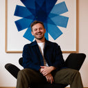
André Fu in a quiet corner of his Central Hong Kong office.
Fresh from the traditional Mid-Autumn holiday last year, we dropped by Fu’s studio to talk about his professional obsession with good design (or more accurately, how that seemingly straightforward concept conveys itself in ways that go beyond the superficial). Meanwhile – in a conversation of unrivalled length and candour – the prodigious Hong Kong designer opens up about the joys of drawing; offers insights into several recent key projects; extols his fondness for the Staatliches Bauhaus; and explains his ongoing friendship with Louis Vuitton.
For readers who might not necessarily be familiar with your work, would you mind telling us a little bit about yourself?
Well, my name is André Fu. I was born in Hong Kong but went abroad to study in England at the age of 14, before pursuing my formal training as an architect at The University of Cambridge.
I guess that professionally I’m best known for my work in the world of interiors, with a strong emphasis on hospitality clients – hotels, restaurants and the like.
Just to stay on your early years for a moment: as a child, was there ever a singularly impactful experience which drew you to architecture?
I’ve always loved drawing. When I was a young boy, I’d sketch mazes constantly: they were popular with my friends actually, who often treated them like very elaborate handmade puzzles. So, the visual aspect has always been there.
When I was around 7 – I remember this vividly – my mother took me to a coffee shop inside a hotel. She sat me down and said, “André, just imagine that when you’re all grown-up, you too could design a space like this. As an architect, you’d create the structure of this hotel, but you could also design what goes inside – down to small details like the lights or the seating”. That conversation has always stuck with me.

Fu adding to design sketches.
If you don’t mind recalling, which hotel was that specifically?
The Furama. The coffee shop was called Café Chater I believe. As you can imagine, that was some years ago. Regrettably, the whole property closed down in 2001, it had a rather iconic revolving restaurant that lifelong Hongkongers will be aware of.
That was before you moved (on a semi-permanent basis) to the UK. Whereabouts in England did you grow up?
Well, for high school I went to St. Paul’s in London, then – as I said earlier – to Cambridge for university shortly thereafter. I majored in arts for my undergraduate and then took a Masters in Architecture.
The Department [of Architecture] there is famously traditional, no? As I understand it there’s an emphasis on theory and the historic underpinnings of the discipline. In your daily practice, do you find some aspects of that training more useful than others?
If I have to be reductive about this, I suppose my tertiary study at Cambridge helped me to cultivate a vocabulary for architecture: so now I’m able to see the discipline’s relationship to everything from a simple piece of stone to whole artistic movements like postmodernism.
Interesting. At university, did you have a favourite artistic movement? Broadly speaking?
I’ve always loved the Bauhaus, but also many of the arts schools that flourished prior to the emergence of postmodernism (so, in earnest, before the 1960s). The entire post-war period holds a lot of excitement for me: the era was defined by novel technology and the conception of buildings intended to serve a new and emerging class of professionals for the first time.
Aesthetic beauty driven by functional concern…
Yes, and then as a compact of that I studied the development of building materials like plastic and fibreglass (the latter being a particular favourite of Bauhaus architects). All of that really changed the way we look at architecture within the context of modern society.
With the advantage of hindsight, I also think spending those formative years in Europe imbued me with a more substantial understanding of where architecture had come from, as a profession and artistic tradition. Our world is overwhelmingly digital and almost everything must be reduced to instant or rapid gratification nowadays. Under such circumstances, it’s difficult to innovate without solid fundamentals – you’re merely reacting to stimulus in the immediate environment. So, if you have a more in-depth appreciation and knowledge of whatever it is you’re creating, that allows you to innovate in a much more precise and confident manner. That’s a reality that those years abroad opened my eyes up to.

A well-stocked bookshelf at Fu’s Hong Kong office.
Despite that conventional training, I think you’d agree most commercial clients (and indeed the public at large) know you best from your work with interiors. Is there a particular reason that, over the course of your career, you’ve gravitated towards the internal rather than external?
Without wanting to make my answer overly theoretical, I think that growing up in Hong Kong – where hotels are plentiful and so often considered ‘aspirational’ meeting places – certainly played a role. You know, if we were celebrating it was always “let’s go to a hotel,” because the level of service that was on offer was so irreconcilably different to what even relatively well-off families would experience at home.
I think that’s still very much the case in 2020. There’s really no shortage of dining/entertainment venues inside many of the city’s best hotels that are themselves a discrete category of ‘destination’...
If I was being sentimental, I’d say a lot of it has to do with childhood. Specifically, the idea that hotels are a setting reserved only for the most special of occasions. Till this day, I love the feeling of discovering a really good luxury hotel – it’s as if you’re being transported to a different world.
There’s certainly a very distinctive feeling that accompanies the best hotel environments – whether that’s The New York EDITION or The Mandarin Oriental here. Everything is just ever so slightly ‘elevated’ from reality.
“Elevated” is a good way to describe it, yes. I’ve always been mesmerised by the aura that certain hotels have and the interesting ways in which that atmosphere (e.g. ambience, customer experience, each space’s physical appearance) imprints onto different people. I suppose that’s why, even as an architect, I’ve always enjoyed the small, humanistic aspects of my work the most.
Like many renowned Chinese modernists – working in art, fashion, architecture – I notice you’re extremely wary of pigeonholing yourself into any one specific style. How do you harmonise that with the expectations of certain commercial clients? Surely, many of them want your ‘fingerprints’ all over the look and feel of a project, as it were?
I will say that, amongst various audiences, people come to my work with a degree of expectation. Clients in Asia (Japan, Greater China and so forth) see me as someone with very formalised European training. They also think that my time spent studying in England has given me a Euro-centric aesthetic. By contrast, most of our European clients see my work as having a strong Asian influence. Personally, I don’t view myself as having an especial affinity for one or the other: my aesthetic is an organic representation of the way in which we choose to live and the modern environments that many of us live in. Oh [laughs] but back to your question!


The tools of Fu’s trade.
Apologies if it seemed a bit obtuse [laughs]…
I’d say I’ve been extremely privileged to work with clients – even just within Hong Kong, St. Regis; Kerry; and The Upper House – who, on balance, are interested in seeing the various ways in which I express myself. Sometimes, that will relate to the specific DNA of a brand I’m working with; other times, the context of the project.
But it varies, right? There are no hard-and-fast rules about how much of a property should embody ‘you’ vs. the client?
It does indeed. And, if anything, I’ve been adamant over the years about navigating people’s expectations – the notion of an ‘expected’ André Fu. That was actually among my strongest impulses for tackling a client like The St. Regis Hong Kong…
Or The Waldorf in Bangkok.
Exactly – The Waldorf Astoria. Obviously, these are classic heritage brands. They have a well-documented legacy in contrast to something like The Upper House: the latter being a very pure, serene project that I had absolute carte blanche on. So, it’s taken a matter of years but I’m now in a position whereby I’m able to articulate the very particular way in which I work and attract clients who accept that.
“Our world is overwhelmingly digital and almost everything must be reduced to instant or rapid gratification nowadays. Under such circumstances, it’s difficult to innovate without solid fundamentals…”
But, and I ask this in the interest of clarity, you’re not protective about the design process?
Oh not at all! Take The Upper House as an example: I could have duplicated the singular approach I took to that site throughout the rest of my career, but to do so would be to neglect the crux of every project: that is, in essence, to do with why the client chose me to work on their hotel. When you particularise the work in this way, the process of doing things a little bit differently every time becomes much more organic.
But why is it important for you to remain (for a lack of a better word) spontaneous rather than developing a very settled visual style?
You know, I actually haven’t given that a lot of thought [laughs]. What I could say I suppose [pauses] is that with each new hotel, we are telling a different ‘story’ and all the bits & pieces that go into building that narrative encourage me (hopefully) to create something that’s truly surprising. So much the better if it makes my professional life feel more varied.
With The Upper House, what story were you trying to tell there exactly? The hotel celebrates its 10th anniversary this year and, when speaking about luxury hospitality in Asia, it’s simply too influential to ignore. Are there any aspects of it that have stayed with you over the last decade?
[Long pause]. I think it’s the all-consuming but highly intangible feeling of comfort…
“Highly intangible”?
By that what I mean is that ‘comfort’ is less of a hard tactile effect and more of an emotional state experienced by the guest. With The Upper House, we also had to factor in the varying expectations that different people had with regard to what’s comfortable: for you [points toward the interviewer’s solaro] ‘comfort’ might be the perfectly worn-in sportcoat; whereas for me, that word means something else entirely.

Fu continues to be sought after by some of the top hospitality companies in the world.
And yet, despite its location in the heart of Queensway [next to the High Court and Pacific Place offices] The Upper House has successfully managed to cultivate this universal reputation, among so many distinct kinds of guests, as being comfortable. Whether it’s the executive set, fashion insiders, or even out-of-towners, the common impression shared by all is of how serene the property is…
Again, having had some time to reflect on the project and physically revisit it over the years, we were able to achieve that impact because it was at the very beginning of my career – there was so little baggage. There was no opportunity to hold it against my previous work and, at the time globally, it was even in a category of its own: an organic, streamlined product that reflected a really specific modern day traveller and their mindset about luxury travel.
In your opinion, did that project help to open the door for you to eventually work on The St. Regis Hong Kong?
Most definitely. In many respects, The Upper House changed my whole career: opportunities as far afield as with Maybourne Group (in London) could be traced back to what was known about my work in Hong Kong. It was a similar idea with St. Regis.
Even before I accepted the brief though, I was conscious of a lot of the challenges of diving back into Hong Kong: for one, The St. Regis was actually the fourth property I’d worked on locally. You never want the project you’re currently doing to ‘compete’ with existing work; and in order to avoid that you need to be conscious at all times of differentiating now from what has come earlier.
From a design perspective, what was it that you found most intriguing about working with the brand?
The element of surprise. I don’t wish to sound cliché but after you’ve been in this business for a while, a desire grows to tackle projects that are unexpected – a little bit outside of one’s comfort zone. The St. Regis embodied that challenge and sense of bewilderment for me.

A varied bookshelf in Fu’s office.
Let’s switch things up a little and talk about where we’re sitting now – your office in Central. What drew you to set up [your firm] AFSO here in the first place?
Actually, we moved to this new studio (on On Lan Street) only about a year ago – we’d previously been headquartered on Duddell’s. I’ve always liked the atmosphere on On Lan. Our office is right in the thick of everything but also has a kind of tucked-away, clandestine feeling – there’s a great balance of connection versus disconnection. With regard to the space itself, our office also has an extremely high ceiling (especially when compared with the rest of Central). That’s because the building we work in isn’t even really office space – it’s mostly dining and entertainment. In addition, at ground level we’re surrounded by a mixture of very interesting fashion and lifestyle concepts. That helped to bring a certain flavour to our location and align us more with hospitality clients.
Do you have a favourite nook in the office? Some corner that’s particularly appealing to you and the team?
Point in fact, there are a few discrete spots scattered throughout the office that allow for group discussions. We actually had a low onyx table [gestures towards the office entrance] installed in what would usually be the reception area; and that’s become a favoured spot to take ad hoc meetings or meet our suppliers.
We even had a high stone table put in near the pantry, so that whenever we’re pulling material samples we have a handy spot to chat, review or make changes over lunch.
Did those working surfaces come out of your own range of homewares and lifestyle goods?
Oh, no. We had them purpose-built for this office.


For Fu, comfort is far more than a soft seat or the right temperature.
One aspect of your practice that I’m sure watch lovers will identify with is how you bring together disparate aspects of craftsmanship. Are there any examples of that from your recent projects?
In terms of what we’re currently working on, we’re actually just about to complete a project in Kyoto this month.
I gather this is The Mitsui to which you’re referring?
That’s the one. So in the case of that project, we worked with a variety of traditional Japanese artisans (appropriate, because of Kyoto’s history as the imperial capital) one standout of which was a producer of kimono fabrics called Jotaro Saito. Traditionally, Jotaro-san’s specialty is in worn fabrics, but we had the idea to create a bespoke textile to go on the headboards in The Mitsui’s guestrooms. That process required us to visit his workshop, inspect all of the mills which might be involved in production then also figure out how we were going to apply traditional brushwork patterns to the fabric. For me, one of the more eye-opening aspects of working with Jotaro-san (and something that I’m sure your readers will appreciate) is how we managed to take a very ancient craft and use it to create something that was entirely outside the traditional cultural expectations of said craft.
The Mitsui isn’t the first time you’ve displayed such natural rigour though, is it? Around the time work on The St. Regis Hong Kong began, there was a rumour around town that you personally went through something like 100 different bathroom tiling samples…
Oh, yes yes [laughs]. The infamous purple marble. In all honesty, I have to say that much of that was conjectural. Public areas notwithstanding, there were 120 rooms in the hotel – that meant that we had 120 bathroom walls to spec. So, it would be quite mad for me to work on all of those on my own. But, as part of the entire project, in total I do think we looked at over a hundred marble samples: in factories, warehouses, both on their own and pre-laid. Actually, it’s extremely important to see these kinds of materials side-by-side, because that enabled us to narrow down which had the perfect balance of white against purple graining.

Fu has managed to position himself in the heart of hospitality in Hong Kong.
Again, based on today’s conversation, I’m going to assume there wasn't a fixed formula for determining what samples were the most desirable?
Well, there were certainly several criteria to fulfil: characteristics such as the purity of the grains; and the presence of colour ‘inconsistencies’. But the main goal was basically to strike the right balance between a very soothing shade of white and purple grains that had a real richness of colour without being too forceful. So more of a balancing act, really.
We’ve already vaguely alluded to the next question, though I think it’s worth exploring more deeply. There has traditionally always been enormous pressure on Asian creatives (working in a spectrum of disciplines) to infuse their work with an element of ‘East Meets West’. In your experience, is that a meaningful expectation for clients to have when you’re working on a hotel or hospitality venue for them?
I should stress that [long pause] I’ve never thought of myself primarily as an ‘Asian’ architect. So, for that reason I try to avoid the concept of ‘East Meets West’ insofar as I’m able. In fact, I published a book with architecture writer & critic Catherine Shaw earlier this year that touches on this topic – Crossing Cultures with Design. The concept behind it (and indeed, the title) was to write a book that explained each of my previous projects, my inspirations, and importantly, the underlying rationale behind how I approach design: as opposed to yet another coffee table tome that’s just a catalogue of images.
In any case, when I’m working on a project – whether it’s in Monaco, LA, Beijing, or Tokyo – I find it much more useful to tailor my approach to the specific place that I’m in. Given the breadth of projects we’re working on at any moment, it simply just isn’t possible to be an expert in the culture of all those various places. The more interesting dynamic is in expressing my own lens on each city.
“After you’ve been in this business for a while, a desire grows to tackle projects that are unexpected – a little bit outside of one’s comfort zone…”
So rather than arbitrarily inserting references to Eastern or Western culture, you’d say it’s more important to design with a mind towards the specific context of each project?
Yes, I’d say that’s extremely important – and context can take many forms. It could be the heritage of the brand; site-specific attributes; the culture of the surrounding city; the geography.
If anything, rather than incorporating a set of fixed cultural motifs, the make-or-break quality of an André Fuproject is whether it has that element of ‘relaxed luxury’ we mentioned whilst talking about The Upper House.
Let’s move away from hospitality design to talk about another of your passions – objects. ACM is, after all, a platform for rare and exceptional timepieces: very much, things that you experience in your hand. Was your own homewares brand an organic extension of the work being done in your design practice?
I think a good deal of consumers would see it as a natural progression. As part of my spatial work, we were already creating quite a few bespoke items: things like furniture, lighting fixtures, so on and so forth. The André Fu Living brand is about 18 months old, I have to say, the work has been incredibly frustrating at times, because unlike spatial design, the development of each of our products is a self-contained exercise. So, it’s actually the reverse of what I’m used to. When you’re designing hotels, you invariably begin with the architecture – you look first at the sort of layout the overlying structure can accommodate. Typically, the objects are actually the last thing to be addressed. That conceptual reversal can often be very interesting however: for instance, it’s only when you see all the various product prototypes simultaneously (e.g. the bedding, sculptures, furniture) that you get a sense of whether everything meshes coherently.


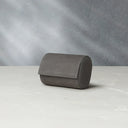
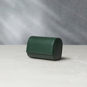
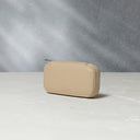
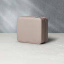
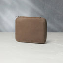
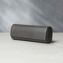
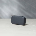
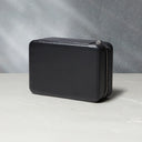
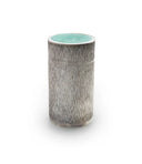
A few of the objects that Fu has designed for his recently launched homewares brand.
That seems to be an inversion of the traditional approach you take when building out a single room or space...
Actually, this year has been a particularly rewarding time to work on the homewares because, despite travel restrictions, they’re still capable of transportation. That’s in stark contrast to the rest of my practice: the kind of spatial work we’re doing on hotel and restaurant fitouts requires us to physically be on-site. Also, the homewares are aimed at improving one’s quality of domestic life and with everything going on at the moment (and the amount of time people are spending at home) that has made what we’re designing feel rather timely.
And how did the ‘Objets Nomades’ collection happen? Did Louis Vuitton approach you about that directly?
Again, that partnership arose fairly naturally. I’d originally worked with the Maison on a Hong Kong-themed city guide a few years back as a ‘guest editor’. But it just so happened that around the same time, Nicolas Ghesquière was appointed as Creative Director. The brand was trying to do something to engage their customers, so they enlisted me to work on a concept called L’Appartement – a month-long pop-up space that we actually created bespoke furniture for, and a setting in which to properly experience Ghesquière’s womenswear.
Right, and it was out of the reception to L’Appartement that the opportunity to work on Objets Nomades presented itself?
Yes. Rather amusingly, it was the Paris office of Louis Vuitton who approached me with the opportunity – the team in Hong Kong were not made aware until shortly before the pieces I’d designed were set to be exhibited (that was back in 2018 at the Pedder Building).
Something of a shock for the Maison’s staff in Hong Kong [laughs] one presumes.
Yes, but luckily it all came together extremely well in the end.
“This year has been a particularly rewarding time to work on the homewares because, despite travel restrictions, they’re still capable of transportation…”
Circling back to all things spatial now, you’ve previously said that you have enjoyed drawing since you were a child. At AFSO, the design process famously begins with hand-sketches of each of your concepts. Walk us through the technical side of that.
Alright, for the spatial part of my practice (what I often refer to as “work work”) my approach is a little reminiscent of photography. But whereas a photographer scouts for locations, I visit a site – sometimes there aren’t even any structures built – and start to visualise all the ways in which the project might take shape: I look at the elevation; the shape and form of the buildings (if there are any); and the kind of experience the guest is going to have stepping onto the premises. In the case of a very large space, it’s best to dissect it into sections – that’s typically the goal of our first layout. With that in mind, I’m then able to draw what’s known as a ‘sketch perspective’. I draw these freehand: they’re not constructed with accurate dimensions and I’m certainly not the only person who can do them, but I’ve now had sufficient practice that I can look at a layout plan and in the course of several hours create a three-dimensional drawing from it.
This is perhaps an elementary question, but what sort of stationary do you usually favour when drawing a sketch perspective?
Just a pencil.

The genesis of all Fu’s work, a simple pencil drawing.
À la John Wick...
Plus a rubber and sometimes even a ruler – just to help guide the lines. We did have our own graphite pencils made for the office, but I’m not generally fussy about having any specific grip, shape or anything like that.
Just before we wrap, can we get your predictions about how the hospitality design industry is going to evolve over the next few years?
Gosh, that’s another potentially book-length answer [laughs]. To be honest, I think the industry is evolving even as we speak – as with many creative fields the trends are increasingly ephemeral. Lately, I’ve been thinking a lot about how to harmonise the concept of ‘staycations’ with destination travel. Going forward, that’s an interesting dichotomy that luxury hoteliers (and their designers) will have to grapple with. Because, when you stop to think about it, hotels are often a window to the city you’re visiting. So, for instance, when I travel to a place like Marrakesh, I want my hotel to embrace the Arab, Andalusian and French colonial influences that are a hallmark of that city.
At the same time, if you think about the state of most ‘global cities’ (i.e. Hong Kong) right now, the goal of staying at a hotel over the weekend is probably to escape the trappings of daily life – to feel as if you’ve travelled.
There’s that term ‘urban resort’ that marketers are so fond of using…
Again, this is a very roundabout way of saying that for designers of these kinds of hotels, the importance of creating unique experiences has never been greater. The product needs to serve multiple clienteles that are distinct from one another: global travellers for whom it’s a destination and then locals who conceive of it more as an escape valve.
And do you think (to be combative for a moment) that it’s possible to serve both niches simultaneously?
I think so. I certainly try to.

Many thanks to André for sharing his experiences working in the design and architectural mediums. As ever, we would also like to credit Amanda Kho for her sharp images, interspersed throughout this story.


