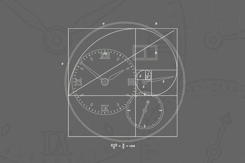
Has minimalism in watch design gone too far?
By Raj Aditya Chaudhuri
Much has been written about the over-the-top ornamentation or complexity usually associated with traditional watchmaking. A quick search of terms such as guilloché, anglage or Zaratsu polishing will prove just how closely watchmaking is linked to such adornment. However, for almost 100 years, there has existed a small subset of watch designers and brands that have opted for a more pared-back aesthetic. To some, this is the road to clarity of visual language, while others in recent times have taken to this philosophy almost in opposition to the established standards in watchmaking and the premium it places on decoration and complexity. The aesthetic is often dismissively referred to as minimalistic.
Anyone who is familiar with brands such as Nomos, Ressence, Ochs und Junior or H. Moser & Cie. will agree that clubbing these disparate design philosophies under the often-abused blanket term of ‘minimalism’ does the watchmakers a disservice. Then there is the term ‘minimalism’ itself. It probably goes without saying, as is the case with any such term that becomes a part of our everyday lexicon, it has become far removed from the 1960s’ artistic movement it shares its name with. So what then is minimalism when it comes to watch design? Is it simply marked by an absence of design elements rather than the presence of key defining characteristics? Moreover, is there a line beyond which minimal design risks going too far? That is if we agree that the line, for the sake of this discussion, is performing the very basic functions of a watch by informing or engaging visually.

The Nomos Tangente, Ochs und Junior Settimana Classic White and Ressence Type 1 Slim all represent very different visions of minimalist watch design, images courtesy of Nomos and Ochs und Junior.
To answer this basic question, we must examine the schools of design most closely aligned to minimal watchmaking. By exploring the history of the aesthetic and by speaking with current practitioners, we aim to better understand this overused and under-appreciated term in modern watchmaking. For balance, we also speak with a founder of a watch brand that champions an aesthetic that is decidedly the opposite: maximal design, if you will. Instead of cataloguing every minimal watch design ever, we think it a more fruitful exercise to use watches that have defined the minimal aesthetic of an era, and to study the thought behind them.
Defining Minimalism
To understand what minimalism means in the context of watchmaking, it is helpful to start off by defining that which it absolutely does not refer to. This is an essential starting point, when the term often associated with a pared-back design in watchmaking has very real meaning in the art world. “Today minimalism in design is a modern lifestyle buzzword. It is used to refer to any reduction of a thing to its essential structure,” says Todd Levin, a veteran art advisor whose collection includes pieces from independent makers such as Philippe Dufour and George Daniels.
While it is understandable why this became the case, it is not entirely clear when this practice started. What we can say for certain is that minimalism refers to a very specific era in the art world that started in the United States in the early 1960s. “It is based on simple geometric forms – mostly the square and rectangle,” says Levin. “The conceptual idea was that art should have its own reality, it shouldn’t imitate something else, like an image of a landscape, still life, or a portrait would. Minimalists wanted their objects, as they referred to them, to only be of their own reality and not reflect or refer to something else. Therefore, it serves no practical purpose. The whole purpose is to illustrate a conceptual idea.”


Frank Stellas Harran ii, with its use of overlapping geometric shapes and colours, is in many ways the quintessential minimalistic work. Tony Smiths Cigarette is another example of the total originality of content and form that was core to minimalism, images courtesy of The Guggenheim Museums and Foundation and Public Delivery.
This alone makes the term minimalism ill-suited to anything to do with watchmaking. “Watches are not abstract art forms because, fundamentally, they are functional – they tell the time. Watches, unlike minimalist artwork, are supposed to refer to some other thing, namely, this abstract concept of time, and they’re supposed to mark that abstract time. So, minimalism in the fine art world and horology seem to be polar opposites in that sense,” Levin explains.
In fact, the aesthetic of the first minimalist watch designs was heavily inspired by a visual language born from the coming together of the world of craft and industry. The Deutscher Werkbund, founded in 1907 in Munich, was a think-tank that united artists, architects, and craftspeople with those who owned the means of large-scale production with a view to make Germany a powerhouse of design and manufacturing. The Werkbund still meets to this day.
This congress brought about a unique aesthetic marked by clean, standardised design, be it in the production of furniture or architectural materials. Ornamentation, unsuited to mechanical mass production, was eschewed. Among its many influences, The Werkbund is credited with inspiring Walter Gropius, a German-American architect, to set up the Staatliches Bauhaus school of design, art, and architecture in 1919. It aimed to codify and educate the next generation in this uniquely German design language.
The Bauhaus chapter

Breaking down the constituent visual elements of early Bauhaus-inspired watch designs shows just how few of them made it on to the dials.
While the Werkbund was disbanded and later revived after WWII (the Bauhaus was shut down for good in 1933, a victim of the rising tide of Nazism in Germany), the pieces that cemented the design movement’s legacy in watchmaking would come a few years later. In 1937, A. Lange & Söhne became one of the earliest adopters of the Bauhaus aesthetic. The brand placed an order with Weber & Baral, a major Pforzheim-based manufacturer of watch dials at the time. The case that was paired with this dial was minimal, with almost no bezel, allowing the functionality of the watch to become its dominant feature. The paucity of visual elements only amplified the effect of the ones that did make it onto the dial, greatly aiding the business of reading the time.


Weber & Baral, the erstwhile dial maker from Germany, offered a wide catalogue inspired by the Bauhaus aesthetic. Brands such as A. Lange & Söhne and Stowa were early adopters of this design and both brands sourced dials from Weber & Baral, courtesy of Stowa.
That same year, Stowa, another German watchmaker, ordered a dial very much from the same design family, also from Weber & Baral. They soon followed it up with a more substantial order for a range of dials with a similarly minimal layout in a variety of dimensions and colours. However, it wasn’t just the Germans who were taken with the aesthetic. Several pieces from Swiss houses, including Longines references such as 4734 and 22097, were quite plainly of this design lineage.

The A. Lange and Söhne that is believed to be one of the first watches to feature an aesthetic inspired by Bauhaus designs of the era, courtesy of Stowa.
Decades later, this aesthetic would inspire a whole new brand in Glashütte, not long after the fall of the Berlin Wall in 1989. To Judith Borowski, chief business officer at Nomos, the aesthetic reflected a hopefulness. “There were and are many things of which we Germans are anything but proud,” she says. “There was and is a lot of ugliness in the country. The Bauhaus, however, was different – free-spirited, open-minded, creative yet modest, and obsessed with quality to the point. For many, including me, the Bauhaus is in a friendly way the ‘better Germany’. This attitude is also expressed in our design.”
An American take on minimal design

Horwitts “museum watch” design straddled the worlds of art and watchmaking. Although when he first conceived of it, very few watch brands thought it was suited to accurately measuring the passage of time.
While the aesthetic in Europe was clearly Germanic, with an emphasis on the function of accurately telling the time, a very different take on minimal watchmaking was taking shape across the Atlantic. In 1947 Nathan George Horwitt, an American industrial designer, created his interpretation of the design movement of the day when he sketched the layout that is now synonymous with Movado. His design, completely devoid of any hour or minute markers, took the minimal aesthetic right to its limits. The dial, pitch black, had an almost enamel-like quality to it. It wore a silver dot at 12 o’ clock, the only overt design element on the watch face, which symbolised the sun at high noon. The hands were long and thin, not unlike the ones on Bauhaus-inspired watches coming out of Europe.
While the design is today viewed as a milestone, straddling the worlds of horology and art, not many brands Horwitt presented it to at the time considered it suited to watchmaking. While Zenith Movado is believed to have produced the first watches inspired by his designs, initially it was not with the designer’s permission. This even resulted in a lawsuit that the two parties finally settled in 1975. However, it was only in 1959 that Horwitt was finally able to commission Vacheron & Constantin-LeCoultre, the American entity that was set up to import the two Swiss brands’ watches into the country, to produce three examples of his design. Horwitt kept one for himself, while the other two went to two museums in New York – the Brooklyn Museum and the Museum of Modern Art. This earned the watch design its “Museum Watch” moniker, which stuck.


Only three examples of Horwitts art-inspired take on the watch dial were produced by Vacheron & Constantin-Le Coultre. Two reside in museums in New York City while the industrial designer kept the third one for himself, courtesy of A Blog to Watch.
It will be unsurprising at this point in the article that the next major update to minimalist design also came from outside the watchmaking community. Max Bill, a student of the Staatliches Bauhaus, was a multi-disciplinary artist, architect, graphic designer, and educator with a well-developed philosophy.
“Functional design considers the visual aspect, that is, the beauty of an object as a component of its function, but not one that overwhelms its other primary functions.”

What started off with a kitchen clock went on to spawn a whole line, named after Bill, courtesy of Junghans.
It was his coming together with German watchmaker Junghans that gave us the distinctive Max Bill dial aesthetic. It started with a teardrop-shaped kitchen clock, the Küchenuhr. Featuring a big, easy-to-read clock, the design also incorporated a small timer in an entirely logical and efficient manner. The piece employed all of Bill’s design sensibilities, whether in terms of its use of clear, unadorned lines, or its use of typography. The dial’s layout remains practically unchanged today in Junghan’s line named after Bill.
Rethinking less is more
While the subtraction of elements had remained the mantra of followers of the Bauhaus school, another industrial designer in Germany was re-evaluating the philosophy. Dieter Rams, design director of consumer products brand Braun, is best remembered for his mantra “less but better”, and for the plethora of products that resulted from this philosophy during his four decades at Braun. He shared this vision with the owner of the company, Erwin Braun, who recognised the need to make products that made sense to a wide variety of customers, no matter their backgrounds or design sensibilities. The result was a family of neutral, modular designs that fitted into any space.
Each product sketch started from the same monochrome palette, with colour applied sparingly and strategically to aid useability. This principle was applied to every product, from radio sets and shavers to record players and timepieces.
Braun’s AW10 and AW50 wristwatches, first released in 1989 and 1991 respectively and reissued in 2017, are perfect examples of the longevity of this kind of design. It was the judicious use of design elements that made those pieces anything but simple. Levin explains the difference, saying, “It’s not the same as simplifying, because to say something is simple, to me, carries a pejorative connotation. Something minimal should still be very rich and fulfilling as an object and as an experience.”

A vintage advertisement of the Must de Cartier sub-brand whose offering included cufflinks, pens, lighters and perfume. Watches were only added in 1977, courtesy of Cartier.
Since then, several brands have dabbled with a similarly minimal aesthetic. A notable effort was the Must de Cartier line. Launched in 1973, under the leadership of Alain-Dominique Perrin, it initially featured pens and lighters with a line of watches added in 1977. Almost identical in profile to the Tank Louis, a design that has endured since it was first released in 1917, the cases were made from silver, plated with gold, with most versions powered by quartz movements. Priced significantly lower than the Tank Louis, it appeared to be a calculated move to attract a new, younger clientele to Cartier.

While the Must de Cartier watches featured several dial variations, the ones without any hour or minute markers, in a rainbow of shades, came to mark the line. The brand recently reissued the Must De Cartier line after a number of years, images courtesy of Time & Tide and Revolution.
While the dials were available in a few different styles, the ones most relevant to this discussion (and the ones that came to define the Tank Must line) were notably devoid of many design flourishes of the Tank Louis. Available in an array of rich hues including burgundy, navy, eggshell white, and black, they not only lost the Roman numerals – they did not feature any of the elements that aided accurate time-reading. To Benoît Mintiens, founder of Ressence, it was reflective of an era where the Swiss watch had to totally rethink what it stood for. “The Quartz Crisis unleashed creativity. There were some watchmakers who said, ‘Quartz has released us from the pursuit of precision. We can finally make art; we can finally have craftsmanship,’” he says.
The language of simplicity

Ochslin’s endeavours to give the day and date complication of a watch as much visual importance as the time led him to devise a language which conveyed information through coloured dots.
It could be argued that minimalist design, taken to extremes, is antithetical to a discipline geared towards accurately measuring the passage of time. This is especially tricky if the design is to incorporate complications – or so we have been led to believe. Ludwig Oechslin (a master watchmaker known for his minimal works at Ochs und Junior, as well as the watch he designed to raise funds for the Musée International d’Horlogerie – MIH – when he served as its conservator) thinks not. The restrained aesthetic of the MIH watch belied a host of complications, including a monopusher chronograph as well as a annual calendar with a day/night display. All this was on a watch face with the spartan layout of a Swiss railway clock.

The MIH watch's minimalist dial-side appearance belied a host of complications including a chronograph, annual calendar and day/night display.
Next to the large annual calendar display were two hollow pips that are the day/night indicator. One red pip indicated AM, while two red pips meant it was after noon. “It followed my aim – better readability,” Oechslin says. It was this pursuit for date readability that got him looking into the science of optics governed by the Snellen chart, the one ophthalmologists use to gauge eyesight. “I wanted to know how large a number should be to make it as readable as the hour and minute hands,” he says. “It turns out it needs to be two-thirds of the dial … I realised that this was not possible to achieve with numbers. I need an analogue solution, and that’s how I came up with the dots.”


The 30-minute chronograph register, set in motion by a monopusher, was moved to the caseback so the wearer would turn the watch over and use it like a stopwatch on the rare occasion that function was called for. The annual calendar display, operated using the crown, was made as readable as possible.
Anyone familiar with the visual language Oechslin has constructed at Ochs und Junior will know what he is talking about. “I decided to go with a circle of dots. But how [could] I make it readable?” he says. “The obvious solution is by the angle between the dots and the centre. But you have to use the familiar division by 60. Even without markers and only the hands, a dial is easily readable through familiarity. For the date, I have to work with 30, half of 60, so the location of the dot tells me the date.”
“I never talk of design solutions. A watch needs to be functional and readable, and that from this internal logic follows a design which is readable, obviously. That construction behind it then leads to a result that is just as obvious.”

The desire to make the date as readable as the time led Oechslin to devise the language of dots. Counting the dots told the wearer the date, day of the week as well as the month of the year, courtesy of Ochs und Junior.
At Ressence, Mintiens’ pursuit of easing the business of time-reading has also led him to a minimal place. While a watchmaker would typically begin with a movement and then design the watch around it, Mintiens, an industrial designer, started with what he calls the “skin” of the watch – the part the wearer actually interacts with.

This was simply achieved by a rotating date disk that did not feature any numbers at all, courtesy of Ochs und Junior.
To him, the function of reading the time on a traditional watch is made harder with the three-dimensional layout. “It has its basis in ergonomics,” says Mintiens. “Information is easier to read when it is two-dimensional, along one plane, rather than three-dimensional.
“It is a simple fact that as we have two eyes, when an object is close to us – as a watch would be to a wearer – your left and right eye do not see the same information if you have a three-dimensional projection of time on your wrist. The date, the seconds, minutes, hours are layered on top of one another, and your two eyes don’t see the same information. That stereo image is projected into your brain that then turns it into a mono image, so you can understand and orientate yourself in the dimension of time.” All of this presented room for improvement.

While reimaging the layout of the watch face, Mintien decided to keep some things the same making the act of reading the time as familiar as possible for a first-time user, as seen here on the Type 8. Courtesy of Ressence.
The solution was to represent time on a flat surface. “The difference is the same as reading a passage printed on a piece of paper as opposed to on a screen – you can read the printed letter on paper much faster,” says Mintiens. “One of the reasons is that your left and right eye see the same thing when things are on one plane. There are no layers or viewing angles to contend with and so it is more efficient.”
This kind of flattening represented the kind of ergonomic minimalism that was truly innovative, according to Mintiens. Form following function, it turns out, is key to good minimal design.
Minimal thinking
vs
THINKING MINIMALIST
In answering the question about whether minimalism in watch design has gone too far, another useful crucial parameter is to distinguish between thoughtful design and a lack of thought. This is essential, since in watchmaking – as with any discipline so reliant on visual appeal – the latter often masquerades as the former. This is usually the case if the approach is ‘design first’ and one not grounded in function.
Mintiens suggests that the end result, more often than not, is an aesthetic predictably devoid of functionality as well as joy. Levin agrees: “If a design is boring, sterile, simple, that is not minimalist design. It should be a rich, rewarding, lively experience.”
It stands to reason that while bad design can be seen as commonplace, true examples of minimalist designs are hard to come by in watchmaking today. Mintiens thinks this is because it requires a more considered approach than is required to create a pale imitation, or something that is busy and complex-looking.
A superficial approach cannot yield innovative designs. “It’s like changing the colour [on a dial]. First blue is in fashion, then it becomes boring and you go for green. It’s like colour combinations that help you sell something. Combining parts seems similar to me. Perhaps you put a little dial there on the top left, perhaps with different markers … it seems a bit far-fetched, wanting to achieve something original in that way,” Oechslin says. This perceived lack of innovation is not a new thing, and some of the most innovative watchmakers have long warned the industry about it.
“It is usually the case that when a watchmaker cannot make a technical advance, he will divert himself by decorating his work.”
If functionality is one of the goals of efficient and good design, bringing joy to the wearer is arguably another equally important one. After all, no one needs to wear a wristwatch anymore. “If you can think of all the fuss, the noise, people sometimes add to give an impression of value to a watch, if you can take that off without resorting to an austere, boring, dry design, then you’ve done a good job,” says Mintiens. “A watch should also make you smile when you look at it.”
Complexity is entirely the wrong way to go about achieving this, he adds. “It’s not very luxurious to have a complex product, certainly not something like a watch that you need to use on a daily basis. So, if every time it is a complex process to read the time or set the watch, it’s not a comfortable experience.”


The Endeavour Tourbillon is unmistakably an H. Moser & Cie., despite not bearing any brand markings on the dial.
H. Moser & Cie. is a brand whose approach to minimal design almost seems like a rebuke of the industry’s maximal preferences. Edouard Meylan, chief executive officer and owner of the brand, told us: “Minimalism is more than an aesthetic – it is a philosophy, an art of living. For H. Moser & Cie., minimalism has become a signature. Our Concept watches, without logo and without indices, speak by themselves.”
In his view, purposeful design is key to recall – a much-vaunted pursuit of all watch brands. This is as true of the Tank Must as it is of H. Moser & Cie.’s designs. “We wanted to let our products speak by themselves, reminding us that true luxury products are immediately recognisable even without any logo. We also wanted to put the products back under the spotlight, to get back to the essence of watchmaking, when the watches did not wear any logo,” Meylan says.

The chimes and hammers that constitute the complication of the Endeavour Minute Repeater, are put on show around the 10 oclock position, with the flying tourbillon at 6 oclock. The sunburst dial is sparse, featuring no brand marque or indices, courtesy of H. Moser & Cie.
He agrees with Levin that busy design can often be a distraction. “In everything we do, we try to focus on the function to enhance the beauty of the complication, keeping it very simple. It is what we call ‘complexity made simple’,” says Meylan. He cites the example of the brand’s Endeavour Concept Minute Repeater Tourbillon, where nothing takes away from the watch’s two main attractions: the minute repeater and the flying tourbillon.

Against a dark background, the Streamliner Chronograph “Blacker than Black”, coated in Vantablack, disappears from view, with only the time-telling parts of the dial – the hands – still in view, courtesy of H. Moser & Cie.
The brand’s Swiss Alp Watch Concept Black followed in the footsteps of the Haldimann H9 by featuring no watch hands at all – a tourbillon was the only visual element to the face, and time was told through the chimes of the minute repeater. This year H. Moser & Cie. inverted this experiment, imagining what it would be like if the hands were all that were visible on a watch. The result is the Streamliner Chronograph “Blacker Than Black” concept watch. On a basic level, it is a Streamliner Chronograph, a watch that Melyan says is a “chronograph that also tells the time”. It is coated in Vantablack, a material that absorbs more than 99% of light that hits it. The result is that the “Blacker Than Black” simply disappears from view. All you have left on the watch face are the hour, minute, second and chronograph hands.
While the watch is just a conceptual experiment, since Vantablack is too delicate a material to handle, it shows where research aimed at making design more efficient and minimal could lead us in the future. It is a literal interpretation of the Bauhaus principle that an object should not overshadow its purpose. This should always be the case with watch design, says Judith Borowski. “After all, we want to be able to look at a watch a thousand times over … The watch should be subordinate to its wearer,” she says.
The case against minimalism
There is also a view that minimalism has been taken to a point beyond functionality. After all, there are several examples, including the Movado Museum Watch as well as the Must de Cartier, that are more pieces of art than functional tools. While fully accepting the fact that watch design often serves as a canvas to showcase craft, creativity, or flair, Mintiens thinks the main essence of a timepiece often risks taking a backseat. “The business had forgotten about functionality since the Quartz Crisis. Prior to that, if you dig a little into the history of watchmaking, you will notice that the brands that are today the big players in the market today, they were not selling on price then, as they are now. They weren’t marketing machines,” he says.

Mintiens thinks straying too far from the key purpose of a watch, which is time-telling, risks them becoming ornamental. This, he fears might also lead to a lack of functional innovation in the industry, courtesy of Hodinkee.
This is reflected in watches being sold on the level of timekeeping precision, having the longest power reserve or other such functional achievements, Mintiens adds. “However, the Quartz Crisis came and all these benefits were overruled by a technology that was far cheaper, more accurate, and had better longevity than mechanical movements – which meant the relevance of their existence was gone,” he says.
In both minimal and maximal design, Mintiens also thinks little mind is given to designing the interaction between the watch and the wearer anymore. “The proof is there,” he says. “Many watchmakers are still selling watches that were designed 50 years ago … It is a sign that product isn’t the key thing any more … You see it in the lack of product development. There is nothing new, no innovation.”
Maximilian Büsser of MB&F says that while he appreciates the visual purity that can come from reducing an object to its elemental parts, there is a place for maximal designs as well. “Each culture breeds a counterculture. And both need to exist,” he tells us. Both schools need to avoid the pitfalls of what Büsser refers to as “vanilla ice cream” design. “Watch design, like any artistic domain, should be about a creator’s point of view,” he says. “And that point of view should be strong … If we are to create emotions, we need a strong attitude. Minimalism can be considered one of these attitudes.”


HM6 Space Pirate presents an alternate vision of watchmaking. Büsser thinks the industry needs minimalism as well as maximalism, with both approaches expressed through a strong design vision, courtesy of MB&F.
Büsser holds up examples such as MB&F’s HM4 Thunderbolt and HM6 Space Pirate as pieces of kinetic art he is particularly proud of. They are both examples of what can be achieved when visual minimalism takes a backseat. “Both are extreme in many ways, not least in their 3D perspective and detailing,” he says. “Most people will never dare wear one, but the same individuals will have to admit that when holding them in their hands they are incredible sculptures, coherent from all angles and in all detailing.”
The verdict
Based on our discussion, we can conclude that there is definitely something to be said for pursuing a design ethos that makes life easier. This is usually born of a clear-eyed design approach built around the basic functionality of the watch. The truest expressions of this approach are anything but bland or lacking in useability. Its deployment, whether in the pursuit of devising an easier way to read the time or an elegant solution to incorporating a complication, is as much an expression of creativity and skill as any. The rarity of such efficient design thought, much like a scarcity of high-quality materials or something produced in limited quantities, makes it a veritable luxury.
Not reflecting the popular aesthetic of the era, nor beholden to a specific design heritage, has meant that minimal designs are better positioned to stand the test of time. It is also indicative of the progression watchmaking has gone through: a design philosophy that was built out of a desire for unadorned functionality is now often a mark of luxury, unencumbered by the pursuit of functionality. While it isn’t the prevailing aesthetic by any stretch of the imagination, the fact that it is often viewed as a disruptive force within the industry can only be a good thing.
Our thanks to Todd Levin, Benoît Mintiens, Edouard Meylan and Maximilian Büsser for sharing their views and knowledge on design and watchmaking and helping make this article possible.


