Our Favourite Uses of Typography in Watches
Good typography should be almost unnoticeable. Blending seamlessly into the rest of the design, it should tell you everything you need to know, without you being aware of it. Despite the many restrictions that are applied to dial layout, the creativity that can be seen in typography across horology is quite staggering. To put it simply, typography is the art and technique of arranging type to make written language legible and appealing when displayed. As the dial is the main point of interaction with a watch, it is arguably one of its most important parts, and certainly one that can produce the most emotion. This is why typeface can play such a vital, yet subtle, role in how we experience and feel about a certain piece.

An original typeface that aimed to capture the sprit of a specific model, courtesy of Hermès.
Typography is a space where different dynamics collide and come at play. The iconic Breguet numerals can take many different forms and connotations, depending on when they’re used and by whom. Some other designs – such as the omnipresent “flat top 4” – were born out of practical necessity and production constraints. It’s also clear that when some manufacturers dedicate themselves to creating their own font, the impact can be significant. With such a rich history to draw on, we thought we would look back at what we consider some of the core principles and themes behind effective typography, as well as list some of our favourite examples in the process.
Typography Can Evolve Over Time
A certain typographic-element can evolve over time. It can change its style, be used by different watchmakers and brands, and ultimately adopt different connotations. A prime example of this can be found with Breguet numerals, which have evolved in a rather interesting way over their history. Originally styled prior to the French Revolution by Abraham-Louis Breguet, it is said that they were formalised by the watchmaker in 1790. The watchmaker only ever deployed the design on his enamel dials, distinguishing them from the engine-turned, metal dials that he also produced. This tradition has been carried on by the brand which carries his name today, as you will only find these stylised Arabic numerals on enamel dials.


Breguet No. 92, an enamel dial perpetual calendar, courtesy of Breguet.
Of course, Breguet numerals have become ubiquitous in watchmaking since their first appearance centuries ago. One brand that has deployed them to great effect over the years is Patek Philippe. Like Breguet, they only ever used these stylised Arabic numerals for special models, setting them apart from their standard production. Whilst Breguet chose to paint his numerals, Patek Philippe often adopted a more visually striking approach, in the form of applied Breguet numerals. These can be found across a few of their vintage pieces, from the time-only Calatravas to their more complicated chronographs.

The highly stylised applied Breguet numerals adopted by Patek Philippe, here on a ref. 1463, courtesy of Phillips.
Lee Yuen-Rapati, a typeface designer who has created bespoke typefaces for several watch brands, argues that Breguet numerals are far more artistic than other equivalents. “Because these were originally painted,” Yuen-Rapati explains, “they contain far too many inconsistencies to be considered a true typeface, in my opinion.” However, it could be this lack of uniformity that has attracted us to this embellished script. It’s because these numerals evolved from hand-painted ones that they remain so characterful today. They were painted, then printed, then carved out of metal, giving them a unique design, which can only result from multiple iterations and evolution over time.

The use of both applied and printed Breguet numerals paired with the more uniform typeface of the modern Patek Philippe signature, courtesy of Phillips.
“This lettering has also become more attractive over the years thanks to the watches that it’s been put on,” points out Yuen-Rapati. Indeed, because Breguet numerals have become associated with rare pieces from the golden age of Patek Philippe in the ‘40s and ‘50s, there’s no doubt that they have become all the more appreciated as a result. Even Patek Philippe themselves gave them a further twist, when they imbed them with Art Deco aesthetics as part of their early watches created for Gondolo & Labouriau. Later in the 20th century, it is telling that certain collectors who prized the history of the manufacture chose to have custom pieces created with Breguet numerals, as a nod to the past. One of the most noteworthy examples of this is Eric Clapton, the celebrated musician, who commissioned several unique pieces through Patek Philippe, including several perpetual calendar chronographs.

Drawing inspiration from Patek Philippe, Dubuis made use of applied Breguet numerals across many of his early models.
Elsewhere, Breguet numerals have taken many different forms, with some brands taking direct inspiration from Patek Philippe, whilst other reinterpreted the original Breguet design in their own way. Roger Dubuis, an independent watchmaker from the late 20th century, integrated the cursive numerals in many of his designs, as a direct homage to the manufacture where he spent the best part of two decades. For him, it was an aesthetic cue which symbolised the best that Patek Philippe had to offer, which is why they can be found across his Hommage and Sympathie pieces.


François-Paul Journe’s use of Breguet numerals is completely unique to himself.
Another independent, who took a rather different approach, was François-Paul Journe. With Breguet being a long-standing source of horological inspiration for the watchmaker, it makes sense that he would also adopt some of his aesthetic cues. Notably, his distinctive numerals are a play on the classic Breguet design. Despite that, Yuen-Rapati lists Journe’s numerals, and his typeface use overall, as one of his least favourite in the watch world. “A lot of what Journe does would be considered objectively wrong within typeface design. The thickness of his 1 and 2 are inconsistent and he uses a typeface that could be downloaded for free online,” Yuen-Rapati explains. “I’m not saying that this is a terrible thing. In fact, in context, the way he has adapted Breguet numerals means that they are instantly recognisable. Most watch fans would be able to distinguish Journe’s numerals without them sitting next to his name or on one of his watches. That’s very strong branding in my eyes.” This goes to show that the classical rules of typography don’t always have to be adhered to.


A Vianney Halter Classic featuring his interpretation of Breguet numerals.
Someone else who took things further still was Vianney Halter, who also integrated his own interpretation of Breguet numerals within some of his pieces. Fascinated with mechanics, science fiction and space exploration, Halter creates watches that are unlike any others. To give you an idea, his Classic model is a futuristic combination of the work of Antide Janvier - an astronomical clockmaker and role-model to Halter - an early submarine prototype and retro steam punk design influences. The fact that Breguet numerals could evolve from being hand painted by Breguet on enamel dials, to becoming synonymous with Patek Philippe to ultimately being given a futuristic twist by Vianney Halter shows how great typography can mutate over time. As it adopts various contexts and slightly different styles, it becomes all the more interesting for it.
Timeless Design Born from Necessity
Though Breguet numerals were the result of pure artistic flourish, some of the other great executions of typography can emerge purely out of functional necessity. In the same way that the Rolex Submariner arguably became such an icon because it was designed with usability in mind, the same could be argued for certain elements of print. One such example is the “flat top 4”.
As wristwatches began to grow in popularity in the first half of the 20th century, thanks to more reliable movements and more secure cases, the technology to mass produce dials was also developing. This is where pad printing comes in – a method used across a vast number of industries to uniformly transfer an image or text onto an uneven surface.

The flat top 4 on the Vertex Cal. 59 Nav watch that was part of the Dirty Dozen, courtesy of Monochrome.
Pad printing uses a silicone pad – which is often cone shaped for dial printing – and something called a cliché, which is essentially a negative of whatever you want to appear on the dial, carved into a metal plate. In these recesses, that often measure about 18 to 25 microns deep, ink is poured. The pad is pressed onto this cliché and roughly half of the ink is transferred and carried over onto the dial. After the solvents in the ink have evaporated, which happens quite quickly, you are left with print that is roughly 8 microns high. Multiple passes can be made to create a thicker type. This is an incredibly accurate and repeatable process, which allows for the uniform printing of text on an uneven surface. This technology has not always been as precise as it is today. As inks have improved, the process has become far more accurate. Originally, certain considerations had to be incorporated into the typeface used, to stop the ink from pooling and apertures in numbers and letters from closing up.


A modern Rolex Submariner still featuring a flat top 4 on its date disc, courtesy of MD Watches.
One of the most famous typographic choices to have resulted from this production constraint is the so called “flat top 4”. Now found across a whole range of vintage pieces, the flat top 4 presents a few advantages. By widening the top of the digit, the aperture broadens out, increasing the size of the internal angles. This not only helped with preventing ink pooling, but it also enhanced legibility and clarity, which is especially important on the limited space offered by a watch dial. Once you notice it, it’s difficult to unsee this subtle design feature, which has appeared on a whole range of pieces, from complicated Patek Philippes to time-only Longines.

The bezel of a vintage Rolex Submariner with its flat top 4 reaching the very edge, courtesy of Lunar Oyster.
The flat top 4 also extended beyond the dial, onto bezels and date windows. Because it occupies space in such an efficient manner, it lends itself particularly well to these areas of a watch, where numerals have to be constrained. As a result, it’s no surprise that many vintage date wheels feature the flat top 4, alongside many of the bezels from Rolex’s vintage models. It also has the added benefit of allowing the 4 to be slightly larger in a date window, where all numerals have the same space to occupy and need to make the most of it to be legible. The flat 4 has become so widespread within horology that it can still be found today across multiple brands and models, despite the need for it being arguably diminished, thanks to modern printing technologies.
The Power of Contrast
A lot can be said for the consistent use of the same typeface across a dial. Uniformity is often praised in the watch world, yet the times when this rule is broken show just how powerful type can be. An excellent example of this can be found on vintage chronographs from Heuer and Breitling, where the model name has been given its own typeface, completely different to that of the brand name from which it sits adjacent to.

The distinctive contrast between Abercrombie & Fitch’s signature and that of the Seafarer, courtesy of Lunar Oyster.
Take the Seafarer watches made by Heuer for Abercrombie & Fitch. These pieces feature an austere, sans serif font for the “Abercrombie & Fitch Co”, paired with a more cursive, playful font for the “Seafarer” model name. The model and the brand sit in balanced opposition to one another, in a way that is extremely visually satisfying. It also does exactly what a good font should do, namely provoke certain associations – the brand is reliable and timeless, whilst the model evokes a sense of adventure and playfulness. Combined, they reach a perfect balance.
Some interesting, though slightly more subtle, examples can also be found from Rolex. Though the brand remains firmly restrained in its designs approach, a few interesting uses of contrasting typography can be found. Because Rolex is so controlled in everything they do, even the smallest of contrasts can be extremely powerful, such as the red line of text found on some early Milgausses or the so called “Red” Submariners. The interplay of serif and non-serif font – on some indications such as the “200 m = 600 ft” – also achieve this same effect.
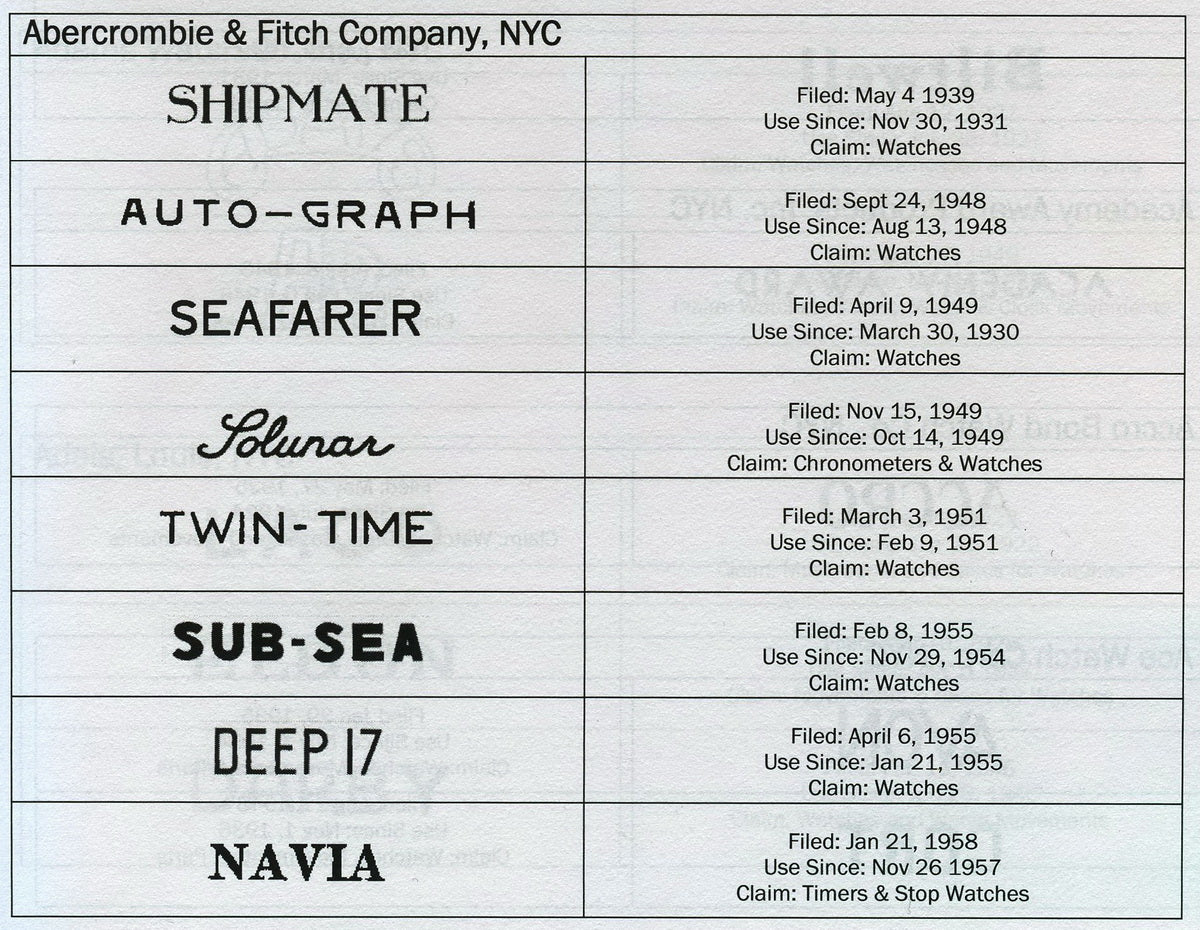
The list of all the models that Abercrombie & Fitch carried and their distinctive typefaces, courtesy of OnTheDash.
If we look more closely at perhaps one of the most iconic wristwatch designs of the 20th century, the Paul Newman Daytona, it also becomes obvious that much of the strength lies in the subtle contrasts which give balance to the design. In particular, the subdials gather conflicting shapes, with the rounded numerals and square painted indices, which are in natural tension with one another. Nowadays, looking back, many of these things appear harmonious, however much of the balance within these designs comes from the idea of gathering things that should otherwise not be brought together.
The Impact of Creating Something New
Most brands, even some of the most established ones, do not have a typographic designer on their payroll. Rather, their typography will be under the control of their design team, which often means that the typeface used is rarely a bespoke one. However, when brands go through the effort of creating a design from scratch, the impact can be noticeable, due to the lack of originality which exists across the industry.

A Lange 1 in stainless steel dating from 1999 featuring the original Engravers typeface, courtesy of Phillips.
The first major name that gets brought up in this conversation is often A. Lange & Söhne. When the Glashütte-based brand relaunched in 1994, it opted for a typeface known as Engravers, invented by the German-born engraver Robert Wiebking in 1899. However, in 2012, the brand decided to rework this typeface into something of their own creation and introduced this modernised version of Engravers MT on the Grande Lange 1 that came out the same year. It was then added to each new model as they came out in the subsequent years.
Beyond some slight adjustments to the thickness, the brand also added small serifs onto the lettering that, while almost imperceptible at first, can be rather obvious if you place an older and newer piece next to one another. These adjustments wouldn’t have been possible back in 1899 when Wiebking first designed the typeface, due to the technology that was around at the time. Now that we can be far more precise with our printing, it is possible to create smaller details consistently, over multiple prints.

The original logo for A. Lange & Söhne compared with the newest iteration.
One of the most interesting additions to this typeface was the flat ampersand in the logo. Not something that was original to Engravers, this is now an instantly recognisable element of Lange branding. During his incredibly in-depth breakdown of A. Lange & Söhne’s typeface in collaboration with SJX, designer Larry Peh shows how this ampersand came from an amalgamation of different typefaces and fits perfectly with the brand and its curved logo.
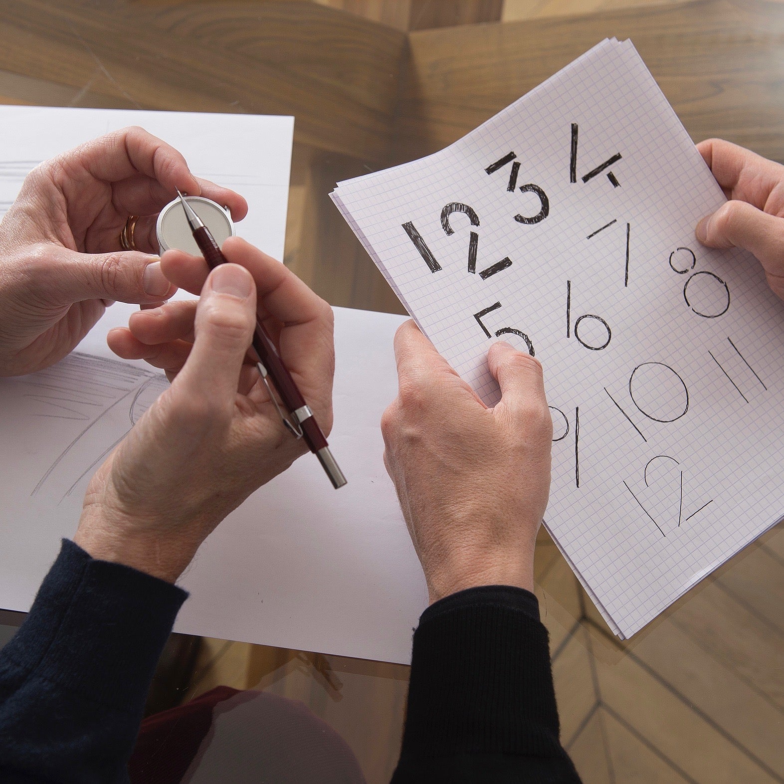
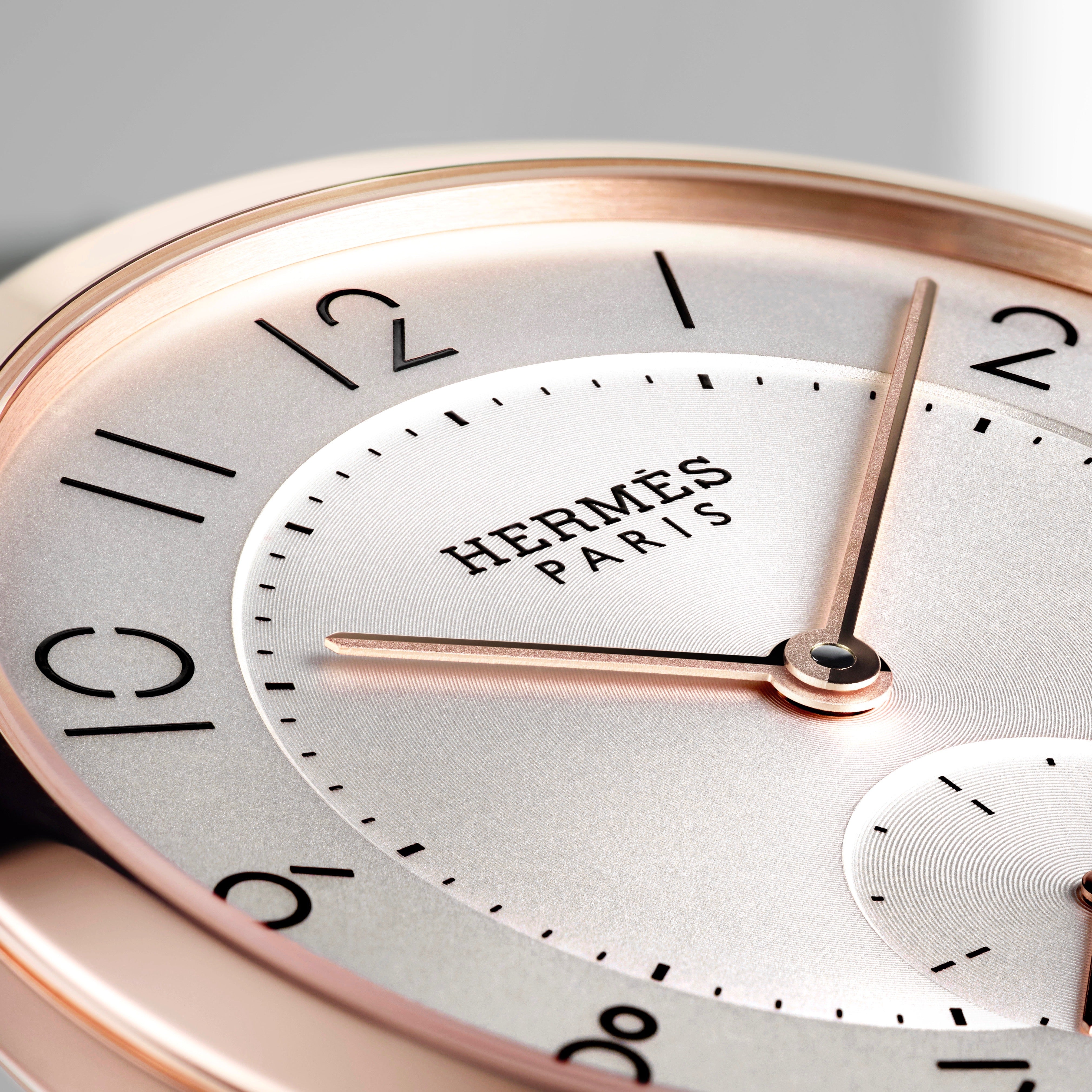
The design of a bespoke typeface for the Slim d’Hermès line, courtesy of Hermès.
While the work of A. Lange & Söhne might have been a more subtle refresh, we can find a bolder direction from a rather unexpected source, Hermès. In 2015, the Parisian brand employed the skills of Philippe Apeloig – who has work displayed in the MoMA collection – to incorporate the spirit of their Slim d’Hermès into a new typeface for the collection. Notable for its disrupted lines and empty space, the bare minimum is used to convey each numeral. Each one is made up of just three different shapes: a straight line, a circle, and a right angle, all with sections missing. It could be argued that the most significant feature of this typeface is what’s been removed, rather than what’s been included.

The curious typeface designed for the Patek Philippe 5212A, courtesy of Watchclub.
A rather unexpected instance of a brand using a completely different typeface for just one model is the Patek Philippe 5212A weekly calendar. Perhaps designed to reflect the singularity of the rarely seen complication, this reference was printed with a handwritten typeface that, when studied, almost looks shaky. While this could appear like a mistake at first, it was revealed that the typeface was in fact chosen by their design team to “recall an epoch in the not too distant past when notes were still written by hand in paper diaries.”
Small changes make all the difference
From the above, you may have gathered that typography is quite a subtle area of design, where small details can have a rather significant impact, whether we’re aware of this or not. In order to finish off this article, we thought we would demonstrate this one last time by looking at the evolution in typography on a single model. Because many of the variables – such as the case, layout, and complication – remain the same, we’re able to see just how powerful type can be in affecting the overall personality a certain piece.

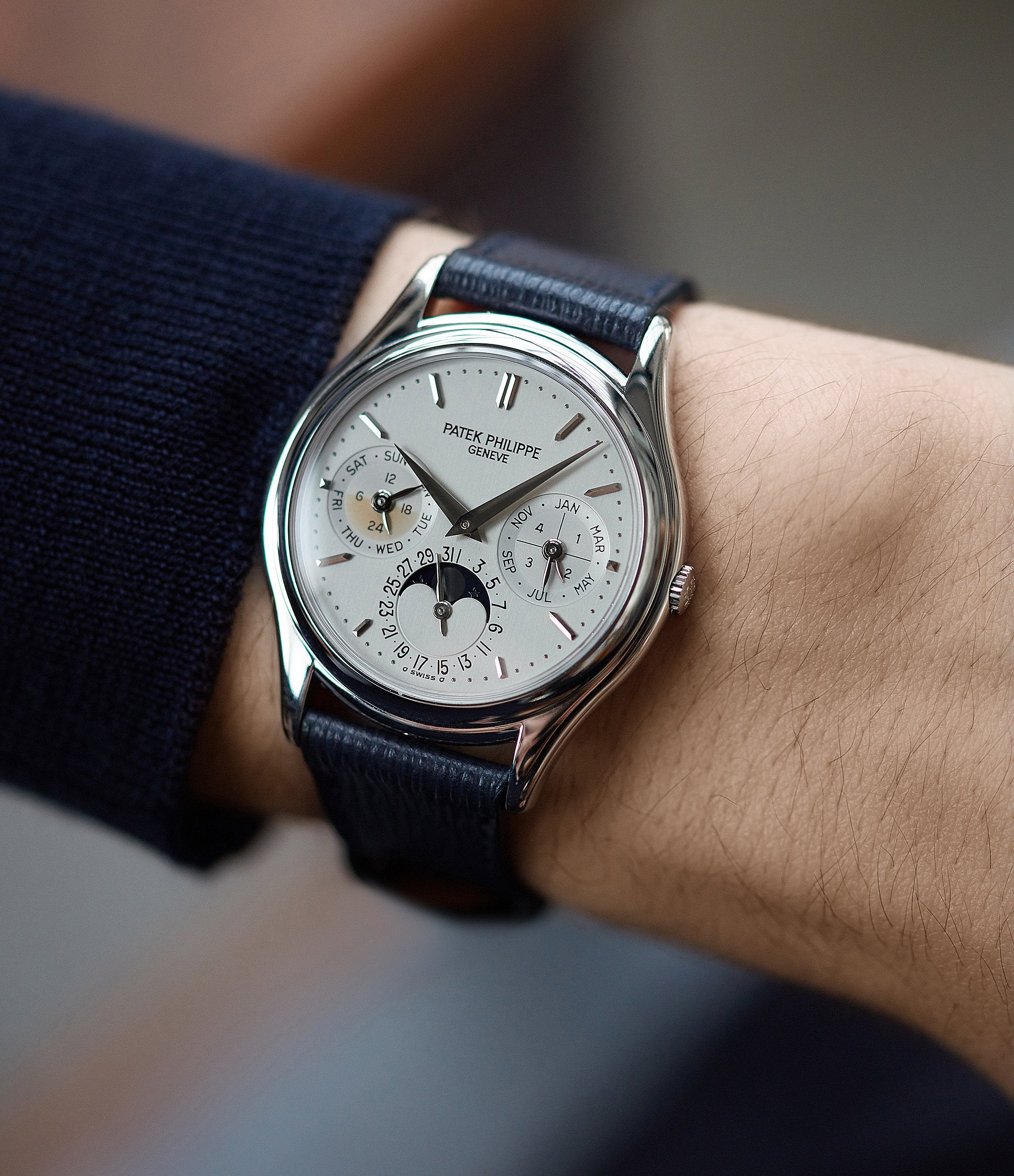
An early and later Patek Philippe 3940 showing a clear shift in typography.
As such, we thought we’d look more closely at a reference that’s close to our hearts, the Patek Philippe 3940. The perpetual calendar marks an interesting period in the manufacture’s history, when their watches transitioned from vintage aesthetics to more contemporary ones. Four different series have been identified by collectors, from 1985 to 2007. Between the first and second series, the “Patek Philippe Genève” signature evolves from a smaller serif-typeface to a far wider sans serif one. The accent above the second “E” of “Genève” also disappears. This certainly helps with the legibility of the brand name, though this arguably happens at the expense of the classic aesthetic embodied in the first few pieces.


The shift in logo typeface from the first to the third series of 3940.
As the reference evolves, this brand signature becomes gradually larger and more muted, whilst the subdials also begin to evolve to a more contemporary font. As a result, if you hold a 3940 from 1985 and one produced twenty years later, they are on the surface, almost identical. However, the subtle differences in typeface size and font mean that one feels distinctly like a vintage piece, whilst the other feels much more modern. Beyond the obvious element of rarity, this is why collectors have tended to gravitate towards the earlier executions of this perpetual calendar, as they speak to a certain Patek Philippe aesthetic which is long lost today.

The classical typeface used by Audemars Piguet prior to their modern shift at the end of the 20th century.
A similarly powerful detail can be found in the evolution of the Audemars Piguet signature, which occurred during the last decade of the 20th century. Prior to this, Audemars Piguet employed a classic, restrained font to apply their name to dials. All the letters were the same size, with a few subtle details imbuing these pieces with a certain vintage appeal – such as the flat top “A” or the serif details on the “G” or the “T”. However, early in the ‘90s, Audemars Piguet transitioned to a much more contemporary brand signature, which they still employ to this day. If you compare two identical pieces from the period – such as their Quantième Perpetuel or a Royal Oak – the effect can be rather powerful, such that one feels firmly grounded in a vintage aesthetic, whilst the other feels more like a modern piece. These details are subtle, but their impact is certainly significant.
When considering all of the technical elements that go into producing a timepiece, it is easy to relegate typography to the bottom of the priority list. As we pointed at the very beginning, a good typeface should go unnoticed. Whether it’s the evolution of a certain element over time, the power of contrasting fonts or the advantages of creating something from scratch, this is an area of design which often gets missed within the watch world. However, as we have hopefully made clear, even the smallest details in type can make an enormous difference to how a watch makes you feel.


