The Colourful World of Vintage Watches
If you follow the watch industry closely, you'll undoubtedly have noticed that each year, from the thousands of new releases, a colour trend commonly emerges. As we slip towards the second half of 2021, it’s clear that the blue dialled stainless steel sports watch has had its moment, and has moved into the mainstream, as an array of striking green dials are slowly trickling out. The psychological link between colours and the emotions they communicate is well documented. Beyond being bold statements – for example, Ferrari's use of red or yellow – vibrant colours inspire feelings of optimism and happiness. So, it should come as no surprise that strategic use of colour on wristwatches goes beyond trends and can serve an array of valuable and interesting functions.

The distinctive tones of a Heuer Carrera Skipper, courtesy of HODINKEE.
Today, such functionality has been superseded by modern technology. However, a look black at the vintage watch world provides an exciting insight at how different watch manufacturers once relied upon colour for crucial features. After all, with so many of today's brands leaning heavily on their heritage and reissuing their iconic classics, multiple colourful details have unusual origin stories. These colourful touches which collectors have come to seek-out, and even nickname, are seen across all functions, from GMTs to chronographs, and especially dive watches. Looking back, these colourful details offer an insight into the history of wristwatches, and the various functions they served over time.
Bright colours and cold contrasts
When browsing the history of one of the most iconic dive watches of all time, the Rolex Submariner, there's barely a pop of colour to be seen. Rolex's Submariner was popular among the world's militaries and professional diving teams, and its lack of colour likely worked in its favour. It provided the most optimal contrast between black and white, helping with legibility and discreteness, in a whole range of different environments. Of course, the Big Crown used touches of colour here and there – a line of text, or perhaps the red triangle on the bezel. For example, the famous red triangle found on the bezel of some early references is used by Rolex aficionados to differentiate between generations of the design.
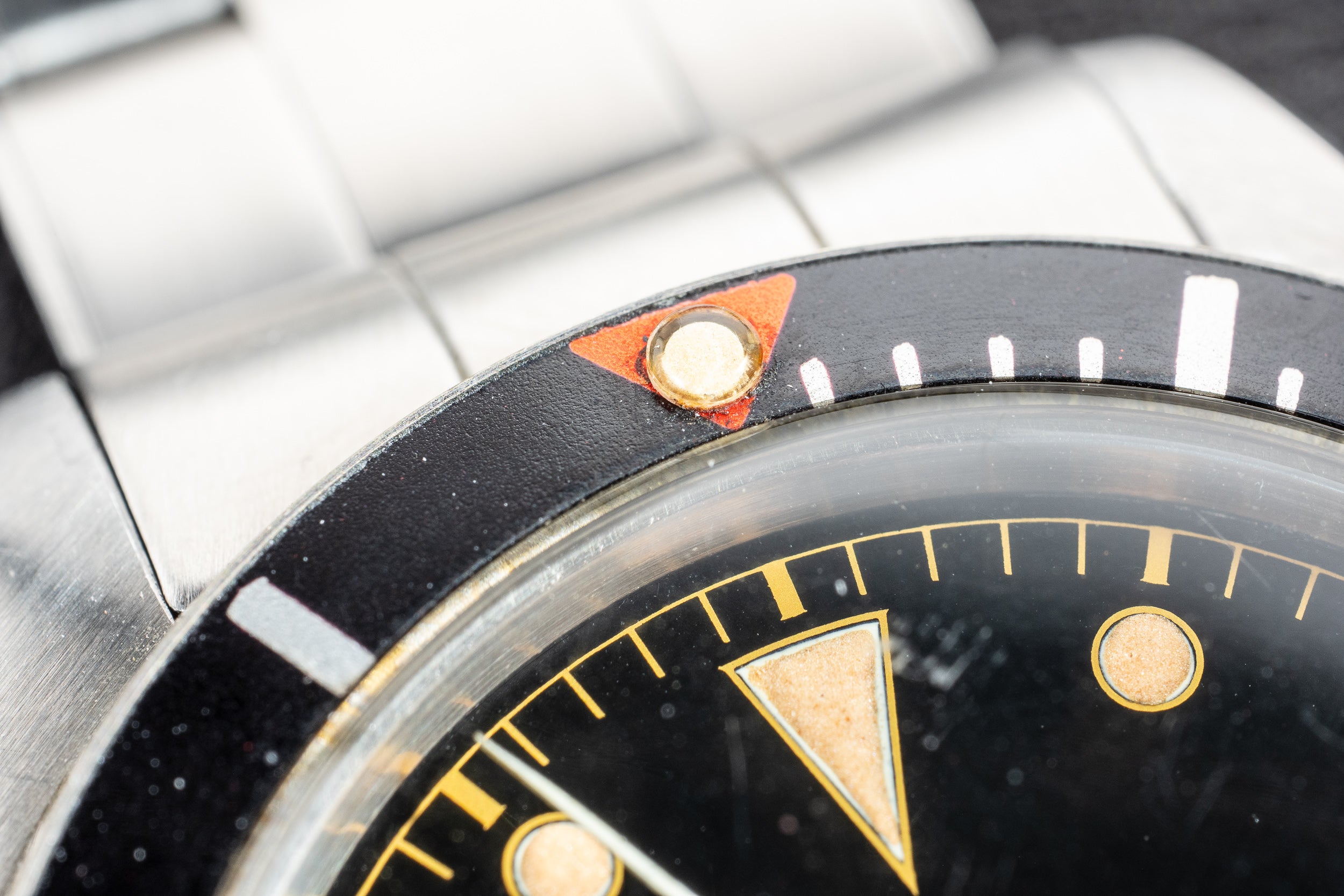
The distinctive red triangle atop the bezel of a Rolex Submariner, courtesy of Atom Moore.
Unlike the monochromatic Rolex Submariner, Doxa famously uses bright and colourful divers on their SUB 300 line. In fact, their original SUB 300, which was released in the late 1950s, featured an orange dial with a now mythical backstory. As the tale goes, Doxa watch designer Urs Eschle conducted testing to determine the most legible dial colour underwater, and orange came out on top. Although the touch of orange was promoted for many years as an innovative characteristic, it ended-up becoming clear that it didn’t add much functionality. Indeed, the most critical factor for legibility when diving is the contrast between the hands and the dial, with dial colour mattering less and less the deeper you descend.

The rainbow decompression scale on the dial of Mido re-issue of their classic diver model from 1961, courtesy of Mido.
Swatch Group-owned Mido isn’t too well known these days, but the brand has an interesting and colourful history, such as the Ocean Star Skin Diver Watch from 1961. Taking functionality to the next level, this particular Mido is famous for the unmissable decompression table on the dial. Mido's use of contrasting colours resulted in quite an unusual rainbow aesthetic, which has proved quite collectible resulting in the brand releasing a reissue of the multicoloured piece recently.
Kaleidoscopic chronographs
The chronograph function lends itself to an array of colours, with many notable uses. One such example can be found in the Seiko 6139 “Pogue”, which was the first automatic chronograph worn in space. Even though it was not part of his official mission kit, Astronaut Colonel William Pogue snuck his personal Seiko 6139 chronograph onto the Skylab 4 mission in 1972, as part of his personal kit, preferring it to the NASA-issued Speedmaster. One of the striking features of the design can be found on the tachymeter scale, which is often divided in red and blue. This scale allows the wearer to calculate and convert elapsed time to speed. The Seiko Pogue's red section of the bezel is a sub-60km per hour scale, used for the second pass of the second's hand. What was initially a colour-coded function, used to make sense of this practical scale, is now one of the most striking features of the design.


The Heuer Aquastar was touted as the watch for any budding yachtsman, courtesy of Hodinkee Shop and Revolution.
As we look beyond the “simple” chronograph, there's a collection of other quirky and eccentric timers found throughout history. The Regatta or Yacht timer is one colourful example. Regatta timers are used to countdown the start time of a sailing race in five-minute intervals, ensuring participants don't jump the gun, so to speak. The very first regatta timer was patented in 1961 by Jean Richard SA and appeared on their sub-brand, Aquastar. Featuring a 5-minute countdown, the five apertures on the dial change from red to silver, as each minute elapses. Of course, many other brands have used this style of display, with varying colours used.
The Regatta timer became a popular and colourful category for watch manufacturers, and eventually, a 15-minute countdown timer was deemed more appropriate. In the late 1960s, Heuer released the “Skipperera”, which featured such a time, indicated by a tri-colour sectional sub-dial — in essence, using red, white and blue, as a traffic light system. For those collecting vintage pieces, the appeal is now more aesthetic than anything else, but it’s interesting to consider that many of these colourful choices were born from functional considerations, rather than artistic ones.
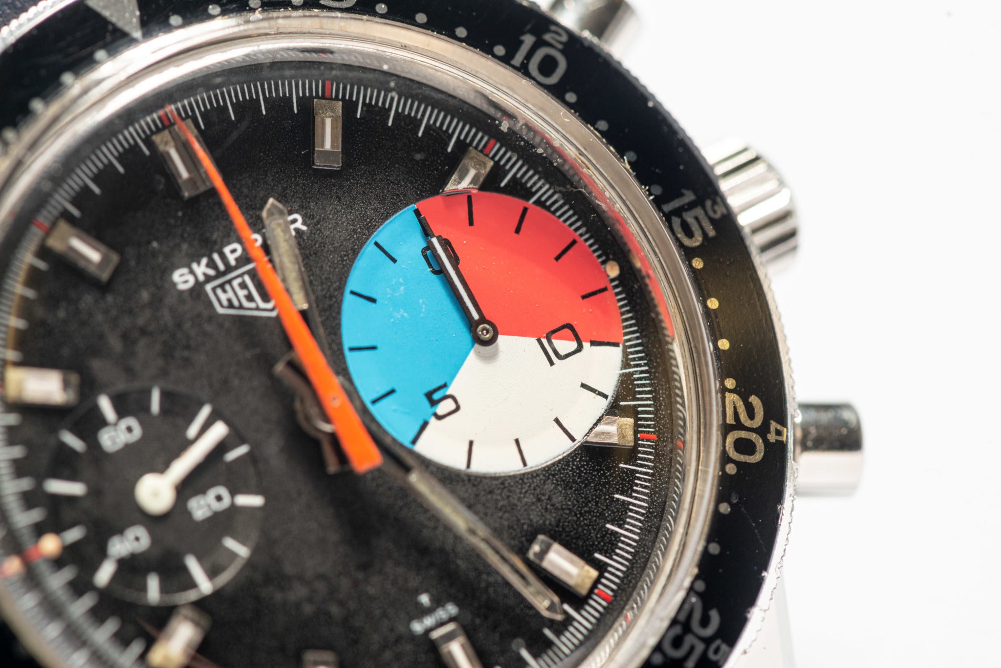
The colourful sub-dial of a Heuer Skipper stands out against its monochromatic dial and bezel, courtesy of Antiquorum.
Like the early regatta timers, a circular aperture disc display also featured on the lesser-known Apnea timers. Created with free-diving in mind, where the diver descends without equipment to test lung capacity, Omega's Apnea timer features a seven-disk display. Operated by a pusher at two o'clock, the circle colour changes to red with each elapsed minute. After seven minutes, the process then reverses for a maximum of 14 minutes.

Specifically designed for use on the pitch, the Omega Seamaster Soccer Timer, courtesy of Hodkinee Shop.
Once again looking to sport, in the ‘60s and ‘70s, Omega also produced a Seamaster “Soccer Timer”. In addition to having a chronograph function, it featured a sub-dial at three o'clock with two colours used to represent each 45-minute half of a soccer or football match. Breitling also did a very different take on the Soccer timer, with their “slow chronograph”. This example shows a dark navy outer ring which runs for 45 minutes, with 15 minutes for break time. Interestingly, this niche Breitling also uses colour to display when the chronograph has been engaged. The circle at six o'clock changes from black to a large green dot when engaged, and when stopped, it displays a smaller green dot.
Colour the Skies
One of the most common uses of colour on vintage watches came along with the popularity of dual time zone wristwatches. Omega's Flightmaster is no exception, and uses colour in a functional sense, in just about every way imaginable. The Flightmaster makes one of the strongest and most legitimate case for the function of colour, given the heavy usage. Firstly, Omega deliberately used cadmium yellow on the hands for better visibility in the cockpit of a plane. The Flightmaster also features a blue 12-hour hand, which can be independently set to display a second time zone. To make adjustments easier, the 12-hour is set with a colour matching blue tip crown.

The colour coordinated Omega Flightmaster, courtesy of Koller Auctions.
The Flightmaster displays another splash of colour on the 24-hour register, using green and black to differentiate between day and night. Omega cleverly used colour matching on the Flightmaster's chronograph pushers, matching the hand colours available, either red or yellow.

An advert from Rolex in the 1950s about possibly their most colourful watch at the time, the new GMT-Master, courtesy of Rolex.
It would be impossible to cover this topic, without addressing the dual timepieces developed by Rolex. Given that the core market for early GMT timepieces were pilots and other frequent travellers, a 24-hour indicator made a lot of practical sense. After all, when jumping between time zones, losing track of home time and whether it was day or night somewhere else would have been a legitimate problem. The most famous colourful and category-defining solution comes in the form of the Rolex GMT Master, with a blue and red 24-hour bezel. Developed with transcontinental travellers in mind, the GMT Master eloquently used colour to represent day and night, with the blue section of the watch’s bezel indicating 6 PM to 6 AM and the red 6 AM until 6 PM. Featuring an additional hour hand, Rolex also used red to distinguish it from local time. Now, red and blue is perhaps one of the most distinctive colour combinations around.


The subtle colour shift on the dial of the Glycine Airman, courtesy of Menta Watches.
An additional interesting example of using colour on a 24-hour display is this subtle Glycine Airman, nicknamed “The Pumpkin,” after its orange inner-bezel. Glycine's Airman features a nostalgic 24-hour indicator, discreetly using grey and black on the dial. Given the bold orange inner-bezel, it's likely the more low-key day and night indicator was a stylistic choice.
The power of colour
Of course, the power of colour is also used on less prominent features, like power reserve displays or day and night indicators. Sometimes, it's completely absent – like military issued watches, where contrast and discretion were key.

The unashamedly-bright Stella dials from Rolex.
On occasion however, colour was used with no distinctive reason or function. It was merely adopted to make a statement or disrupt the industry. Take Rolex's Day-Date “Stella” dials, which appeared in the ‘70s in a band of different colours. After seven decades of making robust and reliable timepieces with sensible designs, the Crown decided to briefly show their wild side, in a rainbow of bright colours. This unusual sidestep, and the fact that Rolex went as bold as they could without any meaningful explanation, is partly why these Stella dials are coveted by watch collectors today.


