
A collectors’ guide to Urwerk:
Part 1
Raj Aditya Chaudhuri
Any mention of Urwerk rightly brings to mind the wandering hours and the wondrous ways in which the brand has expanded on the time display. The story of Urwerk begins years before the brand created its first watch, when co-founder Felix Baumgartner and his brother Thomas, came upon a 17th-century papal clock that their father was restoring in the family home. Later on, the third-generation watchmaker siblings found the ideal collaborator in conceptual artist and designer Martin Frei in a party thrown by fellow art students in Lucerne. Together, they brought the wandering hours into the 20th century. Previously, Baumgartner and Frei articulated the singular philosophy at the heart of Urwerk to us in a freewheeling interview that you can read here.
As a companion to that conversation, this collectors’ guide will chronicle the creations that this philosophy has issued. Through these we take stock of the near-constant evolution that has come to define Urwerk’s story ever since its founding in 1997. We explore the chronology of past and current references and how the brand has strived to imbue greater meaning and functionality to the wandering hours, while looking beyond tradition and convention in watchmaking, venturing forth in ways few other brands have.
If innovation is one pillar, the other essential to Urwerk’s formula has been output numbers that would represent little more than an extended prototyping cycle for most brands. Urwerk has remained small, and consequently nimble, by design. The other side of this argument is that the brand’s particular philosophy makes it unlikely to ever enjoy mass appeal. We speak with a wide range of enthusiasts as well as collaborators to get a sense of what Urwerk represents even within the admittedly small world of independent watchmaking. This roster of interviewees includes the likes of Maximillian Büsser of MB&F, Jacopo Corvo of GMT Italia, Mark Margulies of Marcus Watches, Piano Chow of The Lavish Attic, and Steve Hallock of TickTocking.
For the sake of readability, this guide is divided into two parts – the first will chronicle the brand’s releases between its birth and 2016.
The second part will pick up from the brand’s releases starting in 2016 and will include lines such as the UR-T8, AMC, UR-111C as well as the UR-100, UR-112, UR-120 and UR-150 bringing us to the present era. This part will also detail releases that fall outside Urwerk’s regular series of watches, including collaborations for Only Watch.
1997-2005
The origin: UR-101 and UR-102


Two iterations of the UR-102. The Sputnik-style lugs, part of a truncated run, featured a high-polish case while the other was part of 25-piece run with a ceramicised aluminium case.
The brand’s home in Geneva’s Old Town includes a reception room that displays several examples of historic clocks by makers such as Gustave Sandoz and Ferdinand Berthoud. These have typically served as the inspirations behind Baumgartner and Frei’s creations over the years. However, of these, no other piece is as elemental to Urwerk as the night clock greeting visitors at the top of the stairs leading to this reception room. Produced and delivered to an ecclesiastic person of some standing in Austria in the late 17th century, its wooden frame wears a metal face adorned with a watercolour likeness of Mary Magdalene in a style typical of the late Renaissance. The only indication that this is indeed a time-telling device is an arc with an Arabic numeral that takes 60 minutes to complete its journey across the aperture. Pulling on a handle to draw open the door reveals a module with three wheels, each with four of the 12 hours of the day on them. Powering the module is a calibre, with a pendulum weight. The cut-out nature of the numeral is so that the hour of the day, backlit by a candle housed in the frame, would be projected and visible in the dark of the night. While the design incorporated a ventilation system, owing to the obvious perils of lighting a fire in a small wooden box, only a small number of such night clocks have survived the centuries.


The entrance to the brand’s atelier in Geneva’s Old Town. When entering, guests step over a threshold under which lies a grand old clock, broken and not functioning. The image, of stepping over the old to enter Urwerk's universe, is rich with meaning and hard to miss.
It was this display that the Baumgartner brothers were determined to bring into modernity in the mid-1990s, resulting in the design of the UR-101, the brand’s first offering. Frei was in charge of designing the piece, while Felix devised the calibre and the module for the wandering hours. Thomas, skilled at fabrication, would bring the cases into the real world using traditional hand tools. However, the trio had an issue. Says Pierre Chapeau of Urwerk, “With the first design ever made, the UR-101, the idea was for it to be created in yellow gold. However, at the time they had no money at all. Felix was 22 and Martin was 28 and their operation was brand new”.
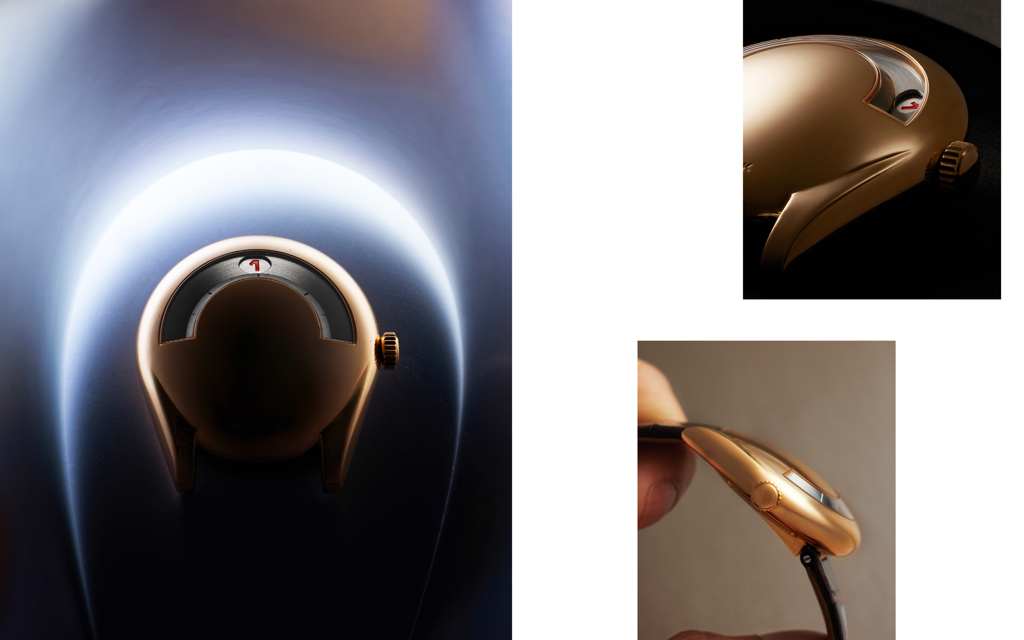
Rather than compromise on their vision by making the UR-101 in stainless-steel, they created an entirely new design, calling it the UR-102. This became the brand’s first production watch, debuting at Baselworld in 1997.
Its case was round and pebble-like in form, measuring 38mm across. Initially made only in stainless-steel, examples were also produced in a 36mm size, with one iteration even created with a 34mm case. Its time display, closely following that of the night clock, was radical for the time but still two-dimensional when viewed in the context of what the brand did in the years that followed it. Powering these were ETA-based self-winding calibres, topped with a module for the wandering hours.


For Only Watch 2021, the brand resurrected this meaningful reference. Urwerk won the Gaïa Prize in 2020 for their entrepreneurial spirit. The watch is identical in its dimensions to the first-generation UR-102, with a grey ceramicised aluminium – sand blasted and anodised. On the platinum caseback is a star-speckled blue sky, created out of lacquer. It approximates the form of the Gaïa Prize, with the sky interrupted by an off-centre column.
The UR-102, at the time of its release, was priced between CHF 5,000-10,000, and designed to be as mechanically simple as possible, leaning on the novelty of its form and time display to attract attention. In keeping with this design-led ethos, the watch was displayed on a twin portable hot plate at Baselworld. The display, like the watch itself, was designed to invoke pieces of conceptual art, much like the works of sculptor and painter Marcel Duchamp. “The idea was to say we are cooking something hot,” Chapeau says.
Urwerk at the time was less of a brand and more of an experiment, with the founding trio more concerned with prototyping than keeping production records. It was marked by a tremendous number of expressions of the UR-102 aesthetic, with very few records of this variety. What is reasonably certain is that a series of 50 pieces of the UR-102 was planned in stainless-steel, with another series of 50 in stainless-steel coated with black physical vapour deposition (PVD). However, it is also true that not all the pieces in these two series were made. This is mainly because, owing to the manual nature of the case manufacture, sometimes examples did not meet quality control standards.
Says Chapeau, “Today we have quite a few prototypes from this first series, but in terms of numbers of pieces finished and retailed, the picture is totally blurry. No archival information exists either because for them at the time it was much more like a project, not a brand”.
In addition to the two series of 50 pieces, there also exist a few examples in aluminium, some with the material ceramicised. Twenty-five examples were produced in a grey shade with the standard lugs, while just 10 were made in black with Sputnik-style lugs. Both examples featured casebacks made from platinum.


A rare example of a night clock that has survived the centuries and provided inspiration for a modern iteration of the wandering hours display.
While UR-102s with aluminium cases were also serially produced, the brand does not have an exact count of many were eventually made. There also exist prototypes in aluminium finished with red, yellow and blue PVD coating.
The trio’s inexperience showed in other ways too. The price they were selling the UR-102 did not factor in the margins required to account for the cost of working with retail partners to sell the watch. The negligible amount they were making from each sale certainly did not allow for the kind of handcraft involved.
Despite the financial stress, proceeds from the sale of the UR-102 brought in just about enough cash for the brand to procure the bullion to produce a very limited series of the 36mm yellow gold cases for the first UR-101s. The design was inspired by the Millennium Falcon space craft from the Star Wars movies, a passion both Baumgartner and Frei shared. Its horseshoe form was more unusual than the form of the UR-102. The caseback, featured a raised incline where the top strap attaches to the case. On this incline was also engraved the serial number in a calligraphic font. A regular production variant, measuring 38mm, was produced in white gold. While an ambitious 500 examples were planned based on warranty paperwork we have seen, there is little record of how many were eventually cased and retailed. In this era, the cases were all made by hand by Thomas Baumgartner and underneath the UR-101 was again an ETA self-winding calibre topped with the wandering hours module.

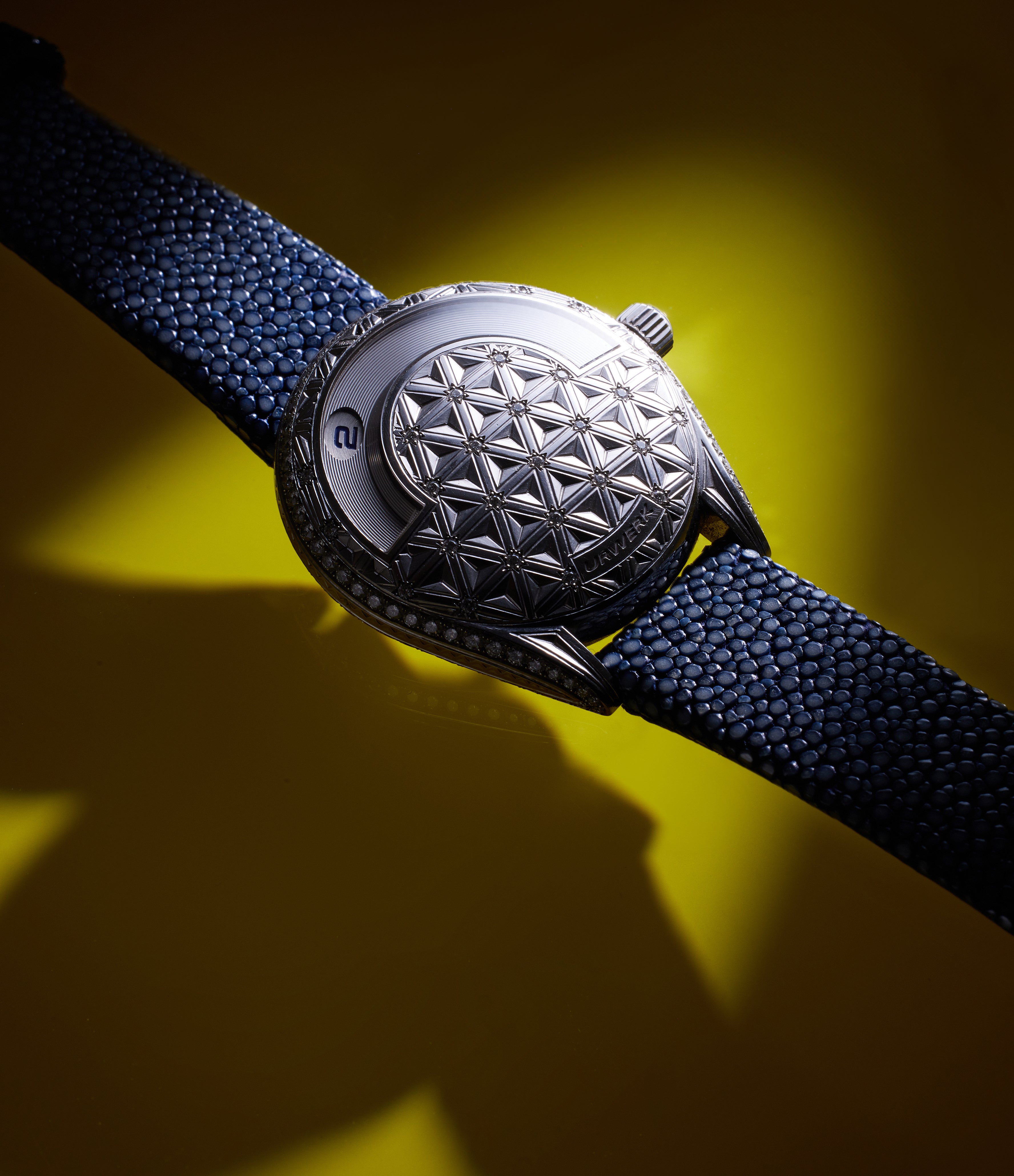
The emphasis on prototyping means there are examples with unusual finishing details. One of the most ornate of these is a high-jewellery iteration of the UR-101 with a white-gold case, with the face engraved with repeating triangular details. The points where the triangles meet each other are inset with diamonds, surrounded by star motif engravings. Framing the silhouette of the horseshoe form are also a row of diamonds. This was the work of master engraver Jean-Vincent Huguenin – the first of many instances of his collaboration with Urwerk over the years. Another example we have found in yellow gold features intricate engraving detailing the form of the temple complex in the city of Jerusalem. Engraved on the semicircular rim above the time display are the words: “City of peace, city of three religions”. This was likely a specially commissioned example. Interestingly, the first production example of the UR-101, destined for the United States, was reported lost by the buyer. As a result, the brand was never paid for this important first piece.
Both original references continued to be produced until the arrival of the next reference – the reference most crucial to the brand’s story – in 2003.

The years in between
It would be five years before Urwerk would produce another reference, although this intervening period wasn’t exactly one of inactivity for the Baumgartners and Frei. In 2001, German retailer Goldpfeil commissioned seven members at the Académie Horlogère des Créateurs Indépendants (AHCI) – of whom Felix was the youngest member – for what would become the Seven Masters series. Each watchmaker came up with a fresh design, produced in a closed series, that would be retailed by Goldpfeil.
For this, the Baugartner brothers created the Chronometer reference 11300. The rectangular shape held within it more complex forms – the flat of the caseback was offset by the bubble-style form of the watch face, with a curved crystal. The crown was integrated on the lug side, a design element that was still a couple of years away in the Urwerk line up. The dial, marked by pinstripe guilloché, displayed the reserve left in the chronometre-grade manually wound calibre and the seconds by means of a subsidiary register. The broad hands mirrored the scale of the broad numerals. The watch was produced in yellow and white gold.
The UR-101 in white gold with the engraved and diamond-encrusted face, inspired the unique Goldpfeil Amphiscala. The latter wears a similarly ornate engraved appearance crafted in yellow gold but devoid of diamonds.
While the Seven Masters series would ultimately be a commercial failure for Goldpfeil, it yielded a crucial CHF 100,000 in revenue for Urwerk, at a time when a lack of funds almost forced them to consider folding the operation altogether. While their logical side dictated they split the amount three ways rather than taking the chance at another instalment of the Urwerk project, their creative and entrepreneurial spirit won the day’s argument. The funds went towards the development of the UR-103.01.
The UR-103
The year 2003 would mark a turning point for Urwerk. “It was the watch with which collectors realised that Urwerk wasn’t just a project but a brand. It marked the first instance of integrating this notion of three-dimensional time-telling,” says Chapeau. The brand displayed the 103.01 with two prototypes produced in stainless-steel, unable to produce one in a precious metal again for a lack of funds. It was immediately apparent to those who first viewed that watch it was going to be a game-changer. Maximillian Büsser says of the watch, “There will clearly be in watchmaking a before and after UR-103”.
It featured a case that had obviously descended from the Goldpfeil Chronometer. Sitting on top of the flat caseback was a form that appeared as a drop of water on a solid surface. The curved top was decorated with deep linear engravings, with a curved crystal offering a glimpse of the time-telling aspect.


The three-dimensionality of the wandering hours display was much more apparent than in previous references. While time was displayed across the same 120° arc, the four aluminium cones that traversed the display sat on a higher plane, their form adding further depth to the display. In this early iteration of the reference, rotation of the wheel on which the disks were mounted, as well as the rotation of the disks on their axis, were all managed with the help of mechanics that sat underneath. The four cones were mounted on four Maltese crosses, themselves loaded onto a lightweight titanium orbital cross. Underneath was a base of ARCAP – an alloy of nickel, copper, cobalt, tin, lead and zinc known for its properties of strength and anti-magnetism, thanks to the absence of iron in the mix. In the UR-103.01, only the time-telling cone revealed itself in the 120° display, while the others were obscured from view – this would change in subsequent instalments of the reference.
Underpinning it was a ETA/Peseux 7001 calibre, with two modules sandwiching it. The one on the top, comprising of the orbital cross on which the Maltese crosses were mounted, was of course driven by the movement, operating on the principle of numerical disk switching. The module on the other side of the calibre was modified to display the power reserve indicator, located on the caseback.


The UR.103.01’s nomenclature reveals the long-term plans the brand had for it right from inception. It would go on to become a pillar of the brand, and its basic formula would also be reinterpreted in subsequent references.


The display on the UR-103.01 was monochrome and minimal. Polished in profile, the case had overlapping ovoid detail that gave it a sculptural form. It was the first of Urwerk’s watches to have been designed on a computer.
The top lugs were substantial and flowed organically from the case, the bottom lugs originated from a raised incline, with the strap secured by screws. In between the top lugs was the oversized crown, with deep grooves that aided ergonomics.
Issued from Frei’s computer, while he was establishing himself as a conceptual artist in New York City, it put in place several key visual details that would endure. Some of these, that were deemed to be secondary to the time display, were moved to the caseback. This was the start of what the brand refers to as the “control board”. For instance, while the primary display lacked a seconds indication, this was found in the twin overlapping registers on the caseback. One displayed 60 seconds while the other showed the passage of time in 15-minute intervals – the latter was designed so the wearer could set the time with more accuracy that the minimal primary time display would allow for.
Also expressed here, along a narrow, arced display was the 43-hour reserve that the manually wound calibre UR-3.03 afforded. Crucially, the caseback also accommodated a fine-tuning function that was inspired by an innovation by Abraham-Louis Breguet. It allowed the wearer to intervene in the rate of the calibre, adjusting it to run 30 seconds faster or slower, depending on whether the watch was losing or gaining time. It displayed both a sense of history and a desire to improve on past innovations.


The control board, later dubbed the Chrono Meter, first appeared in the
UR-103.01.
Of the two stainless-steel prototypes the brand presented at Baselworld 2003, one – namely #1 – is in private ownership. A third proof of concept was created later in gold, immediately preceding regular production. Twenty-five examples would be produced in yellow gold, rose gold and white gold. However, some of the most elusive examples are the ones crafted from stainless-steel, of which the brand says 10 pieces were serially produced.
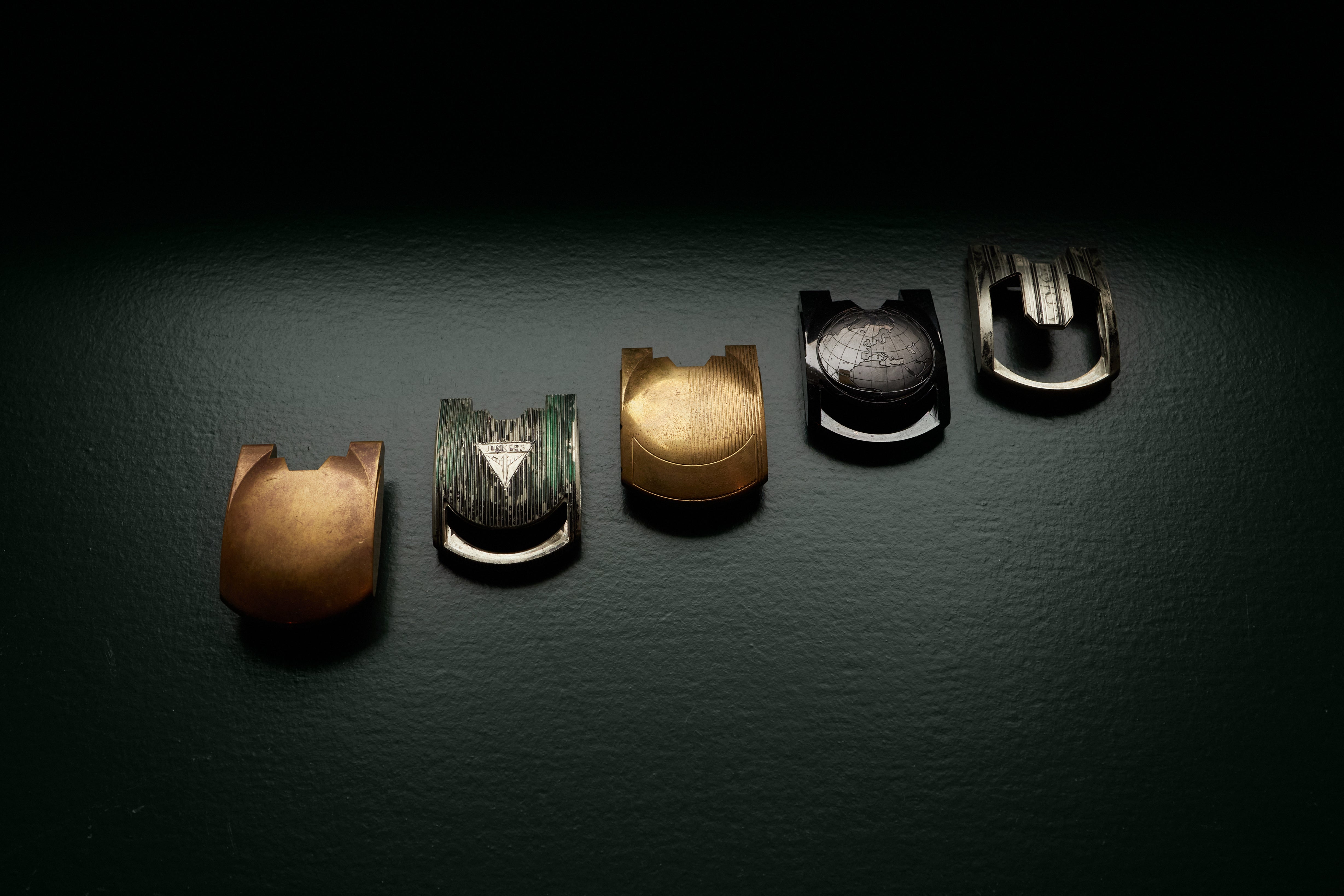

In addition, there were several unique examples. While here too records are sporadic, we have seen examples with the case engraved with a triangular motif with “Junker” engraved on it alongside a top shot of an airplane. This example had a see-through flank, with a skeletal detail designed to evoke the underlying frame of the wings of period aircraft. We have had the opportunity to see early incomplete prototypes of this case.
Another unique example in rose gold, with a dragon motif, was engraved by Huguenin, with a similar example also created in white gold. There is one with a Chinese motif, also by the same artist. A third unique example featured an engraving of the ‘hamsa’ hand motif significant in Islamic cultures, with scripture engraved in the central island of the case. On this particular piece, the case flank also features intricate inlaid floral details.
Opening up
Almost as soon as the 103.01 was released, there was a desire among enthusiasts to see more of the workings of this wandering hours display. However, the brand only did so after reworking the module. As we have stated earlier, the movement of the wandering cones was initially governed entirely from the bottom. However, in the interest of greater stability, they were later suspended from an orbital cross. Each cone sat on a triangular Geneva cross that ensured its revolutions. With this, the UR-103.03 was launched in 2005.
The case was pulled back and featured a U-shaped crystal – this meant only the axis on which the orbital cross rotated was obscured from view, while the time display cones were shown off. This marked the introduction of Superluminova to the cones as well as the minute track to aid legibility. Also notable is the addition of blackened titanium casebacks to accommodate the control board. Till production was drawn down starting in 2010, there would be a family of sub-references added to this most successful line.
The UR-103.03 featured white and rose gold cases, of which around 75 examples were produced in each metal. They feature the classic 12 double-gadroon cases that were a visual simplification over the UR-103.01. In addition to a limited series of 25 pieces in platinum, there were unique examples such as one with an Art Deco motif and one with the Russian coat of arms featuring the double-headed eagle engraved on the cases by Huguenin.
Says Steve Hallock, owner of TickTocking, a business that specialises in selling watches by independent makers, “It wasn't until the 103.03, the first version where they opened up the top, that I truly fell in love with the brand. I bought my first, a rose gold 103.03. At the time, the independent watch scene was comically smaller than it is now – handfuls of people scattered through the globe knew that these things existed. Even fewer took them seriously”.
The UR-103.05 case was changed again, with six double gadroon details across the polished platinum case. This was the first reference to feature hollowed-out case flanks that exposed more of the conical disks. The baseplate included a little detail with the engraving “PT” referencing the case metal. Fifty examples were produced in the series. A similar number of UR-103.07 were produced. The only difference between the two was the lack of hollowed-out flanks.
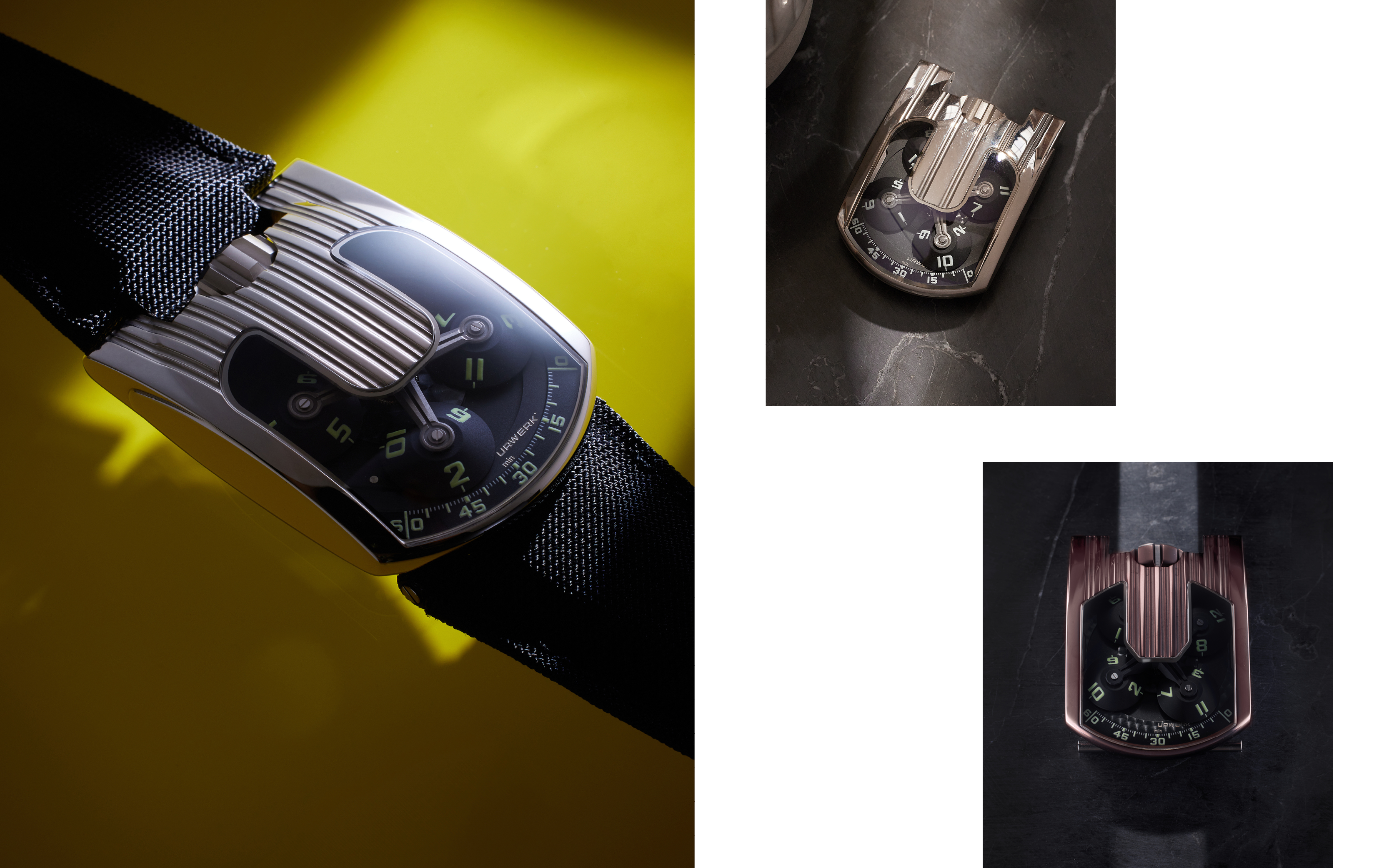

The UR-103.06 Joaillerie, of which 25 pieces were made in gold and 10 in platinum, featured cases with 277 diamonds weighing 5.28 carats. The UR-103 Blackbird, produced in a limited series of 10 in 2006, is one of the rare instances of a case devoid of engraved details, its smooth platinum surface covered in black plasma-enhanced chemical vapour deposition (PE-CVD).
Piano Chow is the founder of The Lavish Attic that retails a number of independent brands, including Urwerk in Hong Kong. She was early to Urwerk and has had a relationship with the brand since 2005. Chow says, “It's important to remember that Urwerk has always been at the forefront of material, shape, and form exploration, extending not just to their movements but also to their overall timekeeping interpretation.
“While the industry typically relied on PVD or DLC coatings for black finishes, Urwerk chose a revolutionary path. A perfect example is the UR-103 Blackbird. Prior to Urwerk's adoption, PE-CVD was primarily used in semiconductors, solar cells, and photovoltaics for its exceptional surface coverage and conformity. Once, a customer brought his damaged UR-103 Blackbird – broken in a fight – for after-sales service. Inspecting the cut revealed the true depth of the black colour – it wasn't merely a coating. This understated black finish also possesses unparalleled hardness, exceeding the limitations of industry-standard PVD or DLC coatings.”
The reference 103.08, featuring cases with 10 gadroons, was launched in 2007 and was the first to include stainless-steel in the mix. The material was coated with a four-micron layer of an alloy called TiAlN – titanium-aluminium-nitride – that gave the case its signature purple hue and a hardness of 3,500 Vickers, close to the 4,000 Vickers of the sapphire crystal around it. In fact, early examples of the 103.08 featured angular edges, a quality only found in fewer than 20 pieces. This was despite plans to produce about 50 pieces with such a crystal. The detail was abandoned reportedly due to difficulties in shaping the crystal. Later examples returned to more rounded edges, as seen in previous references. The UR-103.09, with a similar case, was produced in white gold and rose gold. In addition, five pieces were crafted in stainless-steel coated in black AlTiN – aluminium-titanium-nitride.
The angular case would make a return on the 10-piece UR-103.10 BPT Hexagon from 2008. Its platinum case was coated with PE-CVD to give it a smoky black shade. Equally visually distinctive was the hexagonal shape of the blackened aluminium discs.
One of the final iterations was the UR-103T, or “Tarantula". Appearing towards the very end of the life of the reference in 2009, it is marked by a number of design hallmarks. The targa-style case was completely pulled back, while the discs now featured individual canopies – the latter was included with the view that only the side of the disc that was making its way across the minutes track would be visible. In reality, one side of every disc was always going to be exposed, even when they weren’t displaying the hour of the day. Another key visual trait, which gives the sub-reference its name, was the application of Super-LumiNova to the arms from which the discs were suspended, appearing as the legs of a spider.

It featured stainless-steel cases, coated in AlTiN (60 pieces) as well as cases made from white (33 pieces) and rose gold (60 pieces). There were a few special variants including the UR-103T Mexican Fireleg, with 60 pieces featuring orange luminous material, and what is often viewed as the ultra-lightweight iteration – the UR-103 Shining T. Here the gold case, treated with AlTiN, featured cones crafted from transparent sapphire, with blue Super-LumiNova numerals. Just 33 examples were made.
The UR-103 would also be the brand’s first Only Watch in 2011. Understood to be the very last example made, UR-103 Phoenix featured a white-gold case with a phoenix motif, again engraved by Huguenin.
The Opus V
It is worthwhile turning the clock back to 2005 at this point. While the UR-103 was a couple of years into its story and by most accounts proving to be a success, a collaboration with another brand would turbocharge Urwerk’s future. Harry Winston Rare Timepieces at the time was helmed by Maximillian Büsser, whose Opus series with independent makers was proving to be a kingmaker. It wasn’t principally dissimilar to the Goldpfeil Seven Masters series. However, its success has been often rightly cited as one of the key influences in helping boost the then fledgling independent space.
On the collaboration with Urwerk, Büsser says, “I first met Thomas, Felix’s elder brother, who was then still working at Urwerk. He came to show me the piece [UR-103] at our Harry Winston booth during Baselworld 2003 – the year we were presenting Opus 3. I was just blown away and mesmerised by the piece. It suddenly opened a whole new universe to me. I went to show it to my whole Harry Winston team and virtually no one got it. I was in despair. They just looked at the piece and said they thought it was weird.”
However, Büsser met with the Urwerk team despite this. “I was, of course, always on the lookout for the next watchmaker with whom to create an Opus and this was just a no-brainer. We met a few weeks after Baselworld at their workshops where they suggested an incredible project based on a One-Armed Bandit [slot machine]. A few months later Felix and Martin said it would not be possible in such a short time. They arrived with two new ideas. One was what would become later on the Urwerk CC1 and the second was what we unanimously chose as the Opus V”, Büsser says.


An early wooden prototype of the Opus V that resides in Urwerk’s collection. The final design would subtly integrate a five-day reserve and day/night indicators on the dial side. Worth noting is the fact that the dial bore only Felix Baumgartner’s name.
The time-telling aspect was oriented horizontally, one of many firsts Urwerk ventured in the Opus V. While minutes were displayed across a similar 120-degree arc, the pointer plying the route was mounted on a ring and had a retrograde functionality governed by a traction spring. Inside the ring were three cubes, each with four hours of the day printed on its facets. While novel in its presentation, it represented a clever vertical orientation of the same numerical disc-switching technology that had underpinned the cones on the UR-103. The spinning cubes marked the first extrapolation of the wandering hours display.
Büsser says, “For Opus V, the incredible three-dimensionality of the cubes rotating – something no one had ever seen before – made the time display a mechanical sculpture. Another detail I appreciate is the asymmetry of the case.”
The asymmetry was mostly a function of the retractable crown hood that aided the smooth, pebble-like appearance. Available in rose gold and platinum, 45 examples were produced in each metal.
Another complication that would continue to recur in subsequent watches, albeit with a different name, was the five-year service interval indicator on the caseback of the Opus V. Also present here was the fine-tuning functionality first seen on the UR-103. Underneath was the hand-wound calibre HW1026, crafted from the ARCAP alloy that was to become an Urwerk mainstay.
2007-2011
UR-201, UR-202 and UR-203
The logical successor to the Opus V, the UR-201 Black Shark, was revealed in 2007. It featured many of the innovations first seen in the Opus V, such as the rotating cubes to display the hours, as well as the service interval indicator – which the brand christened “oil change” indicator. There was also the fine-tuning device that had by now become a mainstay. The power reserve and day/night indicator were also neatly tucked on either end of the arc of the minutes display.
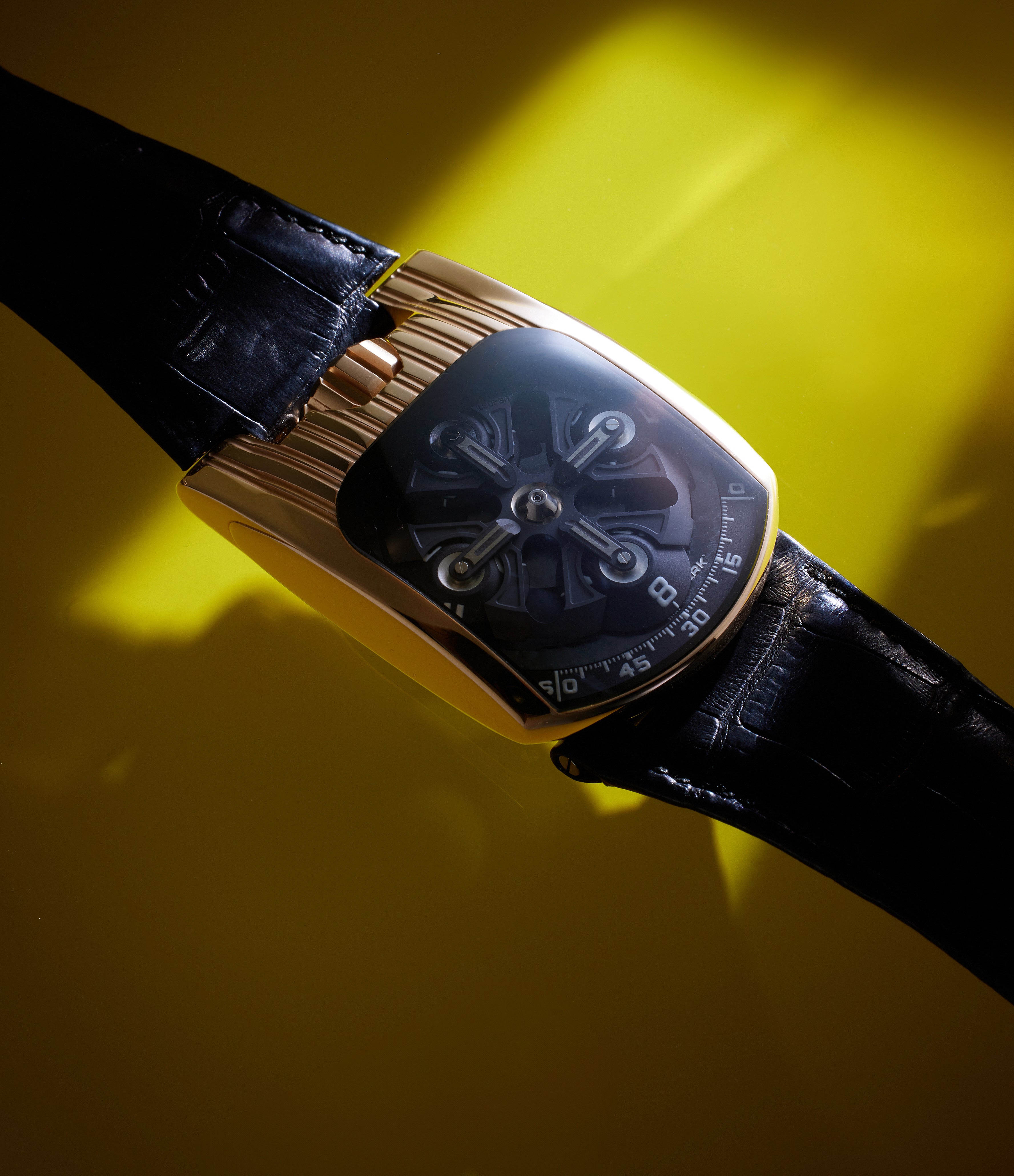
However, these complications and details found home in a new case. The oversized crown remained at 12 o’clock, but the rest of the bell-shaped case was entirely new. It featured a crystal that looked like an upturned hammer, which promptly earned the watch the nickname “hammerhead”. Produced in very limited numbers for a short period of time, the Black Shark was produced in a series of 10, with platinum cases coated in PE–DLC. A similarly small number of examples were also produced in rose gold.
Crucially, the UR-201 marked the debut of the telescopic arms to indicate the minutes. Instead of the retrograde minutes seen on the Opus V, each of the three rotating cubes integrated a pointer that extended, shortened and then extended again as it made its way across the three positional sectors of the minutes chapter. This was made possible by what the brand refers to as transporters for each of the arms – one end of each transporter plotted its way along an irregular-shaped but predetermined track or a cam. Depending on the position of this end of the transporter, the other end would push out – or push in – its minutes pointer. These made their course over an irregular shaped “track”, helping determine how extended the minutes pointer needed to be at a given moment.
It was a clever set-up and prompted the brand to file its first patents relating to the position of the rotating cubes relative to each other (120 degrees) as well as the functioning of the telescopic arms, says Chapeau.
Urwerk’s inspiration for the UR-200’s telescopic arms came from the works of 18th-century London-based watchmaker William Anthony. His experimentation with hands that contracted and expanded as they traversed the ovoid shape of the dials was based on a system of cams that Urwerk also employs.
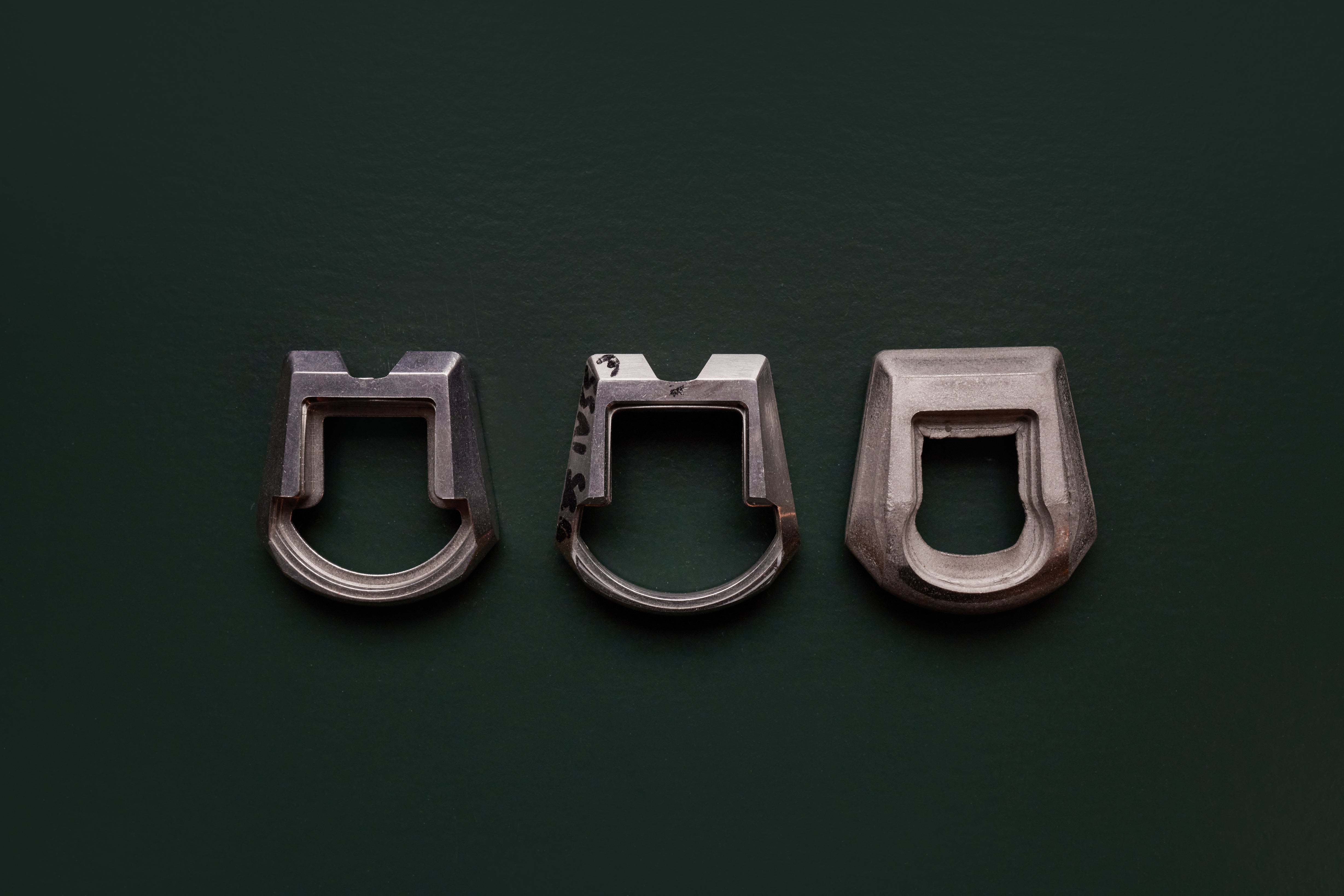

Underneath was the hand-wound calibre UR-7.01, based on a La Joux-Perret ébauche. It is believed that the short run of the UR-201 was in part due to difficulty sourcing the ébauche calibres and the parts needed to service them.
This is why the UR-201 was promptly succeeded by the UR-202 in 2008. While maintaining the hammerhead form, it incorporated a self-winding calibre 7.02, originally based on a Girard-Perregaux calibre GP3000, with the brand later moving to the calibre 7.03, which had a Zenith Elite base. This change would happen later in the life cycle of the UR-200 line.
While it retained the moonphase and day/night complications on the dial side, conspicuously absent from the movement side was the fine-tuning function. Instead, Urwerk debuted its take on yet another historically inspired functionality which was more suited to the self-winding calibre. Air friction was employed to regulate the rate of chiming clocks, but the principle underpinning it had never been adapted for the wrist. With the UR-202, the brand employed the principle for the purpose of shock protection. The twin turbines located on the blackened titanium caseback were underpinned by a pair of toothed gears. These gears were coupled to the winding rotor by means of a rim with a similarly serrated edge.
The turbines had a three-stage adjustment – stop, sport and free – through which the wearer could in effect regulate the speed of the winding rotor depending on the activity. In the free position, best suited to regular wear, the turbines would allow the rotor to move freely. In the sport setting, the turbines would offer some resistance, slowing down the winding rotor’s rate; the stop position blocked the rotor’s movement completely, effectively turning it into a manually wound calibre. This was designed to minimise wear on the bearings that held the winding rotor winding in place, especially minimising uncontrolled, fast spinning in the non-winding direction. This innovation was based on Baumgartner’s working on movements for brands such as Vacheron Constantin and Svend Andersen.
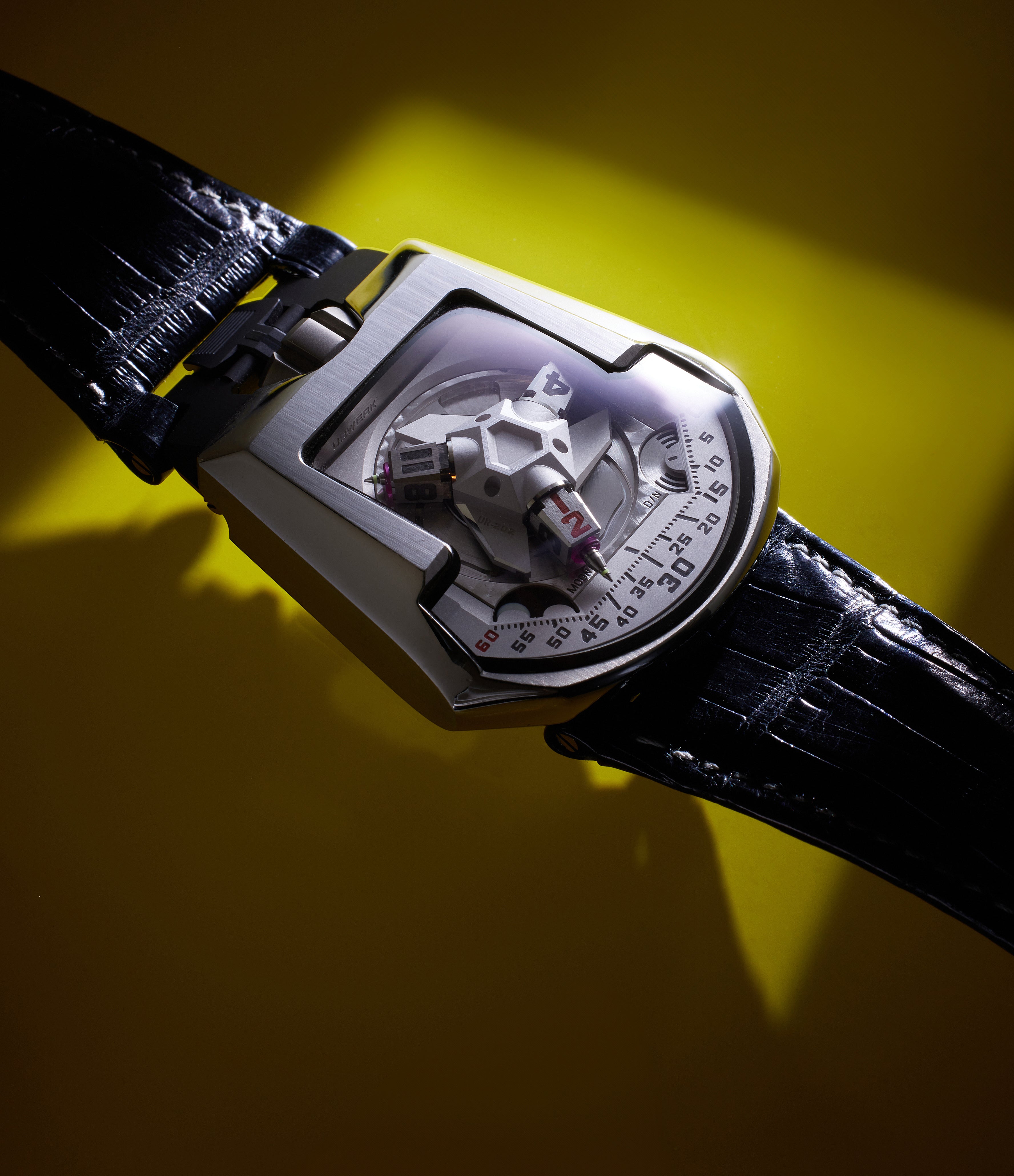

The UR-202 was produced in titanium, white and rose gold, with an AlTiN coating. However, one of the most sought-after examples was produced in a 12-piece series, called White Shark. It was produced with a stainless-steel case and titanium caseback with the choice of a stainless-steel bracelet or leather strap. There also exists a unique example of the UR-202, engraved by Huguenin in an Art Deco motif with repeating triangular forms. In addition to the metal on the dial side, the crown was also engraved. There also exists a single example of the UR-202 PT Blue – the platinum case was coated in blue PE-CVD.
The UR-202S marked an update of the line’s aesthetic with its ARCAP dial decorated with three-dimensional stripes, which lent the update the extra letter in the name, in addition to the metal it was crafted from. It would also be the first watch to wear a bracelet Urwerk designed in collaboration with specialist Italian maker Maspoli. It would be produced in stainless-steel and AlTiN-coated stainless-steel with bracelets to match case metals. Twenty-five pieces were made in each metal.
Released in 2010, the UR-203 was marked apart by a series of key details. It featured a semi-skeletonised dial, with this detailing extending to the ARCAP hood atop the three arms of the wandering hours time display as well as the minutes arc. Instead of the moonphase and day/night indicators were a three-year oil change and 150-year “odometer”. The latter is a detail that reflects the brand’s philosophical musings – it is a counter that could track the watch’s journey over a century and a half. The platinum case, coated with PE-CVD, gave the dial side a stealthy appearance. It was produced in a series of 20 pieces.
There also exists a unique gem set example, called the UR-202 Baguettes. As the name suggests, the case as well as the crown is paved entirely with Top Wesselton-grade baguette diamonds. In fact, the Briolette-cut stone of the sort inlaid in the crown, inspired the creation of the UR-202 Baguettes. Stones are set on the ARCAP P40 canopy of the wandering and rotating time display, as well as arc of the minutes scale. Laid out on to a white gold base and blackened titanium caseback, the watch features 220 stones totalling an incredible 15.06 carats, including the 1.09 carat rock in the crown.
UR-CC1
In 2009, Urwerk unveiled a watch that was removed not just from its own visual language but the prevailing aesthetic of watchmaking in general. However, it was not without historic basis. It traces its story back to a solitary example of the Patek Philippe Cobra reference 3414 from 1958 that sits in the historic brand’s museum. The result of the collective labour of Louis Cottier and Gilbert Albert, it was the first watch to feature an entirely linear time display inspired by horizontal dashboards that were in vogue with the popularisation of automatic transmission vehicles in the United States. The watch’s display was governed by a cylinder drive mechanism linked to the calibre 9-90. The yellow-gold case, designed clearly with motorsport functionality in mind, was paired with a matching gold bracelet. It was codenamed “Cobra”. That the brand did not pursue any form of serial production probably speaks to the challenges of producing a watch with such a display.
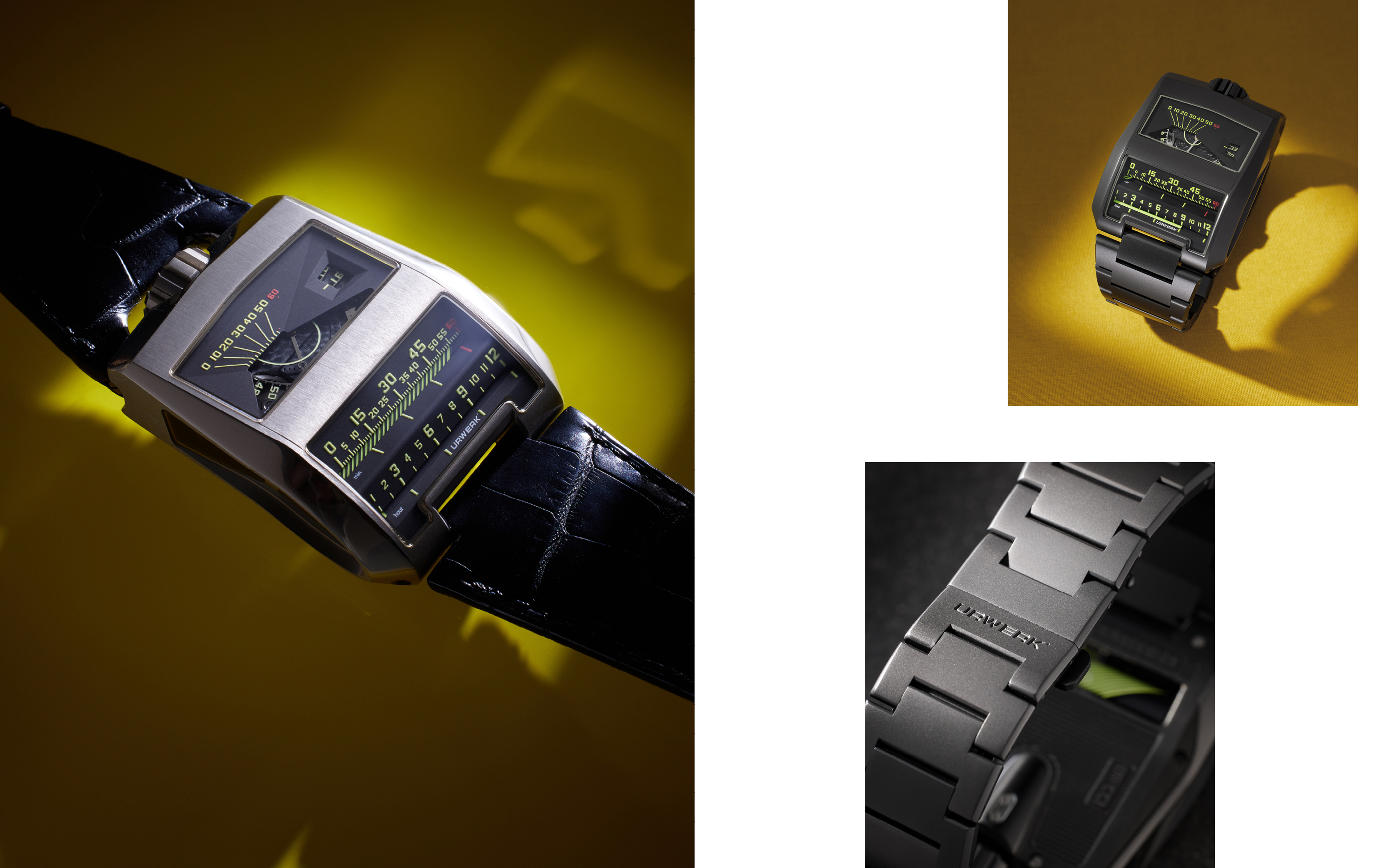

Urwerk picked up the gauntlet and named its attempt the Cottier Cobra or CC1, paying due respect to the original. The time indication was underpinned by two rotating cylinders – one wearing a helix pattern that spiralled up a 60-part scale once an hour to indicate the minutes; the other dodecagon in shape, with each face wearing an increasingly longer luminous line, indicating the hours along a 12-hour scale.
While the rotation of the hour cylinder is relatively straightforward, the flyback function needed of the minutes cylinder is more mechanically challenging. The solution is a vertical triple cam – three ramp-like cams. This was connected to a rack with a honeycomb detail by a spring. The rotating cams move the rack up towards the top of the hour, with the spring flying the minutes cylinder back to the 0 position with a clunk. The rack had teeth on one end, and these interacted with a toothed wheel, turning the minutes cylinder round. It was a complex set-up but one robust enough to survive the very mechanical flyback function at the start of every hour.
Interestingly, it featured two seconds indications. Both were governed by a large seconds wheel with a chapter of Arabic numerals at two-second intervals. The wheel itself had at its centre a spiral, brightened with luminous material – as it turned once a minute, the line forming the spiral made its way across the 12-part linear seconds scale. The digital seconds were visible through a rectangular window adjacent to the scale.
Powering all this is the self-winding calibre UR-8.02. It featured a single turbine, acting as a windbreak to the aid of shock tolerance. Owing to the nature of the time display and the delicate interactions this required, Urwerk advised the time only be set in forward increments.
The flat portion of the case accommodated the calibre and the seconds indication, while the two barrels for time indication were placed in the part of the case that curved down to meet the form of the wrist. The exhibition midcase showed off the rack as it moved up and down, as well as the turbine air brake. An aperture in the titanium caseback showed off the minutes cylinder. Just 50 examples have been produced – 25 in white gold and 25 in gold treated with AlTiN. While it came on a leather strap, we have seen later examples with bracelets matching the case metal. It was the first piece produced in a new “Special Collection” vertical.
There exist a small number of unique examples, such as the one designed in 2012 to celebrate the 10th year of London-based Marcus Watches, an Urwerk retailer in the UK. It featured red time scales and seconds numerals in an AlTiN-coated white gold case.
UR-110
A couple of years later, Urwerk introduced the UR-110, which marked a further expansion of its design vocabulary. While it was the brand’s first asymmetric case, it borrowed visual elements from a number of previous references. For instance, the time display, told along an up-down arc, was first seen in the Opus V, as were the spinning cubes that displayed the hours. In some ways, it marked a simplification of the set-up – instead of the cam-based extending and retracting minutes hands, each of the three arms of the carousels had their own fixed pointers, on which the spinning cubes were mounted.
The UR-110’s asymmetric form meant time display was concentrated on the right-hand side of the case. Its design finally gave credence to the cliché of a watch that slips underneath a shirt cuff, although its dimensions suggested otherwise.
The case, oriented to the right-hand side, featured a bezel screwed on to the midcase produced in a number of metals, with the caseback always fashioned from titanium. It followed the open set-up of the later iterations of the UR-103 and the UR-203. Mounted on a central, three-armed carousel, crafted from ARCAP P40, were the cubes that spun based on a planetary gearing system that linked each of their rotations to the others’. On the baseplate, partially obscured by the turning carousel, was the 120-degree arc of the seconds register, plied by three-armed seconds indicators, reminiscent of the set-up of Breguet tourbillons. To the north was the day/night indicator while to the south was a five-year service interval, or oil change indicator.
On the titanium caseback, directly under the minutes arc on the dial side, were the two turbine air brakes for the self-winding calibre UR-9.01. The crown was shielded by a spring-loaded protector. The overall architecture won the UR-110 the Design Watch prize at 2011’s Grand Prix d'Horlogerie de Genève (GPHG).
At the time of launch, Urwerk showcased a version with a titanium base with a stainless-steel bezel screwed on, as well as one coated completely in AlTiN. Then there was the version where the stainless-steel bezel was coated in zirconium nitride (ZrN), while the titanium base wore a blackened appearance. This coating gave the UR-110 ZrN bezel a hardness of 2000 Vickers. Another key detail related to this 12-piece series production – depending on the serial number, the same numeral on the cubes was coated in red.
The UR-110 EastWood featured titanium cases, with five examples topped with a bezel made from Indonesian Macassar ebony and five more with South African red ivory wood. Notably, they came on straps made of tweed by British designer Timothy Everest. The UR-110 PTH was produced in a series of 20 pieces. It featured a titanium case with a blackened platinum bezel. The red printed minutes scale and numerals as well as on the planetary gears, contrasted with the occasional green on the service interval indicator as well as the 60-minute mark.
Urwerk added red gold to the UR-110 lineup in 2012. The series of 55 featured blackened titanium casebacks that further accentuated the warm shade of the bezel. Then there was the UR-110 ST Ribbed which featured a blackened stainless-steel case with a bezel featuring the striated detail that its name references. Notably, the minutes scale, as well as the hour numerals, were in a bright shade of yellow, offering striking visual clarity. It is understood that 55 examples were produced in this configuration.
The UR-110 PT, with a substantial circular brushed-platinum bezel screwed onto a titanium caseback, was produced in a series of 20. A limited edition, created for the Singapore market, featured a blackened AlTiN case with blued numerals. Only five examples were made in the series.
One of the more visually distinctive iterations is the UR-110 TTH – “tantalum hull”. It featured a detail that only revealed itself on closer examination. This related not just to the metal from which the bezel was crafted, but its thickness as well. At 4.1mm, the bezel on the UR-110 TTH was almost double the size of the 2.4mm thickness of the stainless-steel bezels. Its thickness had to be matched by that of the crystal for this 55-piece run. The purplish-blue hue of the tantalum, along with the blackened titanium case, made for a stealthy combination.
UR-1001
The UR-1001 Zeit Device was revealed in 2011, the same year the UR-110 was released. It was as much a complicated timepiece as it was a projection of Urwerk’s philosophy of time. It was the watch the brand would have made, untethered by practical considerations such as ergonomics and cost of production.
The hand-made stainless-steel case, coated in AlTiN, was an exploded rectangle, and measured an incredible 106mm long and 62mm wide. It also sat 23mm high. On the dial side it wore a concentric circular motif. The angular sapphire crystal revealed an expansive dial where at the top the satellites had been engineered to display the 12 months of the year, rather than the 12 hours. Each month made its way across an arc of its constituent days, rather than the 60 minutes in an hour. The annual calendar was able to compensate for months with 30 and 31 days, only requiring intervention for the month of February.
The carousel, mounted on a wheel with 93 teeth, in addition to the three arms with the months of the year, had three more arms with Maltese crosses on their ends. Some of the ends of these crosses featured “fingers”. The way the program works was that at the end of the four shorter months of the year that came at the same intervals every year – the fourth (April), sixth (June), ninth (September), and eleventh (November) – a finger on the Maltese cross would interact with an adjacent, four-pronged, star-shaped wheel. Such an interaction simply advances the entire date carousel forward at a faster rate, skipping the missing days of the month.
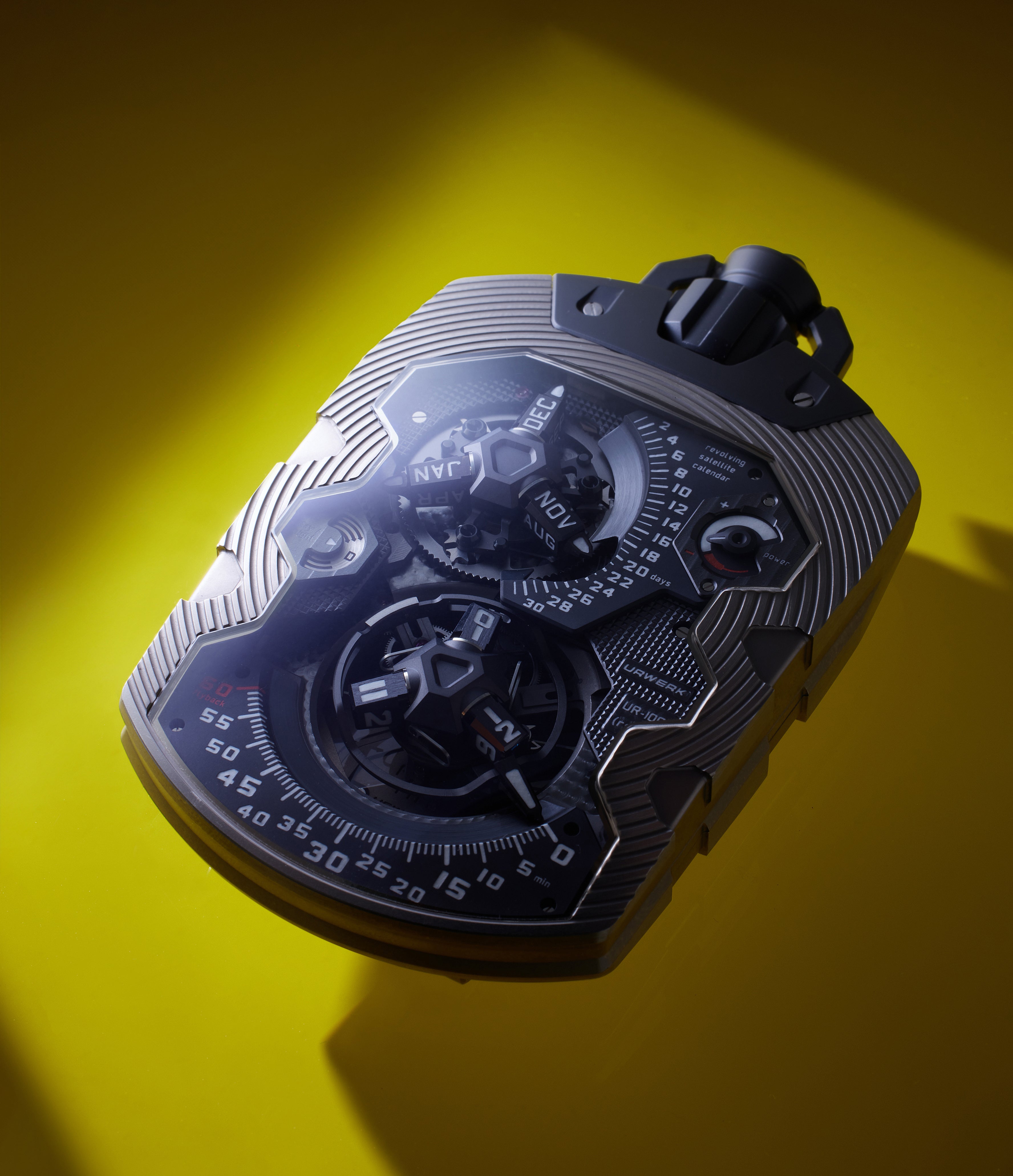

Underneath it, the three-armed seconds display lay concealed, just as it was on the UR-110. There was a power reserve as well as the signature circular day/night indicators.
The southern section of the main dial was dedicated to time display. This was a traditional Urwerk affair, complete with the rotating cubes. However, the UR-1001 marked the return of the retrograde minutes hand, not seen since the Opus V.
On the reverse side, underneath a hunter-style caseback, was a five-year service interval indicator. Above it lay a similarly circular 100-year counter. This is where the linear 1,000-year indicator was also located. The hinged caseback was mounted on a bezel that was screwed on to the caseback side. The watch was designed to be worn as a pocket watch, with a chain attached to a carabiner-style hook behind the crown.
Just eight examples of the UR-1001 Zeit Device were ever made. Four years later, Urwerk followed it with the UR-1001 Titan, a reference to its much lighter titanium case. Perhaps buoyed by the weight shed, Urwerk designed a large leather strap with a housing attachment on it designed to secure the UR-1001 Titan’s case so it could be worn on the wrist. However, given the vertical orientation of the display, the horizontal orientation on the wrist was far from ideal. There also exists a unique example crafted from platinum – it was designated a prototype.
2012-2015
UR-210, 220 and 230
As the nomenclature indicates, the UR-210 first seen in 2012 iterated on the UR-203’s aesthetic. The UR-210 had sharper angles on its bezel while the case itself was not unlike the exploded rectangle seen previously. It measured almost 54mm long and 44mm wide, with a case height of almost 18mm. While the dial layout was similar to previous instalments in the UR-200 family, instead of the telescopic arms there was a single central retrograde seconds arm. The arm is mounted on a central axis with ruby bearings with a substantial spring around this axis. The second arm’s position was based on a star-shaped cam – when it reached the end of the hour, the cam caused the spring to reset the seconds arm back to the 0 position almost instantaneously.
Hallock says of the retrograde seconds, “The arm that flies back on the hour is so large and flies with such force that in a quiet office you can often hear it ‘ding’. It's like a petite sonnerie chiming on the hour. As I am partial to bracelets and it is so hard to find cool watches on bracelets, the 210S is my favourite version.”
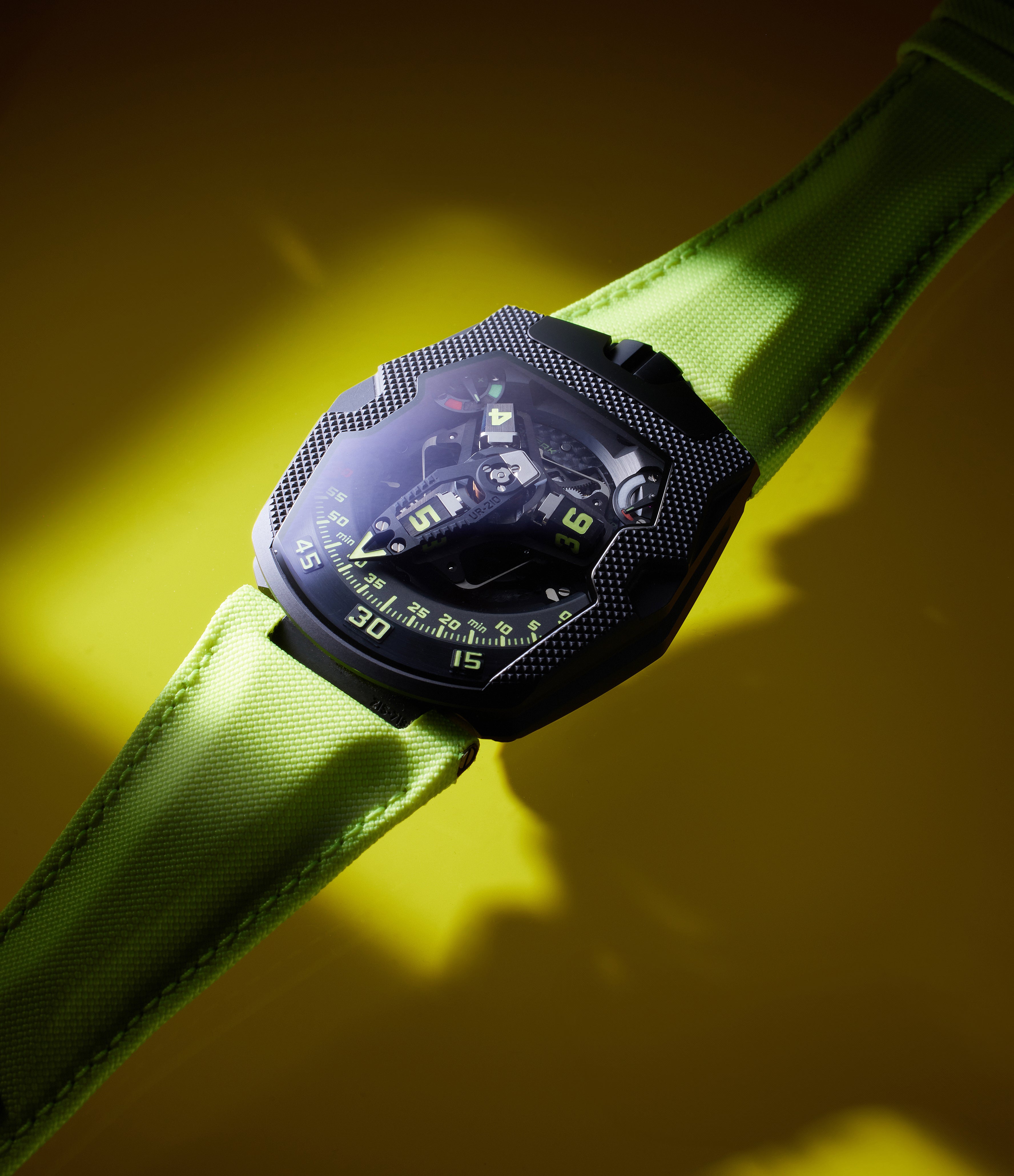

To be able to keep replicating this action, the arm needed to be light. It was milled from aluminium and featured an aperture to frame the hour displayed by the cubes. On the top right corner was a power reserve indicator while its visual counterpart was a new innovation – it showed what was essentially the mathematical difference between the energy expended by the mainspring and the energy it gained by way of the winding rotor linked to the wearer’s activity over the course of the preceding two hours. If the indicator was in the red, the wearer could simply get moving to reverse the energy deficit and restore the indicator to the green. Such feedback was a first in watchmaking and the technology underpinning it is proprietary to Urwerk.
The titanium caseback was home to the full suite of “chrono meter” functionality – the air-brake turbine was on display while the wearer could adjust the self-winding rotor’s rate based on their level of activity. It had inside the calibre UR-7.10.
It was originally available in stainless-steel in a natural finish as well as a version coated with AlTiN, with 35 pieces of each produced. Later, in 2015, the UR-210 S featured a “full metal jacket” iteration of this stainless-steel aesthetic by adding a stainless-steel bracelet by Maspoli. It was produced in a series of 35 as well.
Iterations were produced in red gold (75 pieces) starting in 2013, with a Clous de Paris or UR-210 CP introduced in 2016. This edition, with a machine-turned bezel detail, was also produced in a series of 75 pieces. A limited series of 25 in blackened platinum, called UR-210 BPT or Royal Hawk, featured a bezel with a concentric circular motif and a high contrast red time scale paired with red hours. Parts of the titanium carriage on the watch also wear a similar shade. It was first seen in 2018.

There were some unique examples as well, such as the ornate UR-210 Amadeus, with its stainless-steel case and bracelet entirely hand-engraved by artist Florian Güllert over the course of 260 hours. It dripped with the baroque detail of a floral pattern adorning the bezel, flanks of the midcase as well as the Maspoli-made bracelet. Similarly adorned was the UR-210 Dubai, also by Güllert. Both pieces, owing to the nature of the craft, were unique.
The UR-210 Final Edition from 2020 featured a stainless-steel case and titanium caseback, with the whole arrangement coated in DLC, with contrast reddish-orange accents on the dial. It was produced in a series of seven pieces. As the name suggests, it marked the end of the reference.
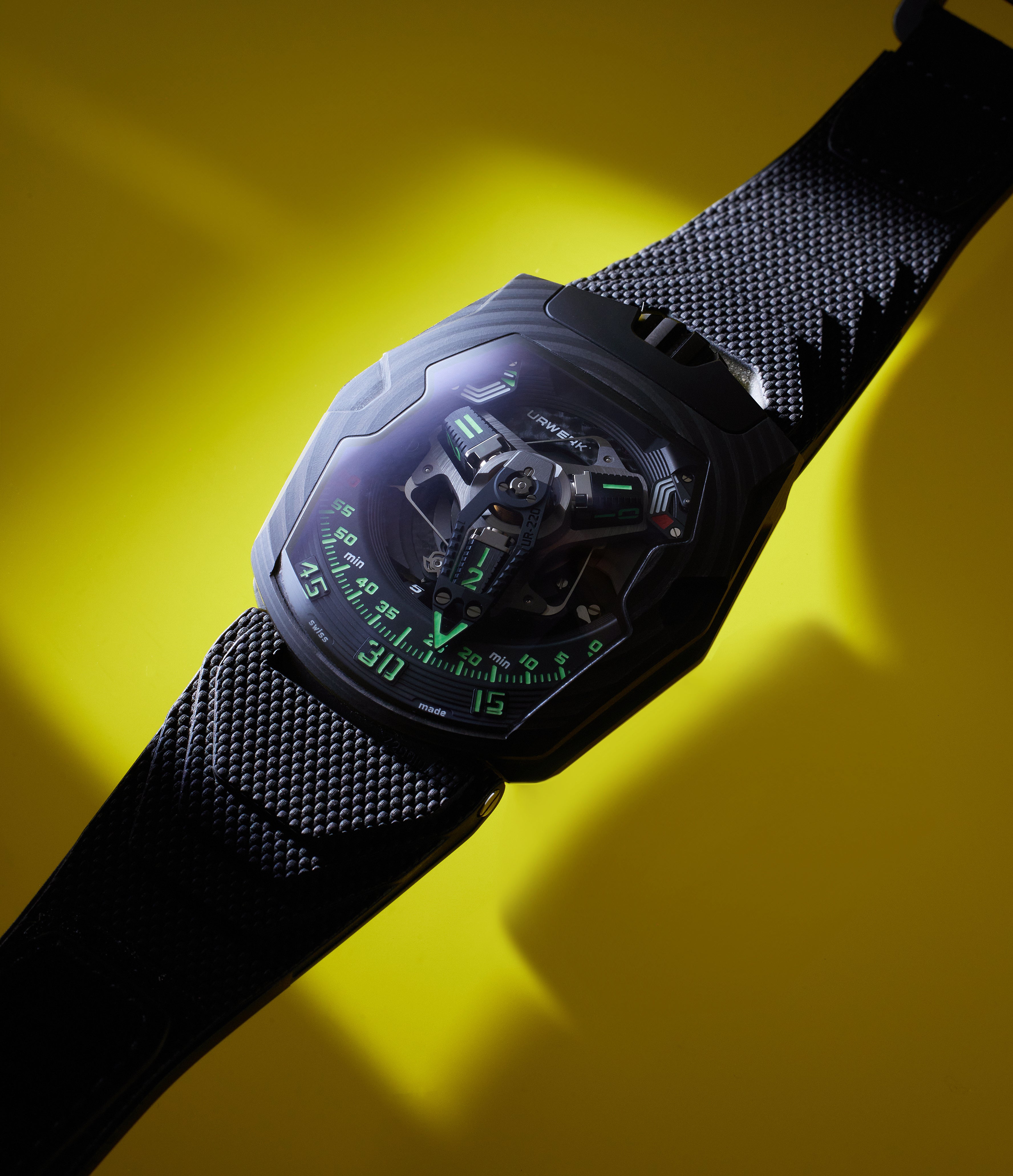
This brings us to the UR-220 and the year 2020 when the first one, the C81, was released. While there were significant changes in terms of the calibre and complications, we must start with the case itself, which marked a first for Urwerk. Visually reminiscent of the Royal Hawk, the entire case was crafted from 81 layers of carbon thin ply (CTP), pressed together in a resin. It made for a unique, layered appearance. While comparable in terms of width to the UR-210, it was marginally shorter and substantially slimmer, owing to the manual-wind calibre it held. While the UR-210 stood almost 18mm tall, the UR-220 measured 14.8mm tall.
On the inside was the new manual calibre UR-7.20 with a single mainspring producing 48 hours of reserve that was displayed on a new and complex split view indicator on the dial. Gone was the winding efficiency indicator. However, Frei could not conceive of a dial side unbalanced by this omission. So, in its place he designed an 83-component split power reserve indicator – the display on the right went from red to half-way wound, while the one on the left completed the rest of the journey, with the indicator going to green when the mainspring was fully replenished. Also new was the digital twin roller 39-months service interval countdown integrated on the movement side of the case.
The second iteration that followed, only a few months after the C81, was the UR-220 All Black, with its stainless-steel case and titanium caseback coated in black DLC. Urwerk planned this as a series of 25 pieces, making only about 15 examples of the UR-220 a year.
A notable iteration of the UR-220 was the SL Asimov, a reference to the science-fiction writer Isaac Asimov, whose work inspired both Baumgartner and Frei as young adults. Inside the stealthy 81-layer CTP case, the three hour indicator cubes were fashioned entirely from luminous material, using technology developed by Switzerland-based specialists RC Tritec.
The UR-220 Miami Vibe, released the following year in 2022, featured a rose-gold case paired with its signature Vulcarboné strap in white. Together this achieved the effect the name was going for. Also golden were parts of the time display carousel and the northern part of the dial where the power reserve indicators were situated. The brand plans to produce around 10 pieces of the UR-220 a year.
Rebooted
The latest development of the series, first seen in 2023, was the UR-230. While staying true to the basic configuration and the mechanics driving the time display, this was extensively reimagined. The case was marginally more substantial, measuring just under 45mm wide and 53mm long. However, the UR-230 case sat a whole 3.6mm higher off the wrist than the UR-220. This is partly because instead of the manual winding calibre UR-7.20, the new watch was fitted with the self-winding UR-7.30.
As with any self-winding calibre, Urwerk deployed the suite of innovations that went with this kind of movement – the watch benefited from twin turbines to protect the winding rotor from spinning uncontrollably in the non-winding direction. Also, for the first time, the turbines were visible on the dial (peeking from under the time display) as well as on the movement sides.
Two controls governed the functioning of the turbine. With one, the wearer could fine-tune, increasing or decreasing the rate at which the winding rotor spun, in an incremental fashion. The other, designed for vigorous activity, allowed the wearer to block the rotor completely, effectively turning the calibre UR-7.30 into a manually wound set-up. When considering this level of functionality, the case’s dimensions begin to make more sense.
To offset the increased bulk, the case is crafted from blackened titanium and layered carbon, the latter material employed in a fashion similar to the UR-220 C81 Falcon Project. The case now also employed a retractable hood that hid all complications, displaying just the time. Another change on the dial side was that the large retrograde minutes display was now crafted from aluminium and skeletonised to shave off even more weight. In all, Urwerk plans to make 35 examples of the UR-230 in this configuration.
EMC
Urwerk’s 2013 release, called EMC or Electro Mechanical Control, marked a bold departure for the brand. Gone was the wandering hours display. In its place was a watch face more reminiscent of the series of displays that typified the brand’s signature chrono meter caseback dashboard.
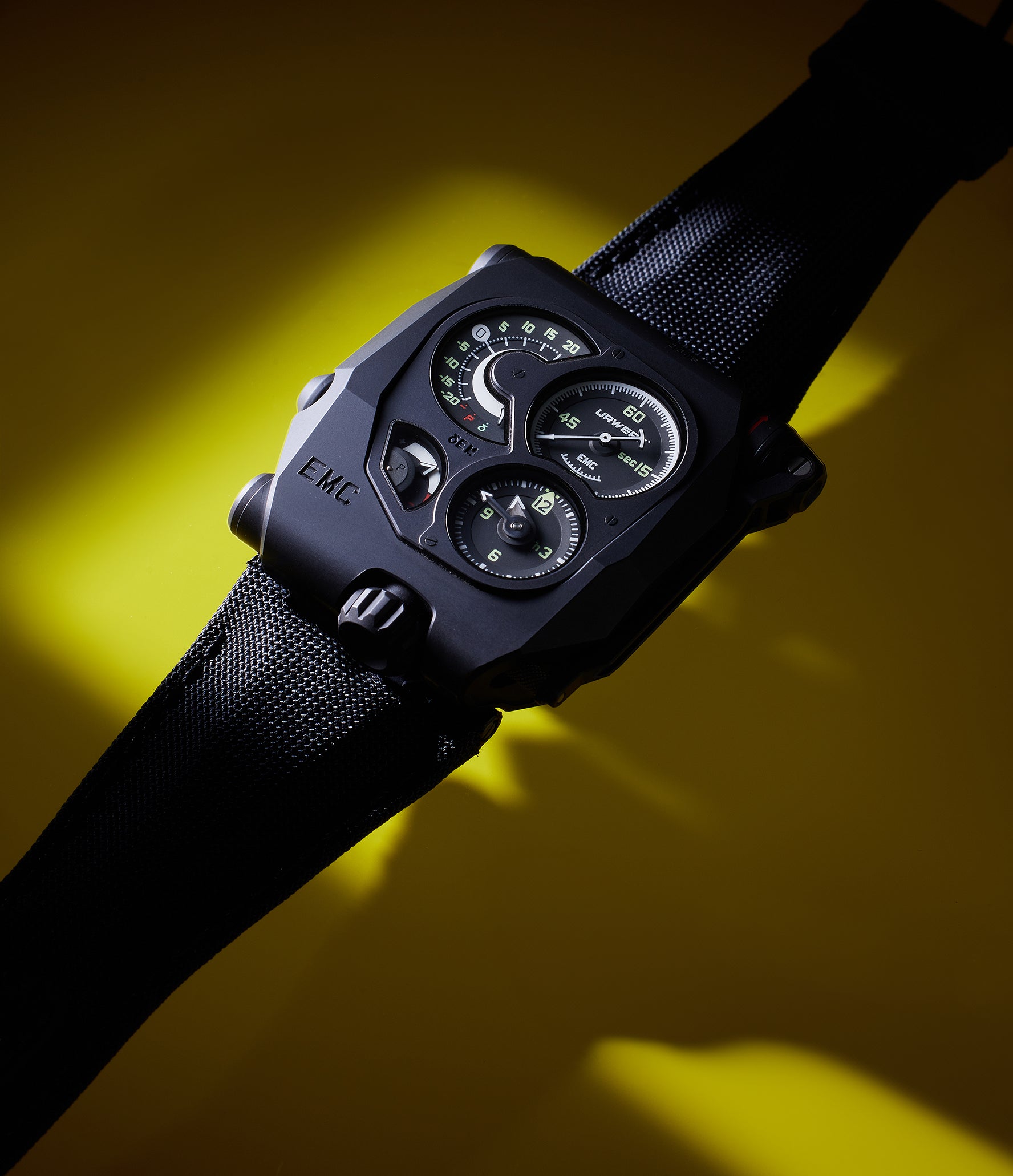

The hours and minutes display, told by conventional hands, was separated from a larger seconds display just north of it. Another window displayed the 80 hours of reserve left in the mainspring powering the manual wind calibre, UR-EMC. This was the brand’s first in-house calibre and it had several details Urwerk was keen to draw attention to. One was, of course, the impressive power reserve, thanks to the twin stacked mainspring barrels, put on show on the movement side. Another detail was the new, flat balance, crafted from ARCAP P40, the brand’s material of choice thanks to it antimagnetic properties. While not clearly visible, Urwerk found a way to showcase its benefits and the overall accuracy it gave the movement.
This chronometry was testable. On the dial side was a scale, paired with a button on the side of the case, that let the wearer know how many seconds the calibre was gaining or losing. Its functioning was referenced in the “electro” part of the EMC name. Adjacent to the mechanical calibre was a micro-generator system developed by Maxon, a Swiss organisation known for its work with NASA. Most recently, the company developed the drivers that powered the Perseverance rover on a mission to Mars.
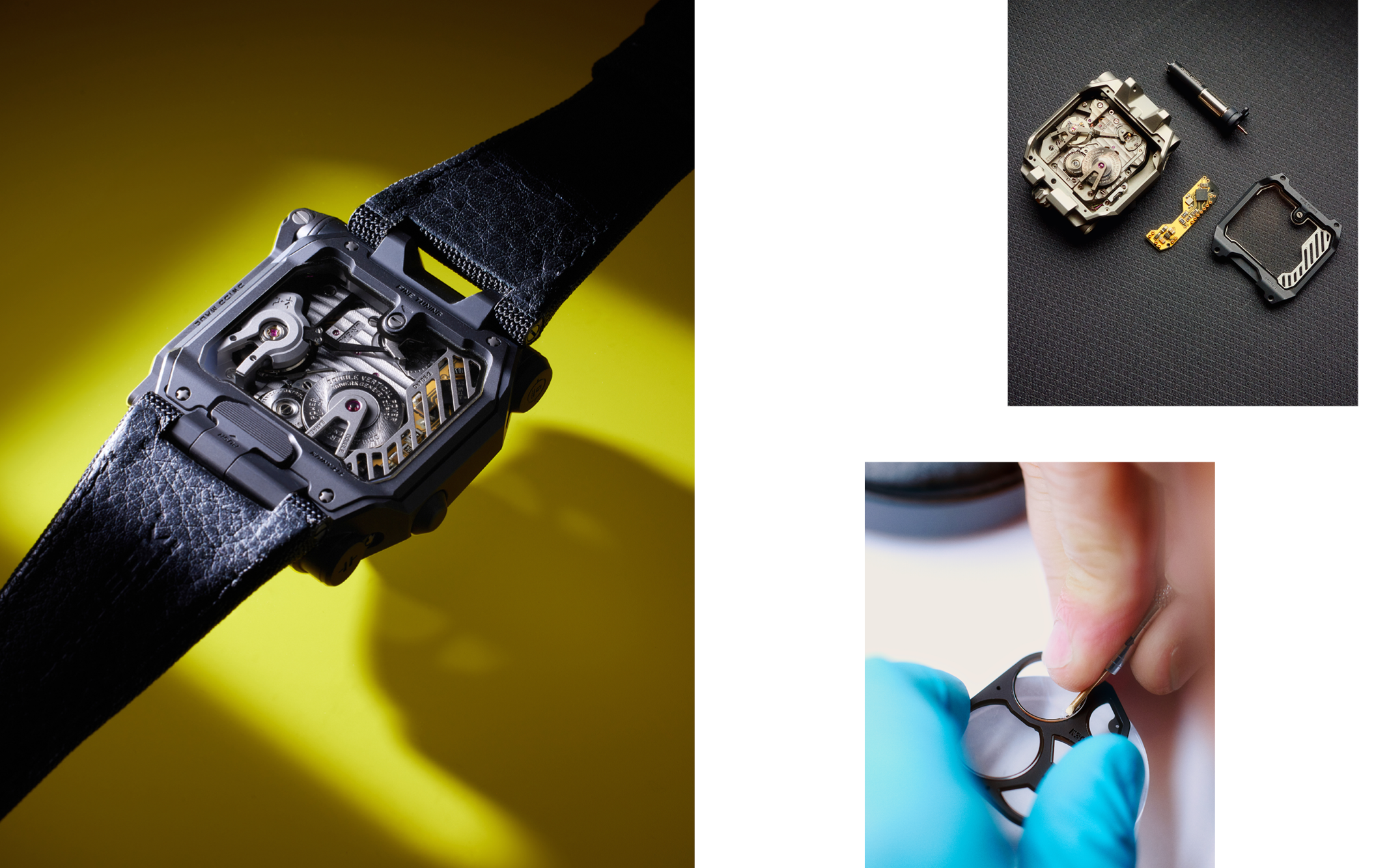

A winding stem, tucked nicely into the case, could be unfolded and employed to wind up a capacitor. The energy from the capacitor powered an optical sensor designed specifically to work with the innovative flat architecture of the ARCAP P40 balance wheel. The optical sensor monitored the rate of the balance wheel for a period of three seconds, then relayed that information to a calculator circuit board located under a grated bridge visible on the movement side. This calculator circuit, that was sensitive to as little as 10 microsecond differences during 125 millisecond periods during the oscillation of the balance, used the average of this data to display the projected loss or gains in seconds over the course of 24 hours. Then, depending on the need, the now familiar micro-adjustor on the caseback could be used to adjust the rate of the movement.
It was an absolute first for watchmaking and a show of confidence that the brand had in its first manual-wind calibre made in-house. The technology earned Urwerk the Mechanical Exception and Innovation prizes at the 2014 GPHG. Fifty-five examples of the EMC were produced in stainless-steel with a titanium caseback, with a similar number being made with a stealthier black DLC coating.
The EMC Pistol was a decidedly more ornate iteration of the functional aesthetic. First seen in 2015, it featured a case where the faceted aspects became a canvas for Güllert. The ornate floral patterns, achieved in stainless-steel, were done by hand. The case was paired with a specially deep-grained alligator leather strap designed by Geneva-based Portales. The iteration was limited to five examples.
The brand followed this up with the EMC Time Hunter in 2016. It retained much of the display details of the original EMC, but now the decentralised display was consolidated under a single piece of sapphire crystal. Centrally positioned and now dominant was the time display, with an arc-shaped jumping minutes display in the right-hand corner of the dial. Diagonally positioned was the power reserve indicator.
Crucially, the movement accuracy indicator had a dual purpose. It now also displayed the amplitude of the balance – information it was already gathering to calculate movement accuracy – in a semi-circular arc. Once enough energy had been generated by the hand crank, a small light on this dial illuminated to indicate the diagnostic tests could begin.
The EMC Time Hunter aesthetic was revealed with a grey media-blasted stainless-steel case paired with a titanium caseback; there was also a version with the stainless-steel case coated in military-green ceramic – this was the Time Hunter Ceramic Green. Both iterations were produced in a series of 15 pieces only.
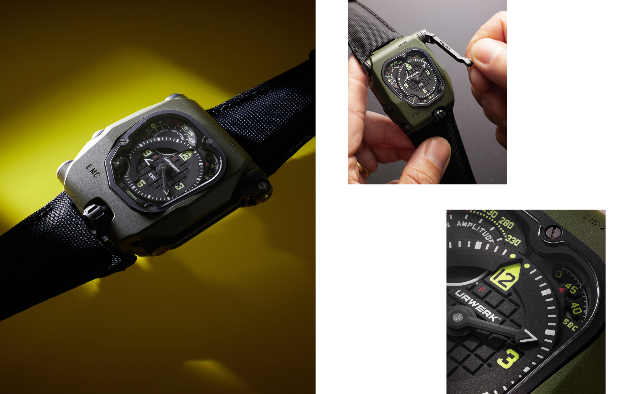

Later in the same year (2016), the brand revealed the EMC Time Hunter X-Ray, with cases crafted from hollowed-out titanium, finished in a greyish-black shade. This lightened aesthetic was paired with a dial that was skeletonised wherever feasible. Another visual distinction was red or yellow scales for the accuracy and amplitude indicators, with some of the bridges on the movement side also finished in the corresponding dial-side shade. Fifteen examples of the Time Hunter X-Ray were made.
The latest iterations, released in 2020, have included the EMC Storm Trooper and Desert Sand. The stainless-steel cases wore the same ceramic coating we’ve seen before, this time in a shade of white and sand respectively. They were paired with camouflage-patterned fabric straps. Five examples of each variant will be produced.
In 2024, returning the EMC back to its regulator dial roots, Urwerk revealed the UR SR-71, named after the Lockheed SR-71 Blackbird, the famed high altitude, Mach 3+ reconnaissance aircraft. The watch, of which 10 examples will be produced, features a crown and winding stem crafted from the exotic alloys that formed part of fuselage of the SR-71. The remainder of the case features blackened stainless-steel, with a titanium caseback.
UR-105
In more ways than one, the UR-105 was a successor to the UR-103. The conical display, now crafted from forged aluminium, was back, this time covered in a canopy of polyether ether ketone (PEEK). According to Urwerk, it was inspired by shields of the sort medieval knights used to carry. The self-winding calibre UR-5.03, equipped with twin turbines, had a new power reserve display on the right flank of the case. The seconds were displayed on a red roller and could also be seen on the dial side in the bottom right corner – this display would, of course, get covered as the cones made their way across the minutes scale, especially at the top of the hour. Beside the seconds display on the flank was a power reserve indicator.
On the caseback was the usual suite of features, including the ability to control the winding rotor’s activity and fine-tune the movement. In terms of diversity of iterations too, the UR-105 was a worthy successor to the UR-103 line. First out of the gate was the UR-105 M with a stainless-steel bezel atop a titanium case (dubbed Iron Knight), of which 77 examples were made. A similar set-up, but with the bezel coated in AlTiN (called Dark Knight), was produced in a series of 50 pieces. Interestingly, these are the only two watches to wear the UR-105 M designation.
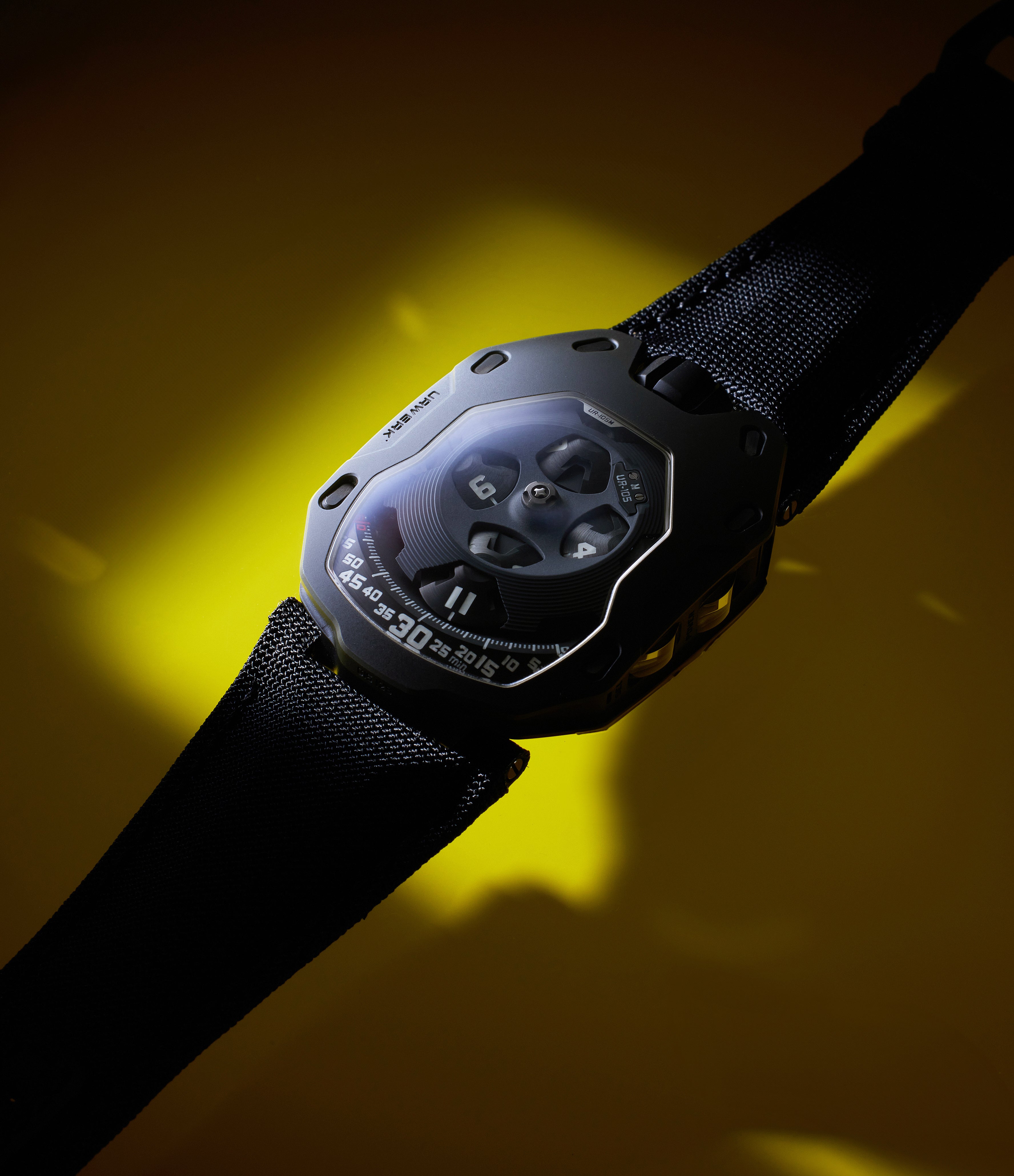

This is because the very next year marked the arrival of the UR-105 TA Black Orange, with orange cones and minutes scale contrasted against a blackened-steel bezel and a titanium case. Also launched simultaneously in 2015 was the UR-105 TA Black Lemon, with a similar case set-up, with high contrast fluorescent-green cones and minutes arc. Both were available with matching fabric straps, and 100 examples of each were produced.
In addition, more conventional examples with bezels in rose gold (UR-105 TA RG) or blackened steel (UR-105 TA Black), both in series of 100 pieces, were made available starting in 2015. In early 2016, the brand offered up UR-105 TA with a textured bronze dial, a first for Urwerk. It was called the UR-105 TA T-Rex, owing to the colour and the texture. It was limited to 22 examples.
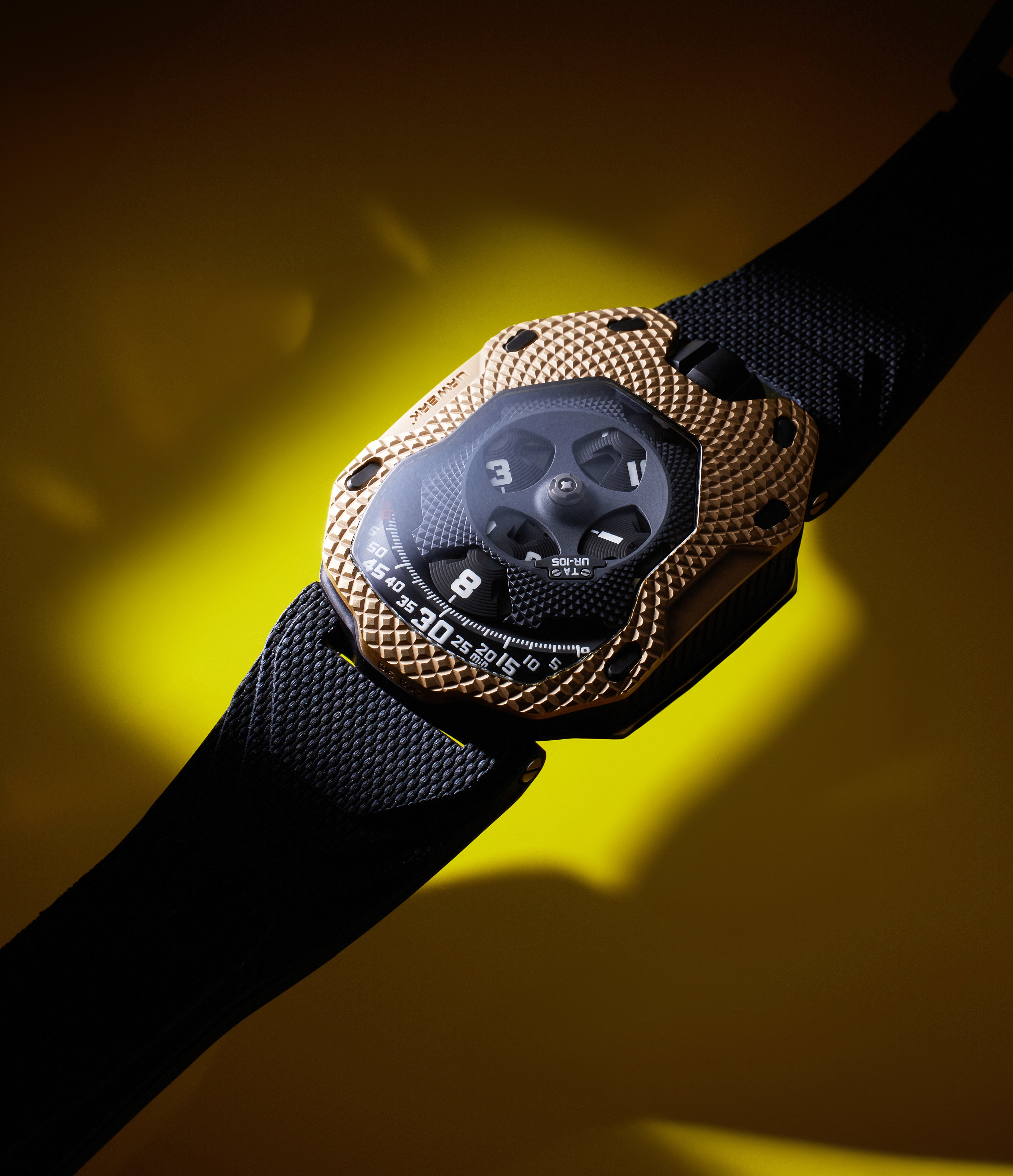

That same year brought us the UR-105 TA Clockwork Orange, a series of 100 pieces with a blacked-steel bezel with orange printed hours and minutes. Even the visual detail that typically accompanied the brand’s turbine-based air brake was finished in orange in this case. Also available in a series of 100 was the UR-105 TA Raging Gold (RGG), its red-gold bezel wearing a large tapisserie pattern.
While the UR-103 started out with a minimal display and progressively exposed more of its underlying mechanism, the UR-105 would go in the opposite direction. This is because, starting in 2017, the brand unveiled the UR-105 CT Black, Iron, and Kryptonite, each produced in a series of 50 pieces. With a set-up akin to the UR-103.3, these were designed to capture the essence of New York City – a place where Frei spent many years – in different light conditions. While the UR-105 CT Black – with a blackened steel and titanium case with greenish luminous material – was meant to represent the city after dark, the UR-105 CT Iron represented a day-time view. The UR-105 CT Kyrptonite, with its greenish luminous material, was the sort of New York City you’d find in a Batman comic book. All three had retractable hatches that would reveal a skeletonised version of the canopy and its underlying cones.
Along similar lines, the UR-105 CT Bronze was revealed in 2019 (22 pieces), with the UR-105 Tantalum Hull or TTH (11 pieces) joining the ranks in 2021.
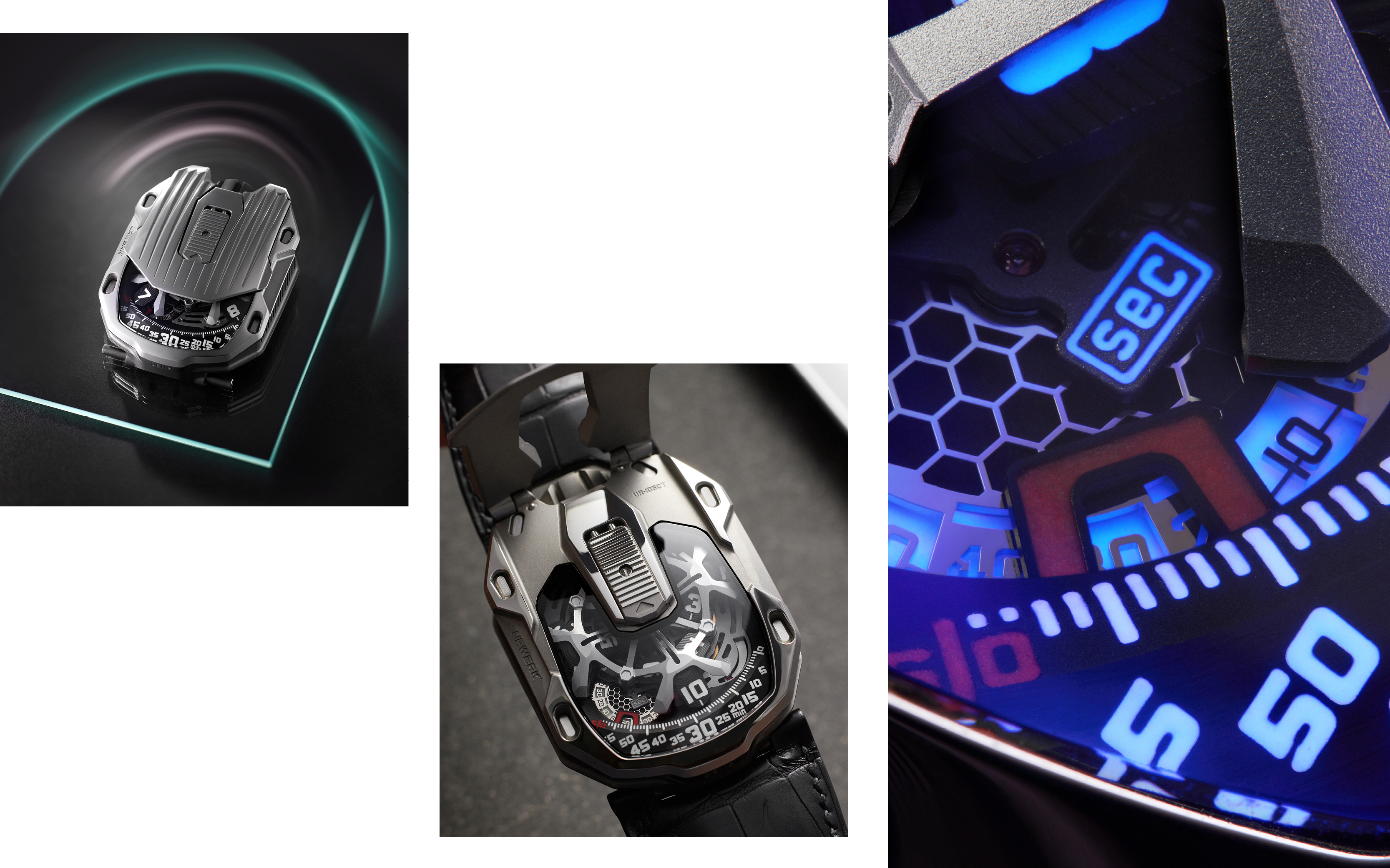

Urwerk has also collaborated with Revolution magazine and UK-based engraver Johnny Dowell (@kingnerd) on a series of iterations of the UR-105, each unique by virtue of the craft involved. One of them was the UR-105 Bronze Samurai. As the name suggests, the bronze bezel was intricately engraved with a samurai motif. The UR-105 Bronze Tiger was another piece in the same series, as was the UR-105 Bronze Guardian Lions.
In early 2023, the brand produced a unique example of the UR-105 TA T-Rex. Created for the Out of This World II auction in Zurich in April that year, it was a companion piece to an auction item – the Trinity Tyrannosaurus rex, a specimen created by merging the fossils of three different dinosaurs. On the caseback, encased in sapphire, were bone remnants of the Trinity T-Rex.
UR-106
The UR-101 and 102 notwithstanding, the brand’s aesthetic is best described as big and bold, drawing inspiration from the worlds of science fiction and even warfare. This is why the UR-106 stands alone. It was designed and marketed specifically with a feminine clientele in mind, an acknowledgement that the watches that had come before had perhaps not resonated with the demographic.
The UR-106 White Lotus and Black Lotus watches, first seen in 2015, inherited the horseshoe case shape of the UR-101 but in a form that was wholly new. The case, just under 50mm long and 35mm wide, with a thickness of 14.5mm, was crafted from stainless-steel and titanium. In the White Lotus, the stainless-steel monocoque case showed the natural colour of the metal, while in the Black Lotus it was coated in black PVD. The hours and minutes on the White Lotus were treated with blue luminous material, while on the Black Lotus these were done in a shade of green aimed at high contrast.
On the bezel was a constellation of diamonds, arranged concentrically, pavé-style. Even the jet-exhaust-style oversized crown, designed so a slider on the caseback would release it, featured diamonds on alternating levels. The Black Lotus made use of black diamonds, of course.
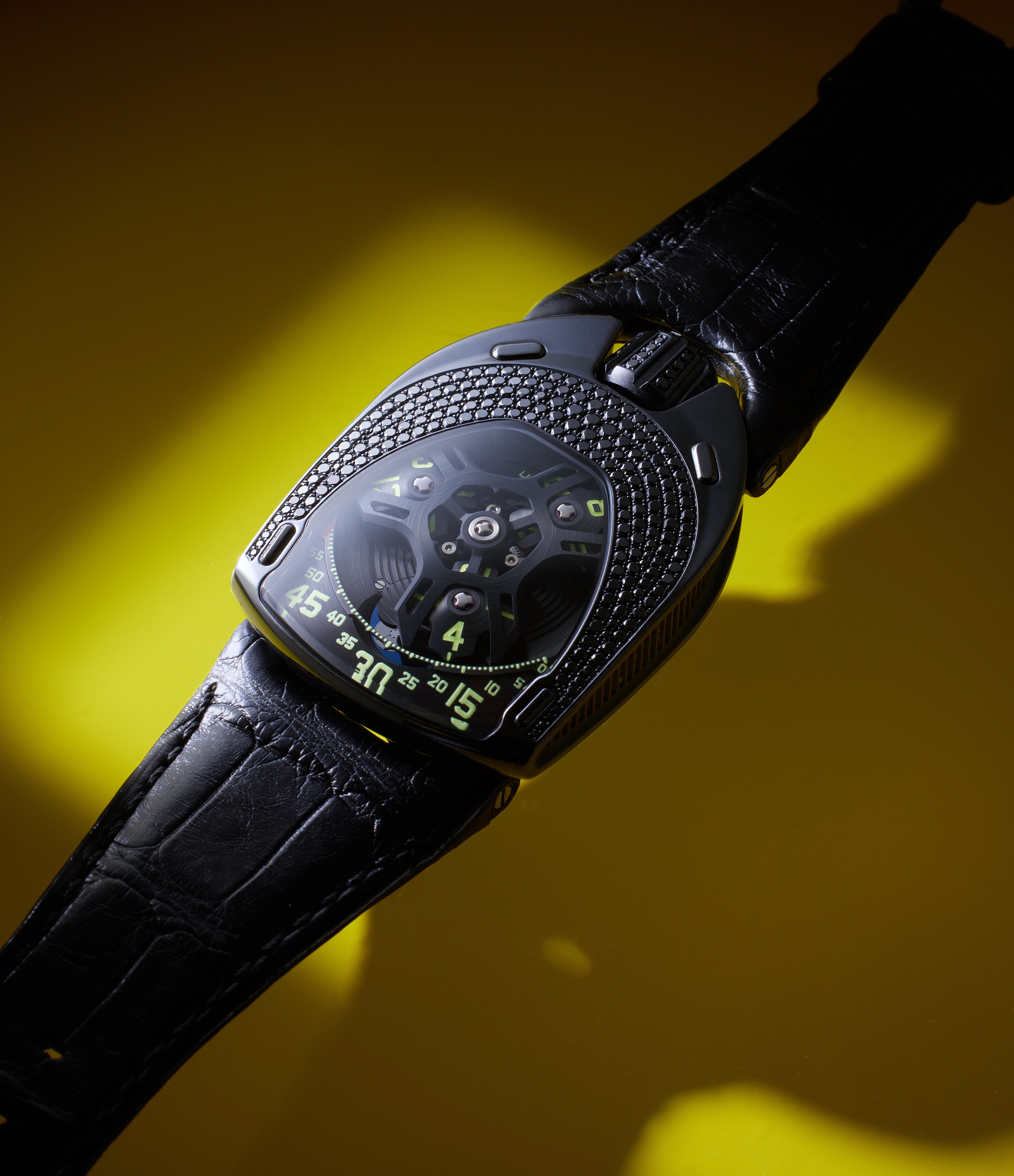

A skeletonised ARCAP canopy hovered over the three-armed hours carousel. The wandering hours were engraved on four arms of the three titanium wheels. There were interesting details such as the partially floating chapter of minutes and the ring-style finishing on the ARCAP baseplate. Also on the baseplate level was a moonphase complication, crafted from lapis lazuli.
On the movement side, the titanium baseplate featured a lotus motif. Underneath was the self-winding calibre UR-6.01.
The UR-106 White Lotus and its counterpart, the UR-106 Black Lotus, were produced in a limited series of 11 pieces each. The following year the brand released the UR-106 Black Pink in 2016, again in a series of 11. This watch, similar in layout to the Black Lotus, featured pink hours and minutes.
The UR-106 Flower Power from 2017 was similar to the White Lotus, with a few key differences. Gone was the ARCAP canopy and, in its place – blooming from the central pinion of the wandering hours – was a diamond-encrusted flower, with three satellite flowers in between the titanium hours discs. The printing, in keeping with the floral motif, was in green. Just 11 examples of the watch were made.
The Story So Far
As evidenced by the references we have covered so far, the brand was particular prolific in its first 19 years. From its adaptation of the wandering hours was born references such as the UR-103, laying the basis for much of what came after it.
However, references such as the UR-202 (and UR-203) and the UR-110 showed the brand’s ability to iterate on this foundation by stretching the limits of the time display in a way that at once faithful to historical watchmaking and to the world of science fiction that was so important to Baumgartner and Frei’s youth. With halo projects such as the EMC, it showed a willingness to go beyond the confines of mechanics that have hemmed in watchmaking innovation in the post-quartz era.
In part two of this Collectors’ Guide to Urwerk, we explore innovations from 2016 right up to the present day.


